HOME | DD
 SystemOverload — Verizon Wireless

Published: 2006-09-06 05:40:28 +0000 UTC; Views: 523; Favourites: 3; Downloads: 0
Redirect to original
Description
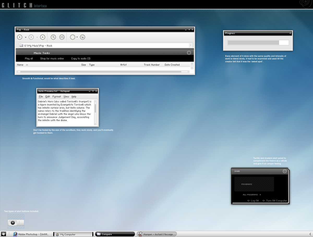
VIEW the Most Updated Version Here...[link]-----------------------------
This is a site im working on.. tell me what you think. Give me ideas
Full view that shit!
Related content


Comments: 17

you should load more of your sites on here. anyway, its a good job, the motorola banner is nice, with the reds, and the turqoise time text looks good with the bluetooth banner. the only thing is i dont like the bordering shadow design around the verizon guy.
👍: 0 ⏩: 1

It looks pretty sweet to me how it is. Excellent work
 (Smile)")

👍: 0 ⏩: 1
welcome! And thank you
 (Wink)")

👍: 0 ⏩: 0

you should sell it to the company, because thier currnet one sux
")
👍: 0 ⏩: 1
you should sell it to the company, because thier currnet one sux
👍: 0 ⏩: 0

That annoying verizon guy is there, put a bullet hole in his forehead accordingly.

👍: 0 ⏩: 1

wow, thanks for great critique...
👍: 0 ⏩: 1
I try 
👍: 0 ⏩: 1

the edges of the pda are the hard. try to make em softer, then it would look nicer.
further i got nothing to complain about
nice design
👍: 0 ⏩: 1
thank you very much for the advice, i really appreciate it!
👍: 0 ⏩: 1

Looks fantastic - nice bold use of colour and smooth, consistent GUI aesthetic
My one criticism would be that the 'specifications' list items' backgrounds need to be darker; it's too bland atm in my opinion
👍: 0 ⏩: 1
thank buddy.. yeah i was thinking the same thing... just something about it doesnt look right.. thank you for the comment!
👍: 0 ⏩: 0