HOME | DD
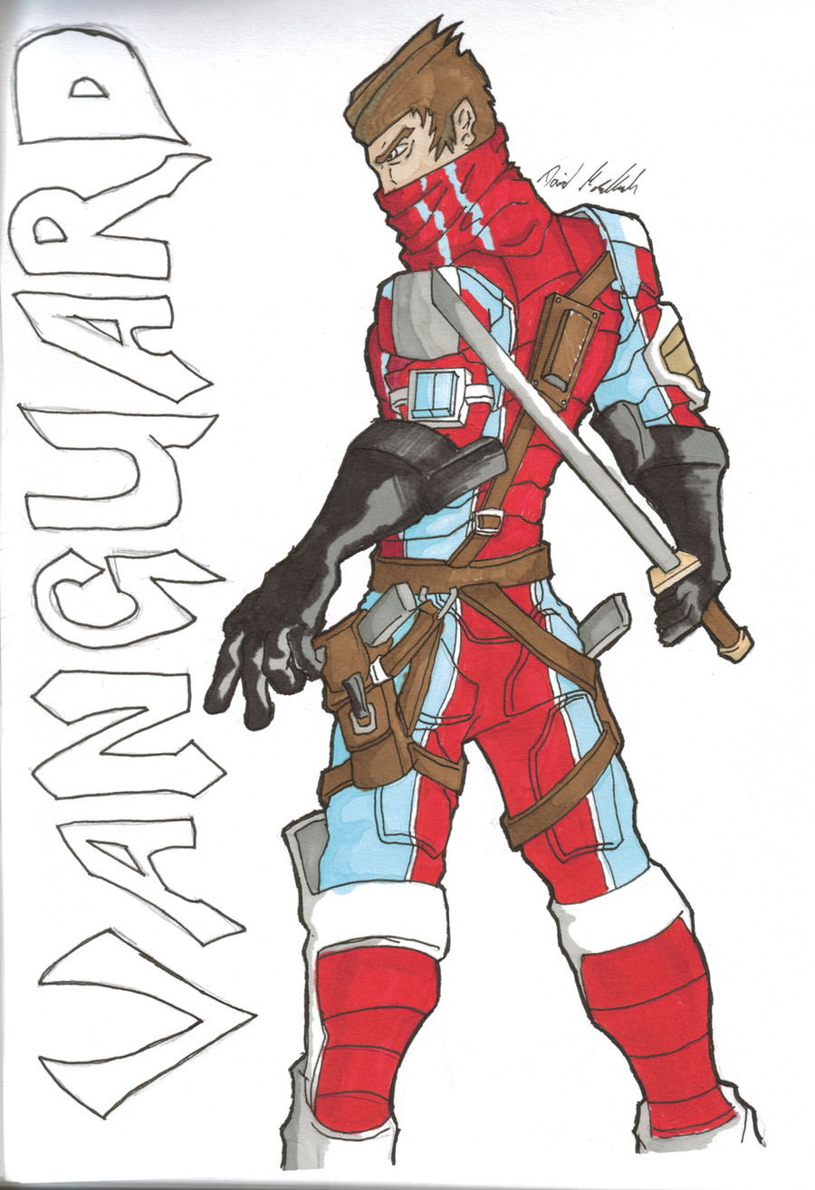
 Systems-Error — Vanguard colour
Published: 2010-07-27 02:15:26 +0000 UTC; Views: 273; Favourites: 3; Downloads: 7
Redirect to original
Description
this is the character Vanguard coloured. I got new markers and this was one of my first attempts using them so I know it's not very good but I'm hoping it will get better as I practice.
Related content


Comments: 5

you got a cool conceptual design, tha pose is also very strong (if you look at it as a sillouette you can see it reads well)
The one thing i see is that you have a hard time with hands, I did for a long time too, look up hand references online or take web cam pics. there are also some really good tutorials on creating a structure of the hand. but practice practice practice lol thats what the "greats" do.
👍: 0 ⏩: 1

thanks for looking over my stuff man  (Smile)")
👍: 0 ⏩: 1


Nice design. I like his stance, and I envy your marker work (I always make a mess when I try to use them). The character's outfit is nicely designed with a strong color scheme and clear details.
The work has some minor anatomy issues, most notably you tend to draw the eyes and eyebrows way too close to the top of the skull--the eyes should start around halfway down the front of the head to make room for the forehead. It was less noticeable on your more recent Samaritan character drawing, but here it's very apparent.
The hand holding the sword looks awkward as well. The way his hand is twisted to hold that sword looks very uncomfortable. I sometimes find it helpful to try to do a pose that I intend to draw (perhaps while holding a broom or something to mimic a weapon) to get an idea as to how the hand(s) should be drawn properly.
Overall, it's good work. Your clean linework and sense of design will take you far when you draw comics.
👍: 0 ⏩: 0

I like the colors you went with! The light blue on the red is an interesting contrast, and the use of the white details gives him a great "super hero" look, which in turn is balanced well with the black gloves and darker, more naturally colored straps. This also gives him "mixed" look. He looks like a hero, but there are elements that suggest that he isn't squeaky clean.
Finally, nice use of markers for the shading, it adds alot of depth.
👍: 0 ⏩: 0