HOME | DD
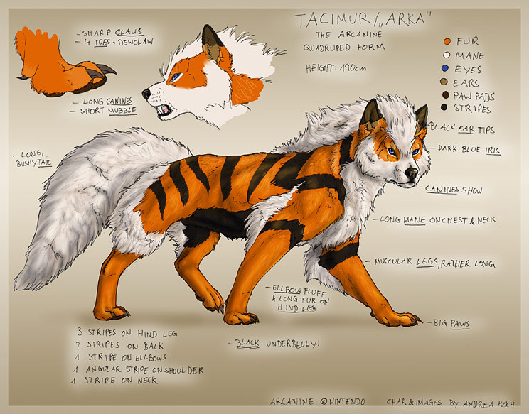
 Tacimur — -scrap- ffffffffff-

Published: 2011-05-12 20:49:17 +0000 UTC; Views: 1764; Favourites: 50; Downloads: 81
Redirect to original
Description
"PhD students presenting resultsComic Sans everywhere"
Imagine a whole big room full of important-looking scientific posters. It was Comic Sans hell.
Will go to scraps later.
(Also could read: Sh*tting a brick - 70% done.)
Related content


Comments: 85

Or the title of my curriculum vitae... which actually does also belong into a kindergarten classroom.
As does i...
I will go back to finger coloring
")
👍: 0 ⏩: 1

All I'm saying is it's got the perfect look for elementary school teachers. It's not ALL bad. I think it's hilarious how graphic designers have strokes over comic sans... and papyrus...
👍: 0 ⏩: 1
I agree. It has its places, but most people wouldn't expect it on a CV so... my part was supposed to sound ironic and i forgot that this doesn't work good on the internet.
👍: 0 ⏩: 1
Oh sorry, ya subtle sarcasm and irony can be hard to detect on the internet.
👍: 0 ⏩: 1
Yes, no reason to be sorry  (Smile)")
👍: 0 ⏩: 0

lol too true.
Although at my school, bad PowerPoint presentations were just as common as bad posters. :<
👍: 0 ⏩: 1

o.o So far, nobody here made a PP presentation with that font, I guess that gives reason to hope...
👍: 0 ⏩: 0

That reminds me of some television advert I've seen for some art school type thing and its name was written in big, bold, rainbow text. So professional.~
But Comic Sans is pretty bad too and like... subtracts from my ability to perceive something as credible!
👍: 0 ⏩: 1
Rainbow... how.. nice. How encouraging. x)
Yep, and if you keep in mind that this were immensely expensive research results that they spent years on... oh come on people, you deserve better.
👍: 0 ⏩: 0

DDD:
Comic Sans ist eine Beleidung für jedes Designerauge! Tolles Bild! Ich kann dir SO nachfühlen

👍: 0 ⏩: 1

Look on the bright side, everyone could have used Papyrus!
👍: 0 ⏩: 1

Sowas ist wirklich extrem peinlich XD Vor allem denken die auch noch es sei was ausgefallenes, wenn sie diese Schriftart nehmen...
👍: 0 ⏩: 1
Und so viele! o.o Und das für Projekte, die so extrem viel Geld und Zeit gekostet haben!
👍: 0 ⏩: 1
Wahnsinn nicht wahr? Eigentlich wären solche Projekte es sogar fast schon wert eigene Schriftarten dafür zu entwickeln...oder wenigstens eine Schrift zu wähelen, die ein wenig ernst zu nehmender ist als Comic Sans....
👍: 0 ⏩: 0

I FEEL WITH YOU. That font is a nightmare. My Designer-heart gets stabbed every time I see that ... that accident.
👍: 0 ⏩: 1
Thanks Nim. Shared pain is halved pain.
👍: 0 ⏩: 0

I don't understand anything but a comic-looking drawn for you,pretty rare.
And you failed it's not in anthro but in animal if I see well.
You scare me more than when you said "hiya!"
👍: 0 ⏩: 1
It's anthro because it's doing a human expression, getting angry about fonts, and the rest of the body might well be anthropomorphic, too. Also, somewhere on the deviation page I've hidden an explanation. Can you guess wheee~re?
👍: 0 ⏩: 1
Neeern because I'm not enough german for reading these scary words.
👍: 0 ⏩: 1
I meant the artist's comments, but they are used to getting ignored, so don't feel bad. ^^
👍: 0 ⏩: 1
No I already readen it.But I wasn't understanding.
👍: 0 ⏩: 0

Die können doch nicht die Comic Sans verwenden! D:
Für jedesmal das die verwendet wird schlagn die im Typo-Forum das Typekaninchen.
👍: 0 ⏩: 1
Armes Typekaninchen... wünschen wir ihm gute Besserung nach diesem Tag.

👍: 0 ⏩: 1


(Also could read: Sh*tting a brick - 70% done.)
xD xD xD xD xD
Du bist genial!!
👍: 0 ⏩: 1
Ich werde dich in deinen Träumen verfolgen.
👍: 0 ⏩: 1

*schnell an was anderes denk* XD
👍: 0 ⏩: 0
<= Prev |