HOME | DD
 tadejmiklavc —
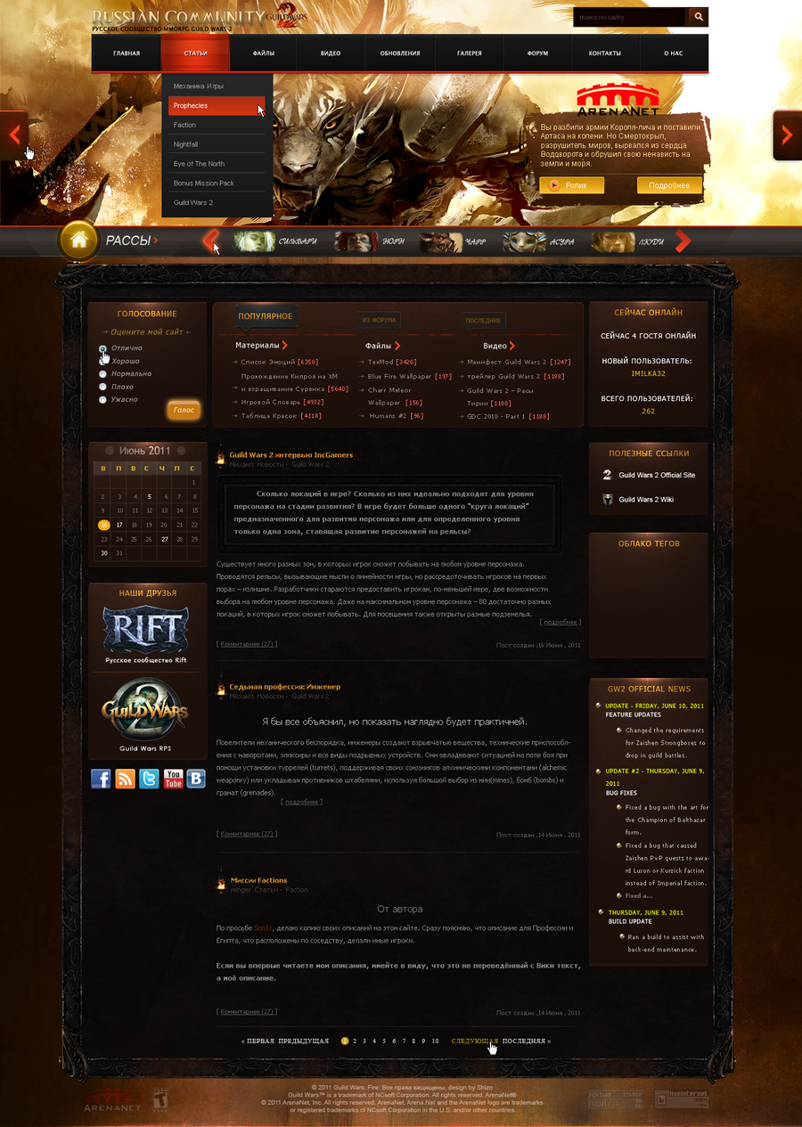
Lawanity Web interface
by-nc-nd
tadejmiklavc —
Lawanity Web interface
by-nc-nd

Published: 2010-07-20 23:24:56 +0000 UTC; Views: 30569; Favourites: 222; Downloads: 1291
Redirect to original
Description
About 50 hours of work. 2165 Layers.Related content


Comments: 132


how to learn make same as interface design ? your take me trick or anythink ?
👍: 0 ⏩: 0


")

")

Featured in Project Educate Feature: Logos and Interfaces .
👍: 0 ⏩: 0

 (Smile)")


i used the font Anglepoise Lampshade
👍: 0 ⏩: 1

This is yet another DD piece that fails to live up to expectations. You say that it's not going to be online, it's personal use, it's all about the details - but as so many people have said, it won't ever be suitable for any real content, and if it's not intended to be used as a functioning website, then you could have more effectively practiced these techniques in a different medium (ie: purely a 3D design, etc).
All in all, way too much work for very little real result. Also, how do you pronounce Lawanity? Is that a real word? It seems upsettingly difficult to say.
👍: 0 ⏩: 0


Beautiful work. If this were a Winamp skin, I'd so be there.
👍: 0 ⏩: 0


Really beautiful frame, but on a web where content is king, this doesn't seem very practical
👍: 0 ⏩: 0


The area reserved for actual content seems crammed and not well thought out. Almost like an afterthought (oh yeah, I need to place content too... but hey, LOOK AT DEM GRADIENTS, MON!)
An average YouTube comment would be annoying to read on that page.
Sorry, way too much style over substance for my taste, it's neither sleek nor clever from a "communication" or "interface" point of view.
Just very big and distracting and in the end useless for transporting "serious" information just wasting screen space.
👍: 0 ⏩: 0

So AMAZING!!!! It's beautiful in a different kinda way.
👍: 0 ⏩: 0


"About 50 hours of work. 2165 Layers."
But the result is
👍: 0 ⏩: 0


Has anyone suggested it for a DD?
This deserves far more attention man
👍: 0 ⏩: 1


wow, the effects on the left and right side are just so amazing. what program ?
👍: 0 ⏩: 1

Can you make simple tutorials how you do these?
I really want to make futuristic designs
I want to start with basics.
Please help me
Thanks
👍: 0 ⏩: 1
u have simple futuristic tutorials all over the deviantart browse system. a tutorial took many of time, and i dont have time to do tutorials.
👍: 0 ⏩: 1
if you could teach me only how to do the footer it would be great
Thanks
I looked at the futuristics tuts here there is non like yours
The cylinder u have in the design its awesome
")
👍: 0 ⏩: 1
it was first brushed, and then the effects, etc. maybe i will upload a psd file for the cylinder, and some other stuff
👍: 0 ⏩: 1
Hello
Can i get ur msn
I would like to talk to u
thanks
👍: 0 ⏩: 1
Send my a note if u want to talk
👍: 0 ⏩: 0


Just WOWWWWWWWW!
is the best template who ever see.! gz m8 is amazing can to say me how mutch leyers are?
👍: 0 ⏩: 1


| Next =>