HOME | DD
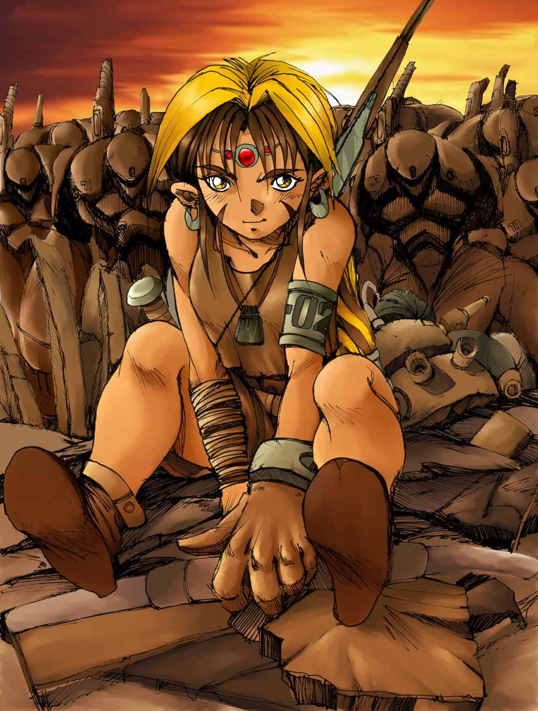
 tagailog — Mina in tears
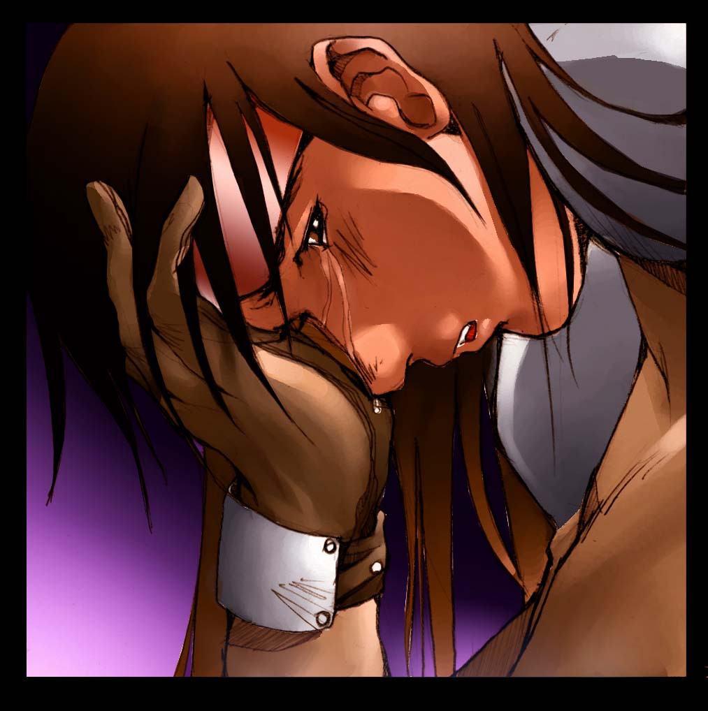
Published: 2003-02-19 16:04:36 +0000 UTC; Views: 2843; Favourites: 25; Downloads: 175
Redirect to original
Description
Mina, a character from "Pasig"-my comic title in Culture Crash Comics issue 8. I especially liked this panel for some reason or another.Related content


Comments: 18


This is a beautiful piece of work. You can really feel the charcter's pain.
👍: 0 ⏩: 0


But where's Dante?? Is she crying because of him?
Mr. Tagailog! I love your works. I just can't believe you're here at DA. *drops dead*
This is a +fav.
~Cyg
👍: 0 ⏩: 0


ooooh .. sad!
extremely beautiful colouring, and it's great for a comic panel!
+fav
👍: 0 ⏩: 0

HiyaaAAAA!!!
Wassuuuupo?!!! ^____^''
Beautiful draw!!!
It's sooo expressive and colorful ^__^
The gradients are very good and well done VERY NICE PIECE!!!
CONGRATZ!!
(Sorry for the bad english)
👍: 0 ⏩: 0

Na! it's not the colour thats the problem, i think that its the gradient used that knocked the original colour back.....
Anyway enough of that, its still a good piece especially as its a panel from a comic...
Keep it up!
Keep it Monkey!
👍: 0 ⏩: 0

Very good picture, but the bandana could be a different color though!
👍: 0 ⏩: 0

good colors, but I think the bandana it's a bit too brighty...
The spression is good too
👍: 0 ⏩: 2
ops.... *pokes myself*
gomen ^^'
I'll pay more attention, next time
👍: 0 ⏩: 0

err... guys....? That's not a bandanna...><; I should know: I have a copy of the comic! hahahaha! ^^
That red thing's a some sort of visor. or sunglasses... I don' know what taga- ilog- sama calls them but it's not a bandanna
👍: 0 ⏩: 0

awesome, and its extremely professional.
HOWEVER (big however) the lighting is really fubar.
like look at the highlights on the face and arms, theyre different.
there should be a single (or multiple depending) light source that makes sense.
like the coloring of her face band doesnt match the shading on her face.
just keep that in mind next time u color.
👍: 0 ⏩: 0