HOME | DD
 TakinFlight — concept1
by-nc-nd
TakinFlight — concept1
by-nc-nd
Published: 2011-09-03 02:45:40 +0000 UTC; Views: 81; Favourites: 5; Downloads: 3
Redirect to original
Description
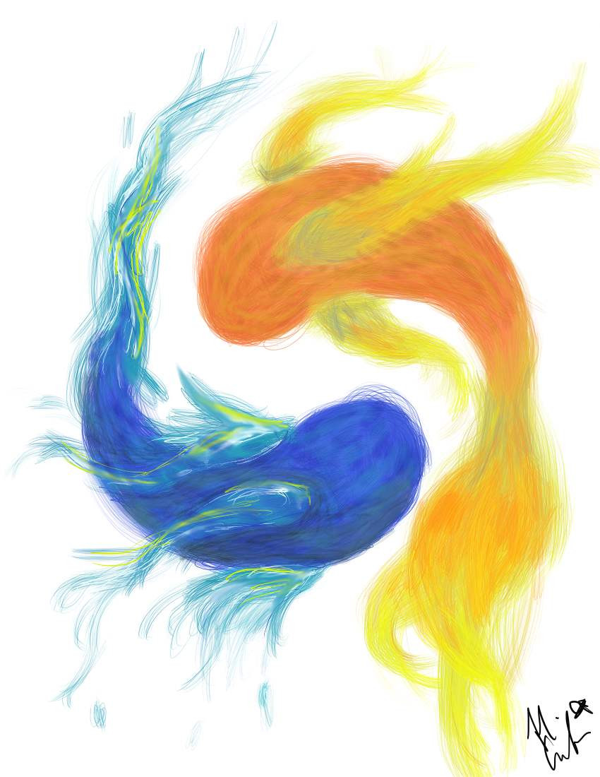
Just a very poorly executed idea...I fail at digital painting!
Related content


Comments: 7

Well, I think you pulled off the fire and water idea. It was just in a subtle way. And even if someone didn't notice, the red and blue still contrast each other. So it works.
")
👍: 0 ⏩: 1
 (Smile)")

This is no where near poorly executed. I think it shines
👍: 0 ⏩: 0

You should elaborate on this idea and make the blue fish more waterlike and the red fish more firelike.
one fish two fish red fish blue fish
👍: 0 ⏩: 1

That was the idea... ")
👍: 0 ⏩: 1
You could call this the color sketch...
👍: 0 ⏩: 0