HOME | DD
 takmaj — oma

Published: 2009-03-01 20:39:56 +0000 UTC; Views: 2586; Favourites: 26; Downloads: 95
Redirect to original
Description
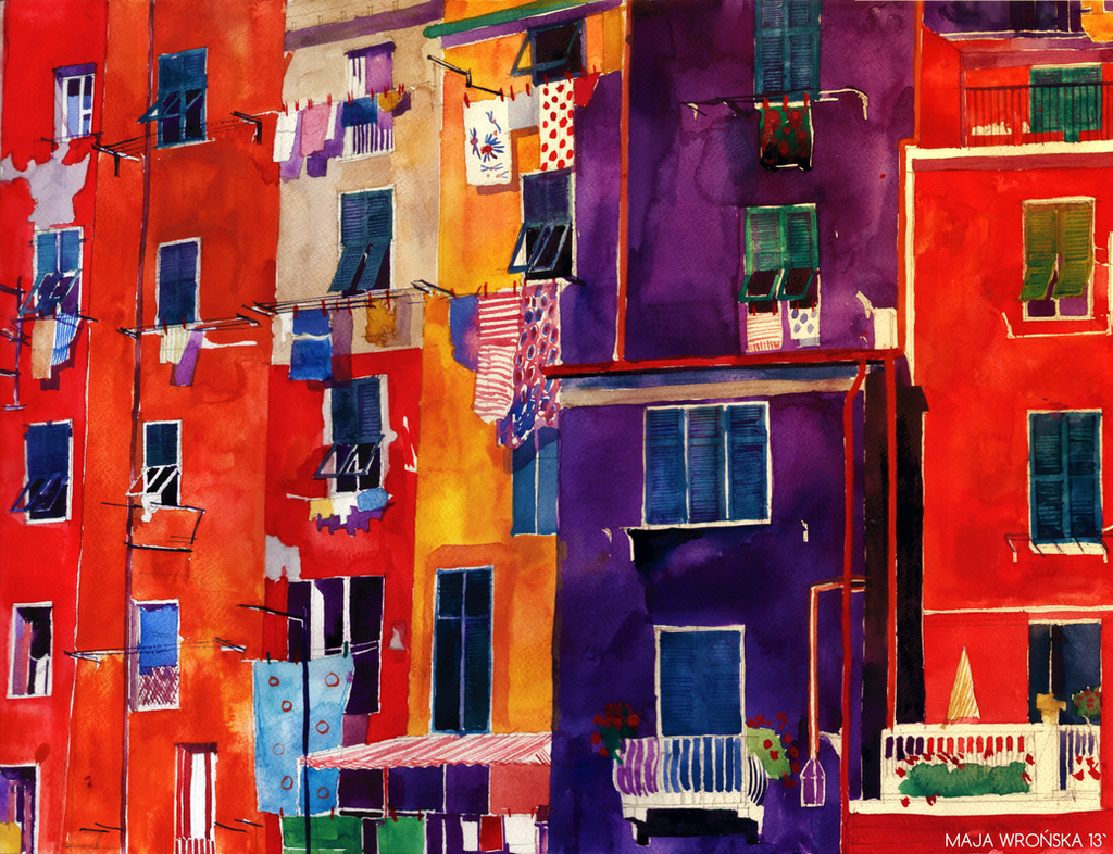
my interpretation of oma's building, acrylic")
Related content


Comments: 7

Even if the shapes are a bit simple in this painting. I do say that the bright colors do give the painting allot of personality.
👍: 0 ⏩: 0

the colors are wonderfully vibrant and interesting, but some of the brush strokes look rushed, mismatched, and a little sloppy. the texture in the purple is distracting and doesn't make it recede as it should, and the wavering stroke of the red stripe at the bottom is at odds with the geometrics of the rectangular form.
it's good but it could use more refinement.
 (Smile)")
👍: 0 ⏩: 0

Each building has to be beautiful, but cheap and fast, but it lasts forever. That is already an incredible battery of seemingly contradictory demands. So yes, I'm definitely perhaps contradictory person, but I operate in very contradictory times. -Rem Koolhaas
👍: 0 ⏩: 1


This is beautiful, the colours look very intense and the lighting is great

👍: 0 ⏩: 1
 (Wink)")