HOME | DD
 Talescaper — No questions asked
Published: 2005-11-24 20:33:11 +0000 UTC; Views: 792; Favourites: 16; Downloads: 97
Redirect to original
Description
Model: RoelRelated content


Comments: 35

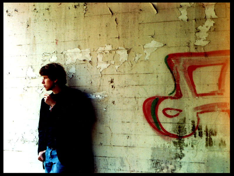
The way the light hits his skin makes it look like it's right out of an old movie  (Smile)")
👍: 0 ⏩: 0

Very nice mood
I like the well textured and dirty; which matched very well with the model expression
The model reminds me someone in a movie but I can't remember at all... Frustrating
👍: 0 ⏩: 1

Thanks ")
👍: 0 ⏩: 1
Yes and that's why I like it very much I think
👍: 0 ⏩: 0


I like the compasition a lot. I think its a little over saturated.
👍: 0 ⏩: 0

This one is nice.
I like how he looks away to a place with more light and how his shadow is affected by this light.
plus as you said, it's nice to look at someone while he's doing something, like in this one - he smokes and reaching his hand towards the cigarette.
My only critique, if I may, is I think the right area is kinda empty and too big which makes my eyes be drawn away from the person himself, which is the subject.
Other than that, really nice and really helpful for me to see some other portraits and learn from them.
👍: 0 ⏩: 1
Thanks
The right area counts as something they call 'negative space', which is another one of these 'tricks' that can help in composing your shot. Some people like it, others do not.
👍: 0 ⏩: 0

I really like the composition of this piece. Most photography manuels would probably say that a model should never be looking out side of the frame, but I think that this is one case where the rules are meant to be broken. He seem to be looking towards the light and it adds mystery to what the light could be. It forces the viewer to use his or her imagination. Great photo!
👍: 0 ⏩: 1
Thanks a lot

👍: 0 ⏩: 0


Aside form the overexposure on the left hand side, I really like the grimy real world feel to this, as well as the spontaneous nature of the portrait.
👍: 0 ⏩: 1
Thanks. Any suggestions how I could prevent this sort of 'local' overexposure without having to fiddle with screens and the like? Oh, I should keep a better track of my settings when I make photos. Most of this portrait (and other portraits in my gallery, really) are not spontaneous in the direct sense of the word. I just told my friend there: 'I want you to smoke a cig and stand against that wall.'
👍: 0 ⏩: 1
Well, unless you have a nice camera and can do manual light readings and such, that is very hard. Mostly it comes to finding shots where you are not shooting into direct sunlight or a reflection of direct sunlight.
On alternative is to take two shots, one focusing on the dark area to get that to expose, and one on the bright area to get that setting, then combine in PS.
If you have no choice though, it is always better to underexpose than over, because you can lighten a dark image, you cannot replace pixels that have been whited out by overexposure.
👍: 0 ⏩: 1
Oh, I usually make manual light readings; I have a lightmeter for that. And you are right about underexposure. There's always the dodge tool
👍: 0 ⏩: 0

Very casual pose, and I like the texture of the background. Good framing and composition too.
Nice one!
👍: 0 ⏩: 0

A very nice portrait. I absolutly love how he is looking towards the light. It makes me want to know what he's seeing. I like how he's leaning so casually on the old wall, lovely. Good work.
👍: 0 ⏩: 1
Thanks
👍: 0 ⏩: 0

nice shot and pose. the use of negative space is also very good..

👍: 0 ⏩: 0

such a beautiful picture, i love the way he looks introspective and dreamy. nice job

👍: 0 ⏩: 1

and i love this one even more
geez youre good.
👍: 0 ⏩: 1
Thanks
👍: 0 ⏩: 0

Pretty picture, the light looks really nifty. And the somewat controversial compositoin - meaning you draw attention to the ritght part of the picture to give it much space over there (since there is this unwritten rule for classic portrets and camera work that a subject should have 'vieuw-space' on the side it is facing and you did the opposite here) works really intresting.. like your suggesting that something is sneaking up from behind.
👍: 0 ⏩: 1
Well yes, I know that unwritten rule. I saw it written down somewhere. I actually like to have people look 'outside' of the picture, because it extends the photo beyond its borders. However, I did brake my own rule about this, because I thought it would only work if the model would be on the right, looking right. This because we look at a picture from (top)-left to (bottom)-right, just like we read a page. For certain reasons, I mirrored this picture and decided that it looked pretty good as well. I'm glad you like it.
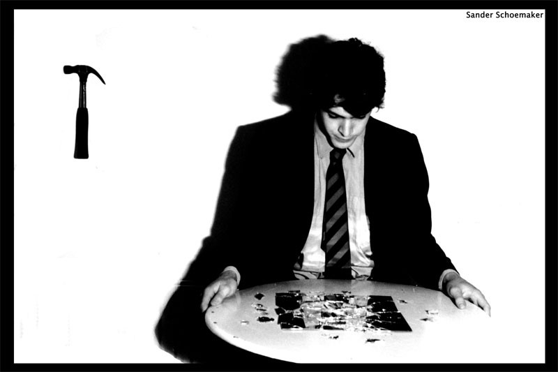
Here by the way is another picture of mine where the model looks outside of the photo, with a completely different effect.
👍: 0 ⏩: 0

I like the idea it has some potential. It should have been more sharp and perhaps a slightly changed composition.
👍: 0 ⏩: 1
What would you have changed about the composition? I have considered cropping the image so the model would fill the height a bit more, but I kind of like the room above his head, as it makes it a bit calmer. As for sharpness... I tend to think that a slight blur gives a bit of mystery to a photo. Especially when you realise that this was taken with very old equipment. A Praktica of about 30 years old.
👍: 0 ⏩: 1
I think I would move closer to the model and step slightly to the left so he would be more in center. I don't think you shold crop it.
👍: 0 ⏩: 1
Ah, I see. I do not agree with that. The picture would loose its adventurous atmosphere if the model were in the center.
👍: 0 ⏩: 1
 (Wink)")

Interesting moment ! I thing the color mood doing this picture looks so nice !
👍: 0 ⏩: 0

Nice scenery but I reckona pose of him puffing out the smoke would be cooler.
👍: 0 ⏩: 0
