HOME | DD
 TaNgeriNegreeN1986 — Leave The Frame
Published: 2008-11-26 13:55:20 +0000 UTC; Views: 2141; Favourites: 157; Downloads: 93
Redirect to original
Description
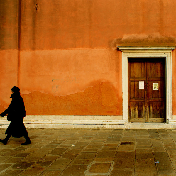
Venice, Italy.Related content


Comments: 41

italians sure has a great sense of colour for their architecture!
ah, i wanted to ask something if i may? i would like to know, why you chose the character to be at the side instead of center. is it to balance the door? thanks. am learning some storyboarding, and my senior told me that the main chara needn't always be in center to capture attention, but are sometimes placed at the side for a reason. so am trying to get the feel of knowing when to do that
👍: 0 ⏩: 1

Indeed they do, such warming colours.
Well to be perfectly honest I noticed the shot at the last minute so she didnt quite fit properly, but I think I prefer it this way, its good to draw the viewer away from the centre sometimes, and seeing as the door is off centre too I think it works
👍: 0 ⏩: 1
oh i see (Smile)")
👍: 0 ⏩: 0


")
Thank you so much
👍: 0 ⏩: 0

wonderful shot- and the figure stands out quite well against the orange bg
👍: 0 ⏩: 1

Hi! This deviation has been featured here! [link]
Remember to 
👍: 0 ⏩: 1
uber welcomez. n-n
👍: 0 ⏩: 0


Thank you....and I want to go back there!!!
👍: 0 ⏩: 0


Simple and beautiful capture 
 (Wink)")
👍: 0 ⏩: 1


A fine example of "Learn the rules of composition - so you can break them."
👍: 0 ⏩: 1
Haha thank you I think.
👍: 0 ⏩: 0


Thank you ever so much.
👍: 0 ⏩: 0

Thank you so much.
👍: 0 ⏩: 0

Unusual but very strong composition! very well done!
👍: 0 ⏩: 1


I think a wide-angle shot would've done more justice to the composition. Good use of space though.
👍: 0 ⏩: 1
Yea I agree unfortunatly though the woman was on the edge of the actualy picture anyway. Ow and also then it wouldnt be a square. Lol
Thank you for your comment.
👍: 0 ⏩: 0

Hahaha yea I know what a pain one minute she was there and the next she wasnt. A right pain.
👍: 0 ⏩: 0

Really nice picture but I would have taken the intere woman
👍: 0 ⏩: 1
Unfotunatly she was moving too fast I only noticed it at the last minute.
Thank you for your comment.
👍: 0 ⏩: 0