HOME | DD
 TatchianaMichaela — Makishima Yuusuke
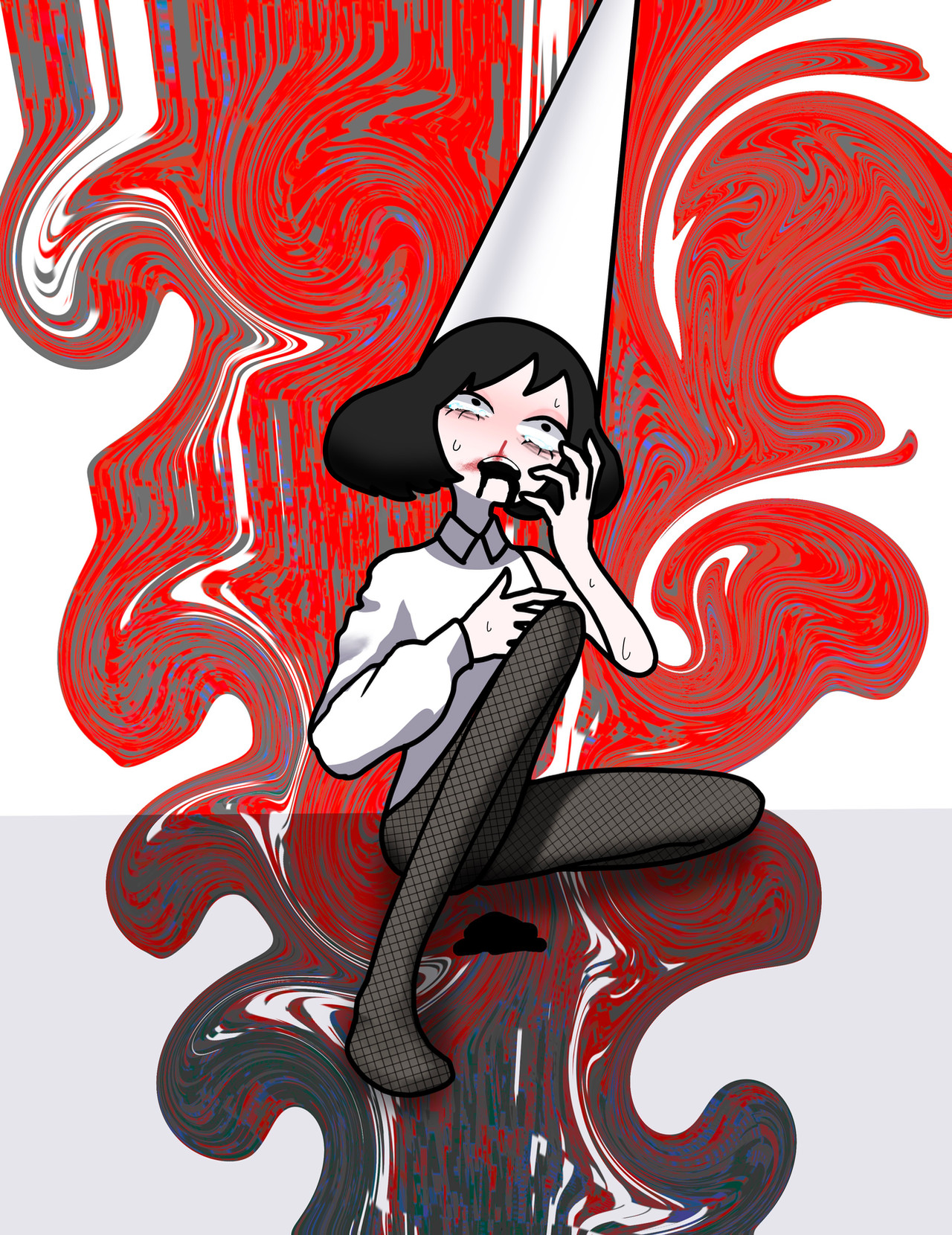
#anime #bicycle #cycling #yowamushi #makishima #yowamushipedal #makishimayuusuke
Published: 2018-08-04 20:23:48 +0000 UTC; Views: 369; Favourites: 19; Downloads: 0
Redirect to original
Description
Adding a version without the birthday text so u can see my sweet bicycle background detailing lolRelated content


Comments: 13


Hey! I'm commenting from ProjectComment . Your work caught my eye immediately among the other pieces there, which is already a good sign. Upon zooming in I was not disappointed, the shadow and light work on the hair is very effective and stands out well. It gives life to the painting with the colors being slightly brighter than on the rest of the piece. I like that the colors of the piece are rather subtle and pastel, it gives the piece a very clean look. The anatomy looks spot on. One thing that grabbed my attention were the wheels - firstly, kudos to you for having the patience to draw the wheels themselves, they're kinda tedious work. You have a good eye also, including the reflectors on the wheels. However, the tyres seem to be a little flat in color. While everything else on the painting is shaded, the tyres seem to be mostly the same shade. The way you have shaded the pedals, would have worked well with the tyres here and perhaps some texture with lowered opacity, or some lines and spots here and there to show that tyre texture.
Another thing that could use a little work is blending an object to another, I did not notice the water bottle at a first glance and my mind registered it as a sock or something of that sort. That can be simply fixed where the bottle meets the leg and the background by erasing the little bit of skin-colored outline on the bottle or replacing it with a darker shade of grey.
The background is well done and the contrast is nice as well. The small crosses seem to clash in some parts - mostly the wheels, feet, and a bit of the spring/signature area. It isn't a big issue, and it doesn't take away much from the piece.
Overall, a lovely pic! Keep at it
👍: 0 ⏩: 1

Thank you for this critique! Sorry for not replying before, but this has been very helpful  (Smile)")
👍: 0 ⏩: 1
No worries! I'm glad it helps
")
👍: 0 ⏩: 0

I love it, although some details disturb me concerning the proportions of his hands, his feet and especially his legs a bit too large for the rest of his body as his wide forearm is for the other one, but that choice of colors, the expression of his face, everything is done very well, I like the main impressing expressed in this drawing, very well done despite a few details, this remains a beautiful artwork
👍: 0 ⏩: 1
Thank you for this critique! Sorry for not replying before, but this has been very helpful
👍: 0 ⏩: 1
it's allright lol
👍: 0 ⏩: 1

I think this design in all respects very good, your technique for painting and the use of colors are excellent, I enjoy the design of the character and how you made the background, the colors are harmonic and does not seem to have anything out of place at the first sight.
I like a lot of the dynamic colors that you used in the hair and the tone of the skin that although it is not a natural tone, the way you rendered the skin gave life to it, the gloves I believe could make a certain volume but in general they are good , it's just that if I'm not mistaken it’s material is kind of thick to give the cushioning.
I like how you did the background and the way you put in the background patterns, I thought it was great and matched the color of the character and also helped to add to the atmosphere of the character, they are bright colors that set the character in an ambient and help to compose on him the idea of what his personality is, calm and amusing, maybe even a healthy and athletic lifestyle as the clothes already suggest.
My tips to improve are in the metal painting, It usually has a stronger contrast and show in the reflection some colors from the environment, since it is a highly reflective material, I also think the tires are lacking contrast and lighting, the wires of the wheel do not have any reflections at all.
I'm not sure if you made the floor where he's standing, but it would have been nice, plus of course have to add it’s shadow
👍: 0 ⏩: 1
Thank you for this critique! Sorry for not replying before, but this has been very helpful
👍: 0 ⏩: 1
you're welcome and I'm glad to have helped
👍: 0 ⏩: 0