HOME | DD
 TaviTurnip — Pony dump - March

Published: 2012-03-27 22:21:38 +0000 UTC; Views: 592; Favourites: 33; Downloads: 19
Redirect to original
Description
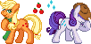
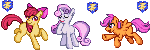
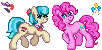
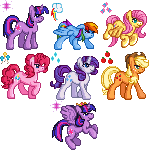
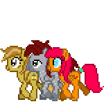
This is about the closest thing you'll ever get to an art dump from me xD Since my nature I don't have work worth dumping in the traditional sense. I've been doing this stuff on and off lately for a while, practicing different shapes, poses, pegasi... still need to give my hoof to stallions and other stuff. And other stuff xDCameo appearance by Eclipse Cadenza c:
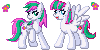
In particular, I hate how Luna came out. I thought it would be easy and she was like, no, I'm going to be hard. I need to try again later ;_; But not right away. Gots other things to do.
Related content


Comments: 7

... :|
Back when I was slightly more freeform and also when I was trying more to be exact with the show's style, where shape was much more important than shading, yes, it's easy to mimic their raw shadeless shapes. Plus I had a lot more room in this style to space them out correctly.
Don't make me go back to this style
👍: 0 ⏩: 1

I just felt like being a jerk last night, since I somehow came across this.
I understand that larger sprites allow for easier manipulation of shapes/pixels as opposed to smaller sprites, which require more precise pixel placement and shading to look as good.
And I love your icons too much to want you to start going back to this style
👍: 0 ⏩: 1
In all right honesty, this art was meant to sort of be an evolution of my old style, combining the icons' general shading/shaping laws with a more detailed size... but for one reason or another, it never really took off with me after the first sprite. As much as I appreciate my own attempt, I am really not super happy with the result, particularly mostly on Lapis's face >~> That is not an attractive face or manecut if you ask me. But I do still want to give this another try. If I can combine the old and new skills to create a larger and appealing product, I should. More learning experience too, of course :o
As for icons, I feel like I've reached the ceiling with those. They've evolved a lot since my first icons of Chatter and Eclipse, and I'm glad that people love the icons so much, but I'm not sure how much more improvement I can squeeze out of them. There's no need to fix something that's not broken, of course, but I guess that even I'm not free of the chains of always wanting to improve what I do. I feel that all my recent icons are a little "samey" in terms of general posing and structure. The dynamic isn't all that huge.
I'm sorry that I'm talking your head off :C I'm glad you like my icons so much, though. It means I'm doing it right.
👍: 0 ⏩: 0

lol I like the commentary on this. 
 (Smile)")
👍: 0 ⏩: 1
Oh, haha~ Thank you :P I've kind of stopped doing the comments on the images like that. I find I prefer it without all the text. But it was fun while it lasted.
👍: 0 ⏩: 1
")