HOME | DD
 TeamCapumon — Hello there
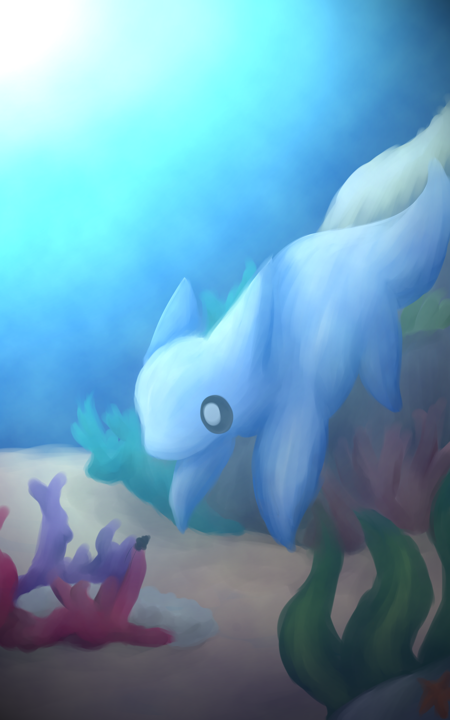
#aquatic #beta #coralreef #kurusu #seasnail #betapokemon #itsarock
Published: 2016-01-30 03:28:05 +0000 UTC; Views: 607; Favourites: 23; Downloads: 0
Redirect to original
Description
Hey look, something that isn't a meme or pixels
BUT ITS STILL LINELESS BECAUSE SCREW LINEART
Okay, does anyone remember/know the reason I have my username? Well, it all started with this guy - Kurusu. Kurusu is THE MOST ADORABLE POKEMON EVER, LIKE EVERYTHING ELSE CAN GO HOME YOU WILL NEVER BEAT KURUSU I'm so sad that its not an official Pokemon rip
On the one hand, I love Kurusu to bits, but on the other hand, I'm kinda glad it didn't make the final cut for Gen 2. I dont like Totodile all that much but I really like Cyndaquil and Chikorita. My favorite of the two changes all the time haha. But if Kurusu was added to the roster... //cries// TOO MANY CUTE THINGS AAAAAAAA-
Also, this is probably really off because I drew this from memory. I actually sketched this entirely in church, background and all (in fact, the background was about 50x more detailed in its sketch form because I took up the entire page with this drawing and I didnt know what else to do xDDD) I could've looked up a ref when I colored it but, EH.
Also that snail is kinda based on Dotty, but Dotty doesn't look anything like that (other than the color) haha
I think I'm getting better at lineless...maybe...no...? Idk haha you decide ;w;
Also this has been done for a while, but I didn't upload it until now because...idk
Kurusu is C Nintendo
Related content


Comments: 10

Overall


Vision
Originality
Technique
Impact
Okay this is awkward.. I'm gonna look like a creep cuz I commented on this like 3 weeks ago :'D.
This is really pretty and Kurusu looks so small and cute :3. Although the bluish colours look really nice, this image lacks impact in that the objects seem to blend in together. If not for the difference in colour, the plants in the back would completely blend into the water (take.ms/eiUZ7 ). And looking at the image in black and white, you can tell that Kurusu is separate from the rock, but I think you could make them stand out more for better impact. In general, the painting needs more value contrast. I can see your shading, but don't be afraid to be bold with it. Especially with such a strong light source, there should be bright highlights on the tips of the plants and the shadows cast by everything should be very dark.
I don't know if you intended the light to be that strong, as the scene is at the bottom of the sea/ocean. However, either way, I don't think you should have used 255 white in the corner at the peak of the light. I don't often use pure white in my paintings because it's quite unnatural - you will never really see that shade unless you are looking directly into a light source or at the strong glare of light reflecting off really shiny metal. Because it's such a strong shade, attention will be drawn to it and it's best used around the focal point of the image to highlight it and make it more eye-catching. Using it at the corner here will just draw the eye outside of the image, and that's not what you want e.deviantart.net/emoticons/s/s… " width="15" height="15" alt="
 (Smile)")
Also, it would add to the watery feel if you added in some bubbles :3. Also would add more movement to the image.
#itsarock :'D
That's all I have to say, I hope it helps! e.deviantart.net/emoticons/h/h… " width="15" height="13" alt="

👍: 0 ⏩: 1

I completely forgot you commented before //sHOT whoops, oh well xD
Thank you so much for the critique! I just want to mention something ironic real quick - after I had finished this, I happened to go to your page and read an article you wrote about value contrast and using B/W mode to see how much depth there is in your painting. I decided to do it with this picture and realized I should probably do that from now on, haha :'D I didn't try to touch it up, though, because I was kinda done with it at that point lol. But regardless, thank you so much!!
The plants always felt flat to me, but I was worried about messing them up so I kinda just left them 
Since my normal style is used to using oversaturated colors and pure white (since its more cartoony), I'm used to using bright white, but yeah, I definitely agree that it takes away from the rest of the painting aha. Thank you! I'll try to watch my colors from now on whenever I try something less cartoony (like this).
Ooh, bubbles...ahh that would've been such a cute addition to the piece~ Thank you for the advice! A BIG, BEAUTIFUL, ROCK
It really does, thank you so much for the advice and critique~!

👍: 0 ⏩: 1
LOL dw it doesn't matter, I just thought it'd look weird to people xD
Oh haha well I guess now it's ingrained in you extra deep xD
Ookay yeah, I guess it does depend on the style
Np, glad it was helpful <3
👍: 0 ⏩: 1
Maybe xD ahh hopefully not tho LOL
Pfft yep~! XD
Yeah, but for this kind of semi-realistic style, I should definitely stay away from stronger values like you said. My cartoony style uses black and white, but my semi-realistic style probably shouldn't xD
👍: 0 ⏩: 0

Ahh thank you so much! ^^
👍: 0 ⏩: 0

Ahhhhh this is so pretty
I love ocean backgrounds ;U;
👍: 0 ⏩: 1
Aaa thank you so much~! /w\
Tbh I love painting ocean backgrounds, idk its just been really fun in the past~
👍: 0 ⏩: 0