HOME | DD
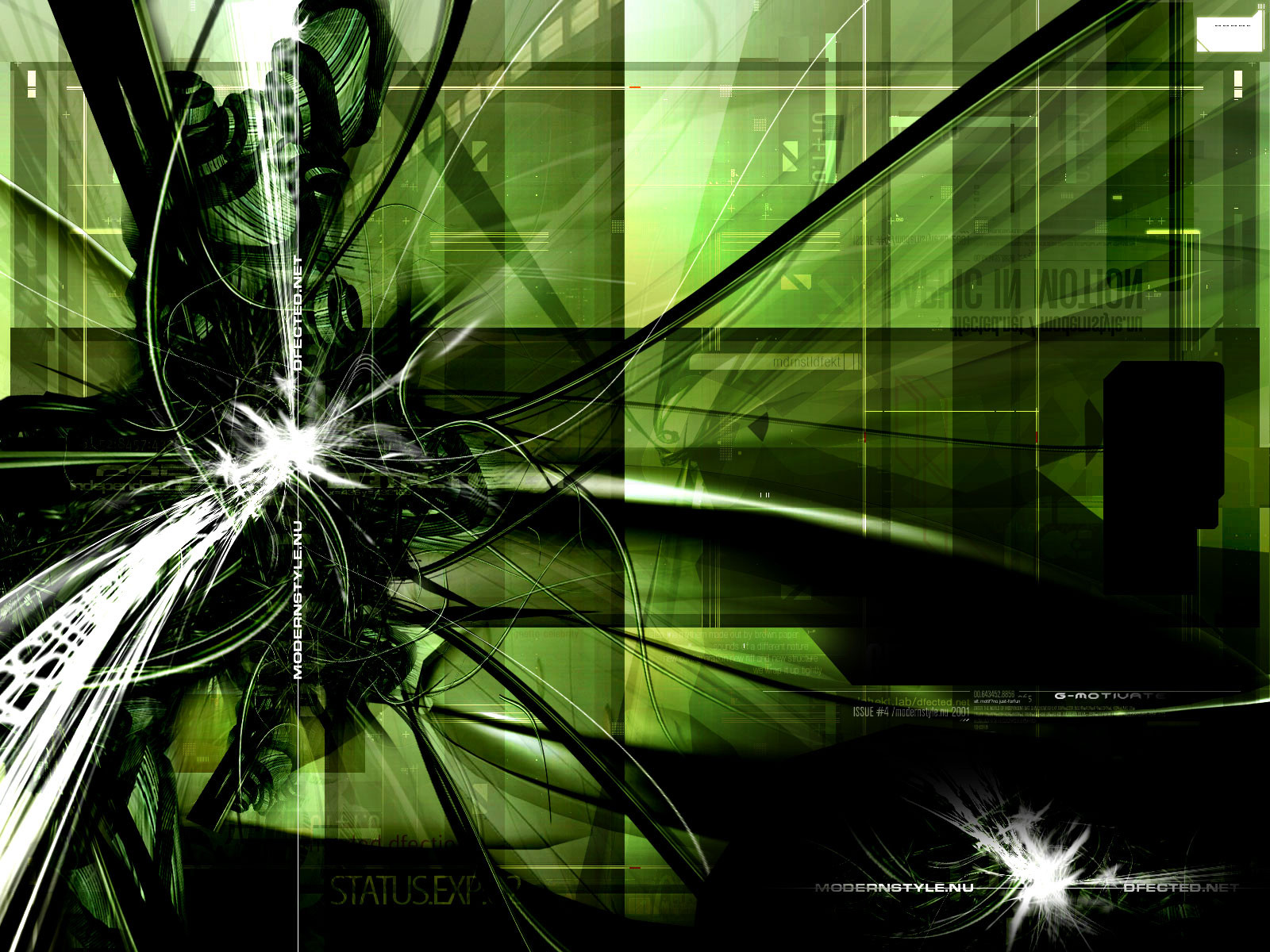
 techstudio — BioStructure

Published: 2004-07-31 00:04:23 +0000 UTC; Views: 1425; Favourites: 30; Downloads: 379
Redirect to original
Description
Collab between me and *vekinComments and favs are appreciated!! :]
Related content


Comments: 59

Espetacular!!Kmo ek fazs istu?ta spetacular...
Tem tanta coisa k ate eu m perco a olhar.
A abstracção é a melhor forma d arte,sem duvidas..
Continua o bom trabalho...
👍: 0 ⏩: 0

trendy 2d. lovely. 
btw i don't like the render here much. rest is simply amazing.
👍: 0 ⏩: 0

You wanted some critique, so I will try to help with that:
Maybe less dots and lines, and more organic-like materils would be better.
The font utilized for the title of this work is something I don't imagine to
belong to the rest of the scene.
I like the fusion, colors and forms.
It is a good work that could be better.
 (Smile)")
👍: 0 ⏩: 1

Critiques are always accepted. Thank you!
 (Wink)")
👍: 0 ⏩: 0


ae marcelo. muito loca essa imagem ai.. parabens
👍: 0 ⏩: 0

it's a bit chaotic but i really like it 

👍: 0 ⏩: 0

nice overall, it just feels too chaotic. nice 2d and render tehre
👍: 0 ⏩: 0

Very nice work - vibrant, bright, exciting - how all artwork should be, right? ")
👍: 0 ⏩: 0
")

Nice render, nice brushing and nice brushing booth of you GOOD JOB
👍: 0 ⏩: 0


poluida demais mano...num dah noção de nd e talz...mas aê...tenta colocar menas coisas e colocar uma cor apampa q fica rox !
👍: 0 ⏩: 1
Eu vo dar um uptade nela e daí eu do uma melhorada nisso ^^
👍: 0 ⏩: 0

rocksem algumas partes mas teve otras qnum curti mt mas good job
👍: 0 ⏩: 0

bem loka..
+ no curti a parte de baixo idem ao aquatk
👍: 0 ⏩: 1
")


Whoa, very nice. A lot happening here. Good work you 2
👍: 0 ⏩: 0

i think there's a bit too much contrast (the white's too white and the black's too black)-- if u kno what i mean..
other than that, it's a very nice collab
👍: 0 ⏩: 1
Yeah I know what is contrast 

👍: 0 ⏩: 1

Looks killer you guys...I like how the main focal, is on top and the lower area fades out with a little 2d. Unique.
👍: 0 ⏩: 0

nice job on details ! whole piece looks very interesting
👍: 0 ⏩: 0


kra eu curti msm a render e o trabalho nela, mas o 2d estragou véio, colocava ele na parte de baixo aê, dixou a img mto polúida mesmo, não q ele esteja ruim, mas eh pq ele cobriu d+ a render
")
👍: 0 ⏩: 1
Eu tb não tava muito certo sobre o 2d, mas resolvi deixar lá pq a maioria das pessoas gostam de imagens com 2d exagerados
👍: 0 ⏩: 1
heheh eu sei =] mas ta boa ainda pow, soh q gosto eh gosto neh
👍: 0 ⏩: 0

beautiful colros. i lvoe teh depth and the high level of detail.
great renders.
👍: 0 ⏩: 0


fico foda mais nun curti o lugar do nome
tinha que ser embaixo do lado da estrela ia fica mais rox!!
abraço vei mais vo da
👍: 0 ⏩: 1
Vlw bro! Eu tentei colocar embaixo do pentagrama o nome, mas não tinha ficado muito bom, dai eu resolvi colocar ali, bem discretinho
👍: 0 ⏩: 0


caralho velho! curti mto!!!
grande trabalho dos 2 ae!
👍: 0 ⏩: 0


wow. some amazing work there man. love those colors too.
👍: 0 ⏩: 0
| Next =>