HOME | DD
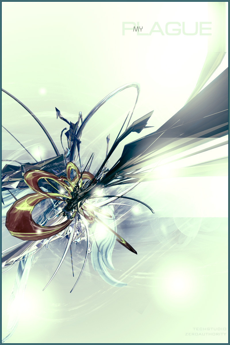
 techstudio — MYPLAGUE
Published: 2004-05-14 20:42:01 +0000 UTC; Views: 3340; Favourites: 81; Downloads: 1295
Redirect to original
Description
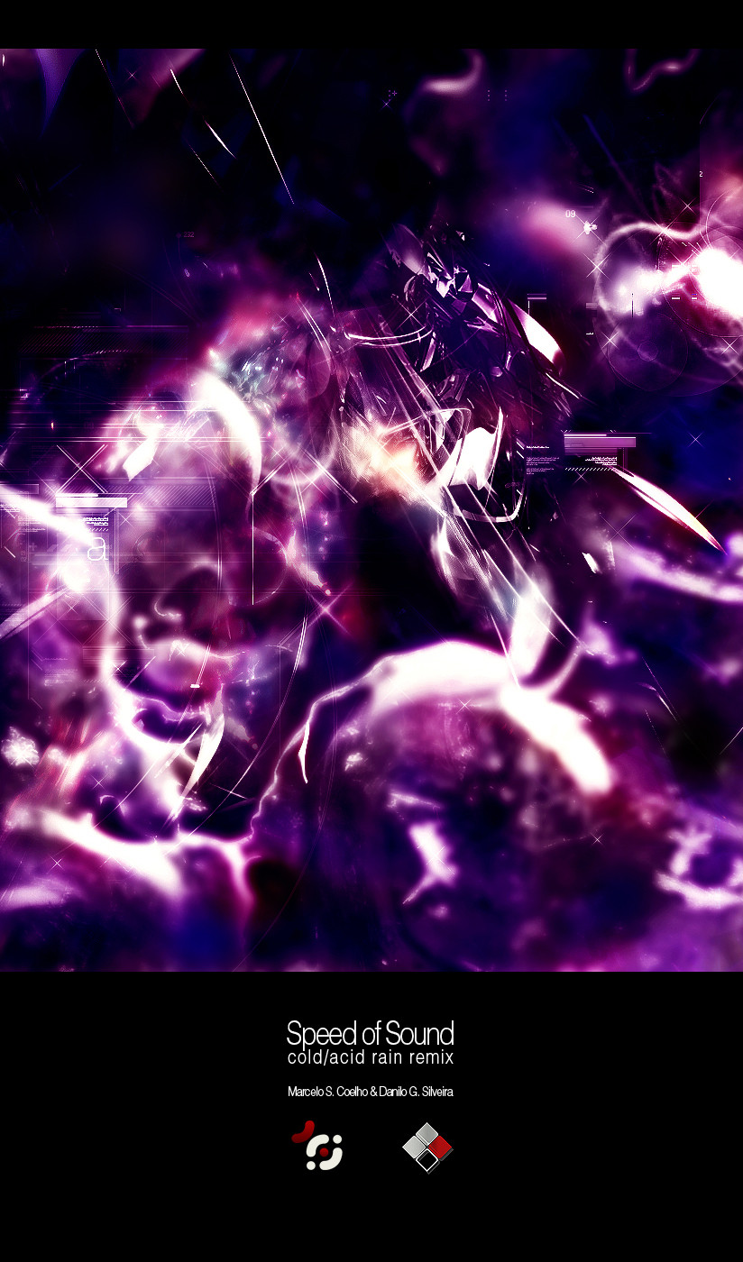
.Collab between me and *zeroauthority
Comments and favs are appreciated
Related content


Comments: 109


great job dude
i loved the render and collors
+fav
")
👍: 0 ⏩: 0

That's awesome. I like how it looks so very 3 dimentional. is this what a spaceship (the gray parts) being sucked into another dimention look like?

👍: 0 ⏩: 1

nice colors! the only thing i can critique on is the red render could be a little smoother. but this is still a great piece
👍: 0 ⏩: 0


Whoa, that's a really lovely render, Very nice color blending, looks angelic. the render is very nice, interesting shape, nice complexity and depth. well done. should add some nice 2D on there to enhance it IMO. overall it's really good.
though one thing, even the overall main color's nice, the yellow-orange-reddish on the render seems to me doesn't really look that well with the others. stands out a lot but there are yellow saturated in there makes it looks a little weird IMO. just my opinion.
really like the tentacles, and the background is nice. keep up the good work!
👍: 0 ⏩: 0

hard and sharp and scary looking. fun fun fun. excellent work creating something that is so organic looking. looks like it is still growing
👍: 0 ⏩: 0

Where are the mesh smooth? Nice, you learned a little tutorial of color balance... that's cool. No typography, just fucked renders with a Carnival of Colours indeed. Keep on moving then. You're going tooooooooooo profesional way.
-
Rating: 0
👍: 0 ⏩: 0

i like this but i have a major problem with one of the renders, it just doesnt seem to fit in properly at all,
im sorry, but that render really puts me off..
👍: 0 ⏩: 0

This is such an amazing combonation of colors. 
👍: 0 ⏩: 0


Excellent render guys, named after one of my favorite songs too, even the background has the good smoothening colors, I like it, fav!
👍: 0 ⏩: 1

is one of my favorite songs too
slipknot rocks!
👍: 0 ⏩: 0

this is crazy.
yep, indeed, crazy.
would my faving it be appreciate it?
👍: 0 ⏩: 0


Intense coloring.
The bright gives character to the overall feel.
👍: 0 ⏩: 1

Nice overall work/collab  (Smile)")

👍: 0 ⏩: 1
some other people doesn't liked the title too.. can u say me what's the problem with this?
👍: 0 ⏩: 1
Problem number 1: is HUGE
Problem number 2: the location inside the image is :thumbsdown_
Problem 3: could use another font to add more professional look and feel_
Problem 4: meybe the colors used in there_
_______________________Just general info and personal suggestions from me, (doesnt mean Im right) but I really hope I could help
")

👍: 0 ⏩: 0

fucking AWESOME renders m8, i cant belive that this only has 11 favs, it deservers much much more, great work u guys, its fucking awsome, the colors are fabulous too!!..
👍: 0 ⏩: 0


My plague = slipknot rula ! ^^heheh
ficou bem dahora mano...mas concordo com o q o magna disse !
👍: 0 ⏩: 0


The render kicks serious ass. Great job you two. Could use a little more 2D.
 (Wink)")
👍: 0 ⏩: 0

Awsome dude - you really made that render come to life, great job!
👍: 0 ⏩: 0

tem ums render rox, umas sux umas com cor rox umas com cor sux eh foda de comentar ma em geral ta rox a lot
👍: 0 ⏩: 0


looks like something u would experience in a fantasy...pretty nice..looks great..weird colors but they add to the entire look..good job
👍: 0 ⏩: 0


This is very cool.. Like the lighting and colors alot. Nice job.
👍: 0 ⏩: 0


acho q deveria ser mais escura pois a render aparece d+!! falta um poko de brushing tbm!
flww cara!
👍: 0 ⏩: 0


sweet render wow, colors r awesome as well, brushing maybe a bit to bright, but overal kicks ass
👍: 0 ⏩: 0

| Next =>