HOME | DD
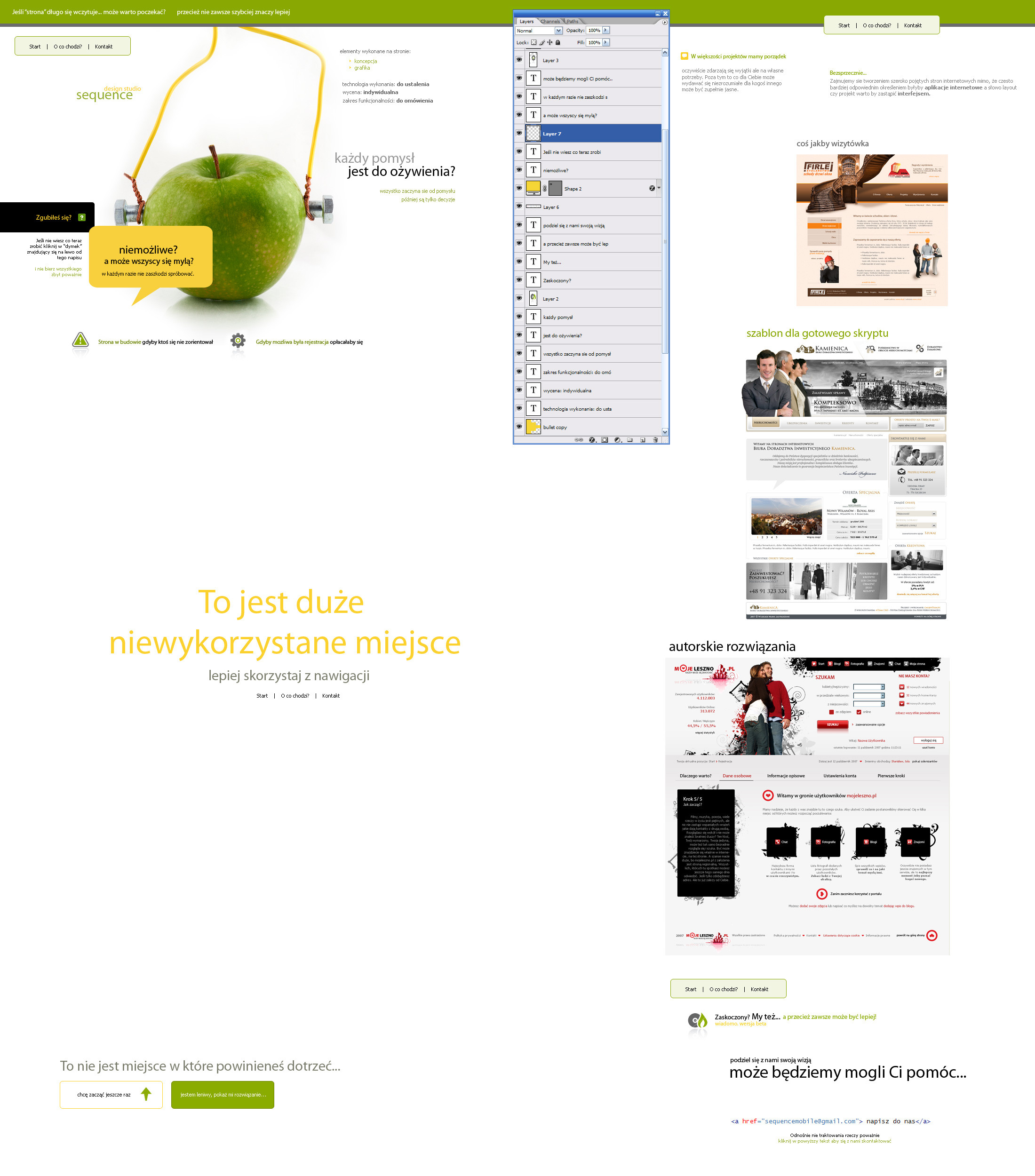
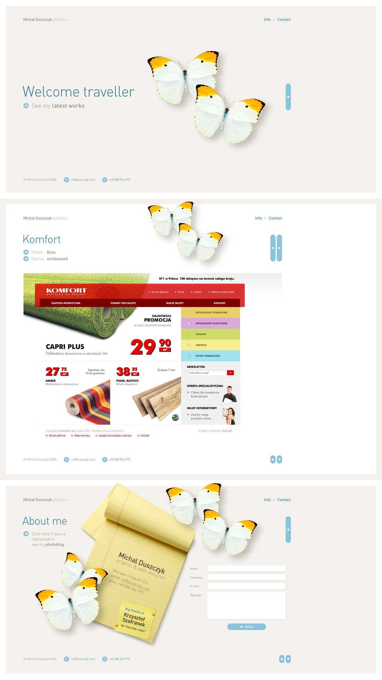
 tehacesequence — website layout 66
by-nc-nd
tehacesequence — website layout 66
by-nc-nd
Published: 2008-01-21 01:05:39 +0000 UTC; Views: 4498; Favourites: 23; Downloads: 0
Redirect to original
Related content


Comments: 22

 (Smile)")

")

rozwalił mnie ten text na paseczku u góry ")
Faktycznie obcokrajowcy nie zczają za cholere ocb tutaj, ale to ich strata 
👍: 0 ⏩: 0


The idea is quite good but as some said, it maybe hard to understand. But I do love the clean look and the colours as well, however there's one thing horrifying me: the code uses TABLES!!! (the worst thing to use in a design).
One last thing: have you tested it in various screen resolutions? On my 1152*864, it's not that bad however it is really confusing on my 1680*1050 since it shows two (and more) pages at the same time.
Hope that helps
 (Wink)")
👍: 0 ⏩: 1

sometimes I'm sick of browsing same kind of pages... I know that they should be build that way and know why I also know that this concept isn't something great it's just different and that's exactly as I want it to be.
yes I've used tables
👍: 0 ⏩: 1
Well... they shouldn't neccessary be built the "standard" usual way, being different is far from being a bad thing. It is great. Maybe you should just hide the overflow (overflow:hidden; on the body) so people doesn't start to scroll on another page without clicking a link reffering to it. That's one possibility, but there are others for sure....
There's not any technical problem on my 1680, it's just confusing to see those multiple pages at the same time.
Anyway, I'm somehow used to complicated situations because I sometimes have great ideas, but it's not always easy to achieve them...
So I hope this will complete what I said a help you a lil' bit more
👍: 0 ⏩: 0


nie bede sie tlumaczyl z okolicznosci zajscia
👍: 0 ⏩: 0

troche sie zakrecilem ;]
👍: 0 ⏩: 0

dzieki i nawet dziala ;] [link]
pozdrawiam
👍: 0 ⏩: 0


lol man i fav this is too weird and Alien style!!! cool but i think its too complecated for the normal people.... The thing i like is the color nice structure.... and a cool thing with the Photoshop Layer Window!
👍: 0 ⏩: 1
👍: 0 ⏩: 0

since you selected advanced critique....
i realize youre trying to do something unique with the side scrolling and anchors but it really is too unorthodox and IMO unprofessional. I see youre other designs and they say a lot more to me than this does.
take it as you may
👍: 0 ⏩: 1
Actually I've tried to do something funny ;] maybe if I translate it you'll change your opinion as I think more on the text than the design...
👍: 0 ⏩: 1

Make an english version, cuz as it is now, I don't really understand it...
👍: 0 ⏩: 0