HOME | DD
 temiel — ATC: Nostra Mater Invicta
Published: 2010-05-03 04:52:56 +0000 UTC; Views: 2083; Favourites: 41; Downloads: 23
Redirect to original
Description
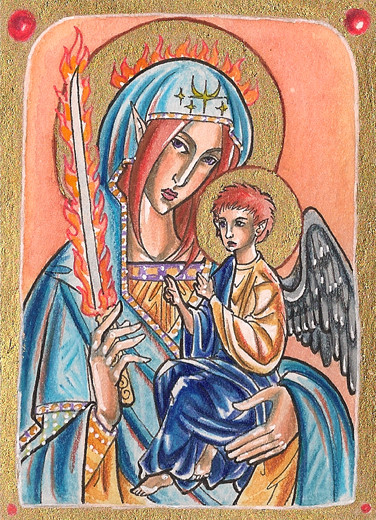
Grand Admiral Lady Trean Maeglan, called the Red Sword or the Imperatrix Invicta, once and future champion of the Terran Empire. Avowed enemy to the illithid menace; protectress, conqueror, legendary hero.I've had this image kicking around in my head for a long time, like a "saint" version of Trean carrying baby Farael, and I've done one or two pencil drawings of it, but I never thought to actually do it in color on something as small as an ATC, which is weird because I should INSTANTLY have thought of Russian icons, but I didn't. When I put up this week's challenge for #ATC-Exchange ("divine"), I had a totally different idea in mind for what to do, but a conversation with =LadyGhostDuchess reminded me of this, and I knew I HAD to do it, just so I could have a real-life version of this thing. The scan... the scan doesn't really do it justice, because in real life, this looks VERY COOL. The halos and borders were done with super old and clumpy gold ink, which of course doesn't scan well.
3.5"x2.5". Micron, watercolor, Prisma pencil, gold ink, white gel pen on bristol.
Yes, her fingers are weirdly jointed. Yes, Farael doesn't look like a proper baby. Yes, the anatomy and folds are abstracted. I was inspired by Russian orthodox icons, which have a very characteristic style that I TRIED to emulate... not sure how successful I was, but it was super fun anyway.
Related content


Comments: 60


Sorta-kinda. It's not exactly intended to be Mary and Jesus per se, but I did take a lot of inspiration from pictures of them. Icon art is just so fantastic.

👍: 0 ⏩: 0

This picture is very interesting.At first,i honestly thought it was the picture of an actual saint,which i wasn't quite expecting to see from you (i don't mean this in any insulting way other than that i just hadn't seen something like this in your gallery before).Then i realised they were your own characters and it just made it more interesting.Because the idea is simply brilliant.Very fitting and convincing enough for me to be fooled.I believe the style you went for is very well executed too.
So i find that this is a quite intriguing and great picture in every way,from the idea to the execusion.
👍: 0 ⏩: 1
Oh wow, thank you so much! That was a GREAT comment to read. :3 I had absolutely no idea how anyone would react to this one, since it's INCREDIBLY different for me. I'm really glad you like the idea! Let me just say, this looks REALLY NEAT in real life, because it's, like... actual-icon-size. I have it in a frame right now that's not really flattering it, but I hope I can find a new one soon. I wanna show this puppy off!
👍: 0 ⏩: 1
Haha,well you're most welcome!I found this so interesting because it was exactly something very different from what i usually see from you.Which is a good thing in its own account (i mean apart from the picture looking great already) as it shows you can take different things and make them your own.
👍: 0 ⏩: 0

Aff, thanks. 
👍: 0 ⏩: 0

Thank you! I'm so glad you think so. I'm hoping to frame it in something nice. :3
👍: 0 ⏩: 1

AMAZING concept! (And execution, of course! xD) 

👍: 0 ⏩: 1
Abrrrrrbrrrr, thank youuuuu. 
")
Now what I REALLY need to find is a frame that'll show it all the way to the edges.

👍: 0 ⏩: 0


Aff, thanks.
👍: 0 ⏩: 0

I love this one!!! *_* my best appreciations for this card!!!
👍: 0 ⏩: 1
Yay, thank you so much!! 
👍: 0 ⏩: 1

Fsss, this looks AMAZING. Considering hw terrible my own gold scanned, I think this looks really good! It must look intense irl. i love Trean's face and how honest you were to the style, an n'aaw, tiny Farael. That flame sword looks totally awesome as well.
👍: 0 ⏩: 1
ANNNGH thank youuuuu. DDD: I spent SO LONG on this last night. Taking into consideration how your gold scanned, yeah, this doesn't look TOO bad, but it's weirdly uneven, you know? Like, it seems like it picked up the metallic on one section of the card but not the other? Fff, I don't know. My scanner is stupid. ")

👍: 0 ⏩: 0

I really love the way you did this. You captured that old Medieval Madonna and christ child look. I mean, you captured it SO much so that i did a double take when i looked at my inbox. I love Faraels look, the gestures of peace and whatnot really just nails the authenticity for me.
Love the byzantine sort of gold look you've got going with this. Just
👍: 0 ⏩: 1
Thank you so much!
When I realized that I could do this for this week's ATC theme and that I even had the gold ink I wanted on hand, I was PSYCHED. I couldn't leave the gold out, it's totally one of the best parts of religious art, the random spots of gold around.
👍: 0 ⏩: 0
Thank you!
👍: 0 ⏩: 1

Yes, and I believe u've done the job wonderfully.
👍: 0 ⏩: 0

That's much much better than orthodox icons 
Farael is so cuuuute!
👍: 0 ⏩: 1

👍: 0 ⏩: 0

Gold ink... why aren't things like that available around here??
This looks really gorgeous
Great job!
👍: 0 ⏩: 1
Really?! You don't have it? It's just Winsor-Newton gold ink in the little glass bottle... You could probably order it here. [link] It is AWESOME.
I'm really glad you like this!
👍: 0 ⏩: 1
I heard of Winsor-Newton but I think most art suppliers just sell Pelikan, Rotring or Faber Castell around here... but maybe I'll get to Berlin again and the art stores there might have gold ink... I just never looked for it and maybe I just never found it XD
👍: 0 ⏩: 0

Thank you!
👍: 0 ⏩: 0

Pwahahahah, this is so funny X°°D
Btw, the work is wonderful
👍: 0 ⏩: 1
I'm glad you like it, thanks!
👍: 0 ⏩: 0

Wow, this is really lovely
👍: 0 ⏩: 1
Aff, it totally was. ")

👍: 0 ⏩: 0

As far as I'm concerned any weird joints and anatomical inaccuracies don't matter in a picture like this when pne is emulating a style like this, which was hardly 100% realistic. It looks very mural or stained glass window indeed.
👍: 0 ⏩: 1
I figured, just thought it was best to cover my bases with a disclaimer.  (Wink)")
👍: 0 ⏩: 0

Wow, for a moment, by seeing the preview, I thought it was a REAL byzantine-orthodox holy icon
Really interesting interpretation, Trean REALLY looks like the Holy Mary
👍: 0 ⏩: 1
LOL!
Trean does look far more Mary-ish than I intended, alas. I thought at the time that I was giving her a different-enough-colored robe, but I really didn't.
👍: 0 ⏩: 0

I really like how this came out, but although I'm not a very religious person, this one feels a bit odd for me.  (Smile)")
👍: 0 ⏩: 1
I was wondering if it might hit any nerves. I hoped it wouldn't, but you can't please everyone, alas. 
👍: 0 ⏩: 1
Oh, of course it is ... maybe it's my experience in different religious styles that makes me feel odd
👍: 0 ⏩: 0

When I saw this from the thumbnail the first thing that went through my head is "how the hell did I remind her to do something so amazing? something like this!" but then I remembered our conversation
I think this turned out really really wickedly cool! And I like the fact that he doesn't look like a baby because if you see all the religious inspired artwork 99.9% of the time baby Jesus looks like a very small full grown man
With the thickness of the golden paint and the color choices you used I can really see this as being a "divine" picture, it looks like something that you would have seen on a bible from Renaissance time and the re-birth of religion.
My word I am using religion a lot in this *swats it away*
I really love the colors that you chose, they seem so bold and brilliant! And I LOVE the gold paint
I really love this, over all I think it is breath taking and I am so happy I helped you to remember to do this piece because it was an amazing piece to be brought to our eyes!
Love it!

👍: 0 ⏩: 1


I'm REALLY glad you like how it turned out. This one... normally the ATCs I make I love to have around but I often offer them for sale, but this one I'm keeping all to myself so I can frame it. I'm SUPER proud of it, and it took a long time and was really painstaking toward the end when I was messing with that gold ink which is so old it wouldn't flow properly. By the end my hand was cramping up like a mofo.
I definitely figured it was okay for Farael to look like a mini adult for exactly that reason. Normally I WOULD make him more baby-ish, but the style really demanded something weirder.
At first I was planning to make this entirely in watercolor with the gold ink and the lines, but I just couldn't swing that because watercolors, unless you lay them down ULTRA thick which makes it pick up the paper's texture too much, just don't get really dark. After enough working the paper can't absorb any more water, so it just stays a certain darkness, so I really needed to bring in my good old friend the colored pencils to push the darks more. It looked okay before, but once I started delineating the really dark values it looked SO much better. Also, through this experiment I managed to find out that gel pen does indeed work on top of the wax. Just don't go over the gel line more than once, because it'll start carving a groove down the center of the line.
👍: 0 ⏩: 1
YAY! Okay note to self, do not buy a gel pen, white out pen it is!
I am glad that experiment really opened up the answer to another question you and I were talking about.
I am glad you are not selling it, that you are keeping it for yourself
👍: 0 ⏩: 1
Oh, that's totally the plan! If I can find a small enough frame that's also decorative, I want to hang it in that. Our Lady of Perpetual Ass-Whomping can hang over our gaming table, ensuring critical hits and favorable dice rolls.
👍: 0 ⏩: 1

👍: 0 ⏩: 0

Trean certainly like a jack of all trades, isnt she? She's just awesome at everything!But how is she at SCABBLE?!
Actually, I'm very fond of emmulating old-tiney styles. Russian gothic icons are AWESOME and you were entirly successul. I know exactly what you were trying to do even when I saw it in the thumbnail in my inbox.I love that old-time tapestry style as well, harkening to The Unicorn Tapestries.
👍: 0 ⏩: 1
HAHA, she's probably NOT that good at Scrabble. Her specialties lie almost exclusively in the ass-kicking field. She CERTAINLY has no patience for puzzles, games, "creative" pursuits, or anything of the like; after all, she's got places to go and monsters to kill ALL THE TIME.
I love old-timey tapestries too!
👍: 0 ⏩: 0
| Next =>