HOME | DD
 Temiree — Nestle Redesign (Colors)

Published: 2014-03-25 03:55:29 +0000 UTC; Views: 5871; Favourites: 138; Downloads: 0
Redirect to original
Description
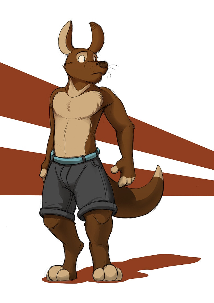
Nestle’s coloring and fur pattern design are done! While I’m sure he’ll evolve over time like my other characters have, I have to say I really like where he is right now. I’m going to say this redesign has been a success.
One thing I still need to work on though is studying kangaroos more, primarily their facial structure. I feel Nestle could look a lot more like a kangaroo, but I’m sure that will come along with more time and more practice.
Related content
Comments: 16

👍: 0 ⏩: 0

I really like this version of Nestle, he looks so bulky compared to his newer versions. He has a lot stubbier toes and hands which I think is cute fitting with the bigger legs as well, love it
👍: 0 ⏩: 0

(this is not at all meant in any rude way, I just want to give you some pointers. In the description you said you wanted to further study the kangaroo's anatomy, and I want to help with suggestions)
For the facial structure, the nose is just small and somewhat pointed, but this honestly looks just fine to me. You should focus on the legs, though; kangaroos are plantigrade like people, not ditigrade like a dog- that will make a huge difference. Also you should really downplay the lower leg; kangaroos have muscular thighs but their lower legs are almost nothing but bone.
I really hope this helped, and that no one takes this in an offensive way at all.
👍: 0 ⏩: 1

It's not rude at all! My digitigrade legs not being very good is something I've heard before a couple of times. It's definitely something I need to work on more with life/anatomy studies. 

👍: 0 ⏩: 1

You're welcome! Keep being awesome!
👍: 0 ⏩: 0

Heh, heh... cute! He looks great in colour - and I love that chocolate-coloured fur... suits a guy called Nestle!
👍: 0 ⏩: 1

Ooh, *awesome*! 

👍: 0 ⏩: 1

Maybe! I've thought about changing his name to Nestlee for the sake of it not matching the food company, but for now I'm sticking with Nestle. It could be neat though to have two e's on the end, since it'd match the name Temiree.
👍: 0 ⏩: 1

Heh heh, hey, maybe that could be a thing for your OCs, having names that end with 'ee'.
👍: 0 ⏩: 0

I like his ears, so cute. I should draw a kangaroo I never have lol.
👍: 0 ⏩: 1

The reason I redesigned him was because I was surprised I wasn't drawing kangaroos more too - they're my second favorite species behind otters. I'm glad I did, so you should try drawing a kangaroo too.
👍: 0 ⏩: 0


