HOME | DD
 Tentopet — Tutorial--Colorizing Pencil

Published: 2010-08-14 22:29:09 +0000 UTC; Views: 11130; Favourites: 218; Downloads: 156
Redirect to original
Description
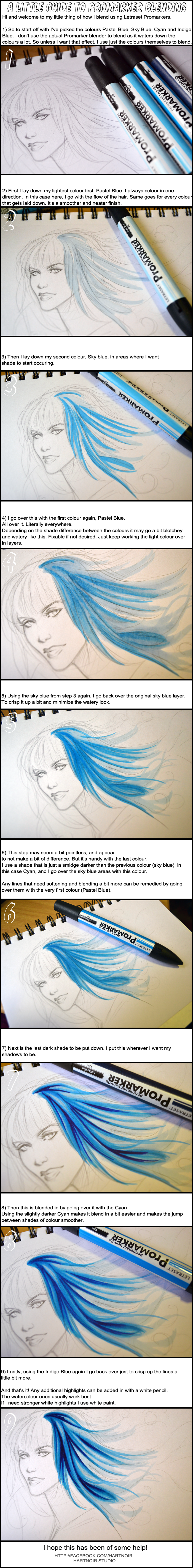
Here's my tutorial on how to color your pencil-shaded drawings in Photoshop.I used my Batwoman 0 cover as the example--check it out here: [link]
Try it out!
Related content


Comments: 41

Thank you for the tutorial, hope it works out when I try it on Photoshop Cc. And I do love you're comic Fools Gold, I have the first manga here with me and its signed by you. lol Have a good day! ")
👍: 0 ⏩: 0

Kool I'll try this technique on my back grounds
👍: 0 ⏩: 0

Very Useful Tutorial , I am going to try this put on my current work in progress [ thanks
👍: 0 ⏩: 0

A great tutorial. One never knows what to do with the blending modes ")
👍: 0 ⏩: 0

never used the layers that way, humm. should be fun to try it out.
👍: 0 ⏩: 0

I'm one of those people that always did the "multiply" thing, but this sounds much better  (Smile)")
Thank you for posting!!
👍: 0 ⏩: 0

It's really cool of you to let us in on your process.
👍: 0 ⏩: 0

after reading the comments, I get it, thanks so much!
👍: 0 ⏩: 0

Very elaborated yet simple work. Thanks for sharing it.
👍: 0 ⏩: 0


Oh, my. This is great! I've never thought of doing that with pencil layers. :] And the end result looks beautiful and textured... almost like copics. <333 Great tutorial.
👍: 0 ⏩: 0

nyoho? I feel the need to play with layers a bit....
Thanks, hon.
See you in October!
👍: 0 ⏩: 0


Ahh, I was a little confused at first too, mostly because I'm still new at Photoshop/digital art in general. XD But after reading through your explanation in the comments, I think I do understand it more now, and the whole process is pretty amazing (and a lot of work, but that's just me being lazy, ahem)!
Anyway, thank you so much for this tutorial! 8DD I've always been looking for a way to make pencil-shaded drawings brighter, and this was exactly it. Wonderful work, and thanks again for sharing it with us~
👍: 0 ⏩: 0

Awesome and very interesting tutorial. Thanks for sharing!
👍: 0 ⏩: 0

Nice tutorial. I would not have thought to shade the pencils that way.
The final art looks great.
👍: 0 ⏩: 0

Love this cover, by the way! People, don't be confused! You have three layers: the original > the layer in the middle set to "multiply" (follow the arrows on the left) > the layer on top set to "color" (follow the arrows on the right). Thanks for the tut, Amy!
👍: 0 ⏩: 1

The layer in the middle is the one set to "color"! But thank you!
👍: 0 ⏩: 1

Wait, so you actually mix both of those together and somehow end up with red hair still? Is that just how the color blending layer works? *is quite confused*
👍: 0 ⏩: 1
Yes, and this is how color works when people paint with oils or whatever...I learned it using copics, that certain colors produce a deeper, darker shade without actually using dark colors that have black in them. I have youtube tutorials on how I do it with copics; my ID is amyreederhadley.
I almost never pick a shading color in the same hue as the original color. For skin, I slide it slightly closer to red, and up the saturation. Don't just pick a color that's "darker".
👍: 0 ⏩: 1
That's always been my problem...I kind of know where to start, but without a model I'm lost at finding anything at a decent shade!
👍: 0 ⏩: 0

Awesome! I always coloured using the greyscale underlayer and was wondering what easier ways there are to make it look more...well, colourful.
Thanks for sharing. :>
👍: 0 ⏩: 0

Cool. Thanks for posting it. I'm going to have to try this out with inkwash too.
👍: 0 ⏩: 0
Trouble is, I don't know what's confusing you! So now I'm confused too!
I dunno, basically, a lot of people will color things from grayscale, like pencil shading, inkwashes, markers...and sometime all they do is color over it with a typical color layer, set to "multiply". But the trouble is, it looks really gray and desaturated this way. Basically, the darker something is, the less saturation and more gray is has, so it's not a deep color.
But there's a layer setting called "Color" that takes whatever's underneath it and gives it that hue, only the values (dark/light) stay the same. So it can colorize the gray. You can turn it all of the gray into a particular color, like blue, or brown. But really, certain shading colors complement the main color more. Like with her red hair...using blue to shade makes the darker areas deeper and richer than with other colors.
So in sum, I end up with three layers: the b/w drawing, which stays unchanged at the bottom, the color layer, set to multiply, which stays at the top, and in the middle, there's that layer that colorizes the gray. You put it all together...and it looks good.
👍: 0 ⏩: 2

I guess what is confusing me is the flow on how you did the tutorial. I mean this helps a lot, if I could understand it. I mean, I love But he seems to pre-shade his work.. so I'd love to learn how to colour it like they do in the comics.
but.. maybe you could re-do this tutorial? I'm not demanding it.. but maybe look at other tutorials, and how they flow
But all 'n' all, I will take into consideration what you said and add it to my skill list
👍: 0 ⏩: 2
This isn't a "how to color in general" tutorial--I could write a book on that, and there are already books on that! This is just explaining a layering trick to people who are well-versed in Photoshop and want to mix it up. Can't do more; I honestly didn't even have time to do this in the first place.
Thank you, though.
👍: 0 ⏩: 1

man, what??? this tutorial makes perfect sense while I can barely understand your sentences!! maybe read more carefully @_@!
👍: 0 ⏩: 1
whatever dude, go to your corner.
👍: 0 ⏩: 0

Wow, this tutorial is perfect. Thank you so much!
👍: 0 ⏩: 0

Us . . . it confuses us.
👍: 0 ⏩: 1
But seriously, I can't follow this tutorial, maybe I'm just an idiot.
👍: 0 ⏩: 1
I can't comment on your level of intelligence, but this is confusing to me as well. Seriously.
👍: 0 ⏩: 0

What a very interesting progression I've noticed from your work done on your fools gold series to the work your doing now. Im wondering though, since your working for a major production company, are you required to change the manner in which you approach your work in order to make it more "marketable" to they type of clientele that DC comics is generally aimed at. You figures, especially in the facial expressions or so much more mature in appearance than your first work. It something I even noticed while looking at different issues of "Madame Xanadu". The main character seems to change as the book progresses. Very interesting.
👍: 0 ⏩: 2
Also, Madame Xanadu is supposed to age throughout.
👍: 0 ⏩: 1
Very true!!! Although she's immortal...so lucky...
👍: 0 ⏩: 0
People ask me this a lot. No one's really asked me to change my style (though to me it's still very much in keeping with my philosophy).
It's a combination of many things...one is that I've gotten more detailed as I've gained knowledge about little nuances. Before, if I went detailed, it would get too creepy looking. I certainly tried and you can find that in the older sections of my gallery!
Another thing is just the story content and audience; I have to find the best way to communicate to whoever's going to read it. It's like when you talk to people and change up your speech to what reaches them and makes them feel comfortable.
Also, when you collaborate with an inker and colorist, and when you work with a writer, and work in color instead of black-and-white, you find that certain things just work better in the final product if you approach it in a certain way.
So this cover is very different from my interiors or covers where I collaborate, or on characters who are less...serious or understated.
I'm still not sure what my style is, even my preferred rendering style. Still trying new things.
👍: 0 ⏩: 1
I certainly love the progression that the work has taken compared from the first published items to the most recent. There is a huge fluidity in the movement in the work and the manner in which you execute the images which seems very natural and not nuanced at all. Your older work has a very high fashion influence which I could definitely see being printed in some kind of periodical like "Vogue" or "Vanity fair". I also really enjoy the emotive aspects of the work your doing now, that at the same time is keep within the genre of what I suppose would be classified as "fashion Illustration" while adding exciting narratives.
I imagine that It can be difficult trying to bring the ideas and abilities of various different people together while still trying to retain the same element of your work since you have to make sure that it is translating the ideas while still being workable and practical.
I love your work and I find it to be a breath of fresh air because you are able to tell a rich story while still retaining characters that have a class and elegance to them without having to over sexualize them, which I feel is something that the comic book industry tends to do a bit often "something I have always attempted in my own work."
You are awesome and I cant wait to see what you have in store next, you are definitely someone I will be looking at for a long time.
Hans
👍: 0 ⏩: 0
