HOME | DD
 test-0 — Konata+Patricia Merge Colored

Published: 2008-08-14 06:07:48 +0000 UTC; Views: 3251; Favourites: 32; Downloads: 183
Redirect to original
Description
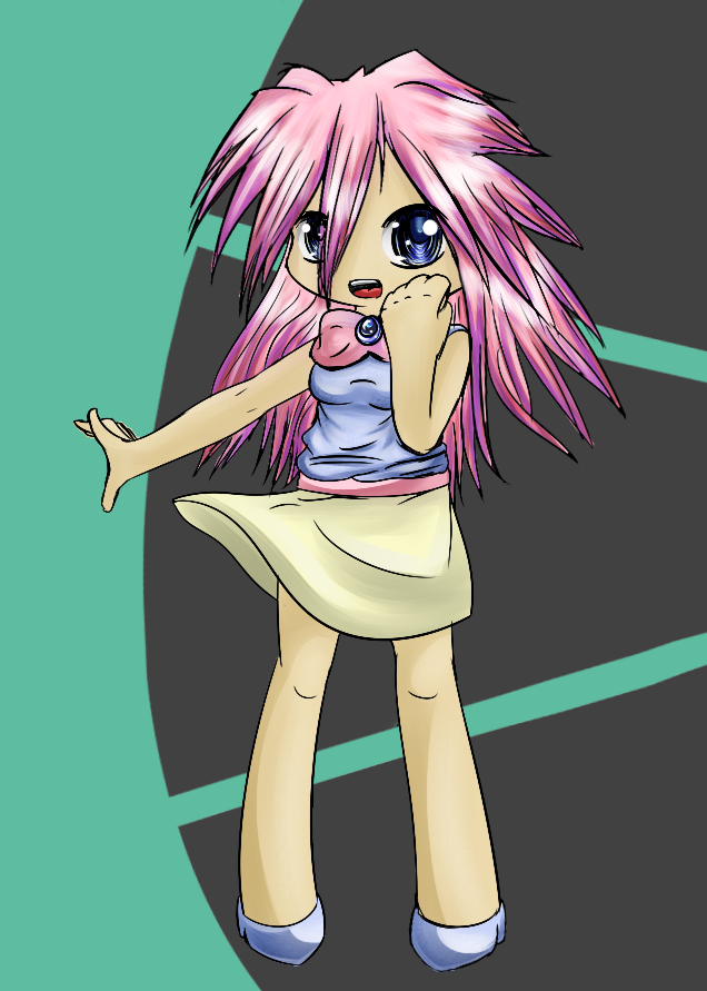
Colored it looks both good and bad.
[edit] Don't know if you saw the other version, but heres a diffrent version, more hair highlights and the two hair colors blend from one to the other much better. Also the eyes are no longer as creepy as they were before, though the end result makes her look a bit sad instead of surprised.
[/edit]
Related content


Comments: 16


And she still manages to keep her konata self. Shiny colors are a plus, and the fact that you kept each of their 'special' characteristics makes this another successful merge.
👍: 0 ⏩: 1

Yeah, this one's more of a take the best of both worlds then the complete merge that the other one was. Both types have their merits, but I kinda lean toward this one more.
 (Smile)")
👍: 0 ⏩: 0

This is whimsically fun. I like how you feathered the blue into the rest of her hair.
👍: 0 ⏩: 1
That was actually absent in the original colored version, which I added in after I had posted it as well as the eyes not looking so horribly creepy.
👍: 0 ⏩: 0

Nice Job, Test-0.
It might take some time for that girl to get used to the changes.
👍: 0 ⏩: 1
Especially since they're both still in there.
👍: 0 ⏩: 0

This 1's pretty detailed 2! I hope you keep drawing like this! Its really good!
")
👍: 0 ⏩: 1
I'll likely draw like this again, but don't expect a full conversion to higher quality, or even a partial one. Just isn't worth it. I decided to test the waters with these, like I'll do again later, but all signs point to "Meh."
👍: 0 ⏩: 0

The blending looks better now. And I imagine she would be sad if she was merging with someone else

👍: 0 ⏩: 0
It doesnt look so bad. Maybe if some of the merging colors had mroe of a gradient sort to thing happening than just a sudden change . .
...creepy alien eyes...
👍: 0 ⏩: 1
Problem is using gradients in a colored sketch which uses almost nothing but flat color looks bad. I might try and make the hair blend better tomorrow, same time I color the second merge sketch though.
👍: 0 ⏩: 1

Wow, huh, does look better with color, easier to tell the merge and such.
Good work! XD.
There just isn't enough Lucky Star TF out there!
👍: 0 ⏩: 1