HOME | DD
 TexZak — A Few Changes

Published: 2010-05-17 05:15:57 +0000 UTC; Views: 1121; Favourites: 39; Downloads: 86
Redirect to original
Description
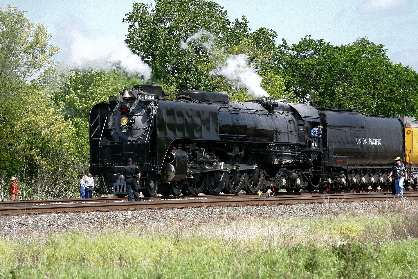
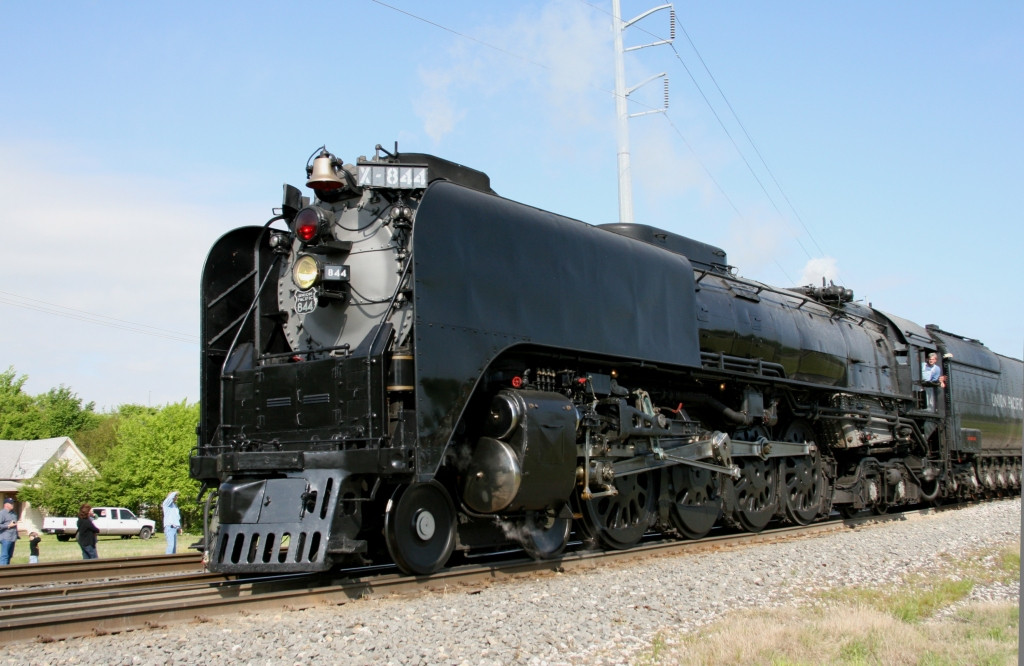
So I decided to fiddle with the colors of [link] to see if I could make it any better. Please, tell me what you think! Please suggest ways to make it better! I'm all ears.Related content


Comments: 7


Off ya go, young gal!
(I'm speaking to 844 as she passes by. Sadly either my brother or I've seen her running in life.....)
👍: 0 ⏩: 0

")

This is a lot better,Like Z said it was too grey, I know its a big job but I'd remove the telegraph pole and wires.
👍: 0 ⏩: 1

I would, but that is a skill I don't quite have yet. Thanks for your input, fellas!
👍: 0 ⏩: 0

Definitely an improvement, the other seems a little too grey to me. I don’t see anything obvious that needs changing about this version.
👍: 0 ⏩: 0