HOME | DD
 Th3FalleN — Fallen Angel
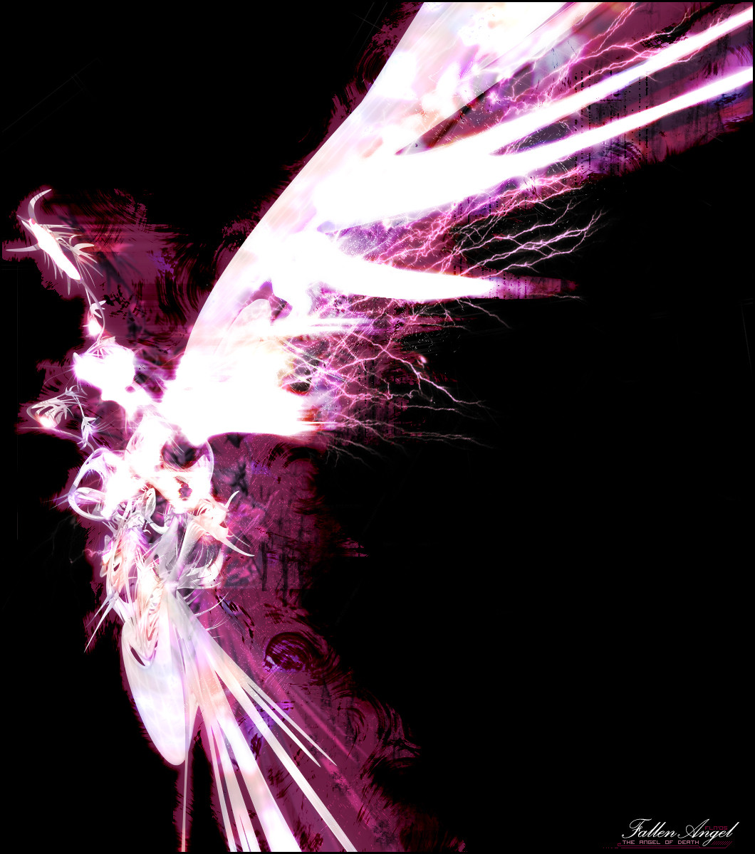
Published: 2005-01-10 21:19:19 +0000 UTC; Views: 3859; Favourites: 61; Downloads: 266
Redirect to original
Description
First piece in the year '05, trying something different to the normal. I'm going to concentrate on working with 3D renders alot more in my work for a bit, get some practice in. I'm still unsure as to what style I enjoy so this is part of that path...Render looked like an Angel spreading its wings behind itself, so I went with that theme.
»»»»________________ _____ _
3D render courtesy of: ~Gaara2k3 .
Rest of the piece: Photoshop 7
»»»»________________ _____ _
Comments and +fav's welcome, if I get enough feedback on how to improve, I will v2 this piece.
 (Smile)")
Related content


Comments: 31

[faints and then revives after an hour] How... did you... do this? THIS IS SOOO BLOODY AMAZING! The texture and the colors and the effects and how it glows and the whole entire concept and the colors and how it was formed to look like an angel but not be one at the same time and how it is just over all... I love this piece of work! Thank you for making it! This is sooo awesome! [procedes to tell the world]
~ Koki
👍: 0 ⏩: 1

lol thanks, there's V2 on my account.

👍: 0 ⏩: 1
Awesome. I'll look into it once I get some free time.
~ Koki
👍: 0 ⏩: 0

Original and I like it! I don't know how to describe it but I think it's the clean and simple style that makes me like this. Great work!
👍: 0 ⏩: 0

v2 will be up on my new account shortly.
[link]
~aeonart
👍: 0 ⏩: 0


holy MAN
+fav <3 loving it fallen, I actually thought that was real angel for a whiel.. man..
GJ on it, !
~N_
👍: 0 ⏩: 1

U heard what i said m8, i fucking love it, the way this piece works over-all and fits together is astoundingly beautiful.
Though i can notice that some parts of the render seem un-brushed, un-coloured and over-all plain, these are only minor thing, i noticed this most apparent in the "body" and the "Head" of the andgel judging by its wing. Also i think that a bit more of that sweet electric brushing wouldnt go amiss on other parts of this piece, even though it might make the wing lose its beauty compared to the rest of the piece, there are other ways to still make the wing stand out, im sure you know of some. The purple 2d background behind the piece fits SO perfectly, very nice. As Vai said making more of an issue of text in the large black space could do this piece some good, even tho the text as it is aint looking to shabby, the fln05 seems to stand out really badly in my eyes for some reason, doesnt look right, mebbe its jus my eyes getting dodgy in mah old age ey m8?
Like i said man, fucking sweet piece, brilliant job, lovely colours,
👍: 0 ⏩: 1
I think its your ghey eyes tbh.
I wanted to keep the render simple - think the opposite of your pieces.
👍: 0 ⏩: 1
No i know what you mean and that wasn't what i was suggesting. What i meant was that parts of the render look like you havent done ANYTHING to them, not even give them colour, very small parts tho dude dnt worry about it. My work aint THAT over the top? ")
Again GJ dude
👍: 0 ⏩: 0

I think this look bloody amazing! Looks much better than it did the last time i saw it i must say. Only crit again, is a feel its a bit empty in the middle right - you could have tried putting the text up there or something, i don't know but there needs to be something there, thats for sure - although don't fill it with any random stuff because what you have atm is amazing and you don't wanna ruin it ")
👍: 0 ⏩: 1
Thanks Vai - I tried to put the text there but it just seemed so randomly placed.
👍: 0 ⏩: 0

Holy shizzle! I just seen the whole Angel, I only saw the wing to start off with. But just glanced at thumb and its much easier to see, now its just there and I cant-not see it. What a freakeh render, top job Gaara and as I said above well finished Scotteh.
👍: 0 ⏩: 0

I have to agree with snake on this one, the brightness of the wing(s) are really distracting, you have this really nice bg with the electricity and what not, but its all blocked off by the wing.
Anywho, gj mate
👍: 0 ⏩: 1
Cheers Dream, i'll take that into account.
👍: 0 ⏩: 0
*Biotchslaps DA and its shadey uploading'ness*
Hey lil' man,
I instantly fell in love with this piece. Why? Here are just a few elements that make it great, even though theres nothing "New" in there:
- The render although a key part, is not the most influential on the eye (Yes 1-0 to the none 3D'ers! XD)
- The brushing is excellent - not the trendwhorish, yet well executed, 'lightening' - the purple aura around the wing.
- Colouring is top notch, as usual.
...But something that really caught my eye - Being a text-arranging-phreak, is the layout and use of text.
Nothing too overpowering on the eye, layers kept minimal, colours well disciplined from centre-piece, neatly arranged and not 'sheephish'. Simply excellent use of design forsight.
+fav definitely,
Keep it up lil' man!
👍: 0 ⏩: 1
w00p! Thanks m8, appreciated.
👍: 0 ⏩: 0

Hmmm i'm fond of its colors and forms... it really looks like an angel and 'death' is also nicely represented with these dark tones. Whats bothering me though are these highlighted parts, there are to many of them. The huge wing is to much 'in your face' if you know what i mean, its distracting. Still you did pretty well overall man... keep it up
👍: 0 ⏩: 1

It looks nice, I really like the amount of work which has gone into the brushing, amazing. It looks like some kind of angel, maybe you should try and render a evil looking angel, use photoshop to manipulate it and do the extra work. Great work my friend.
👍: 0 ⏩: 1

hey this is very pretty.....realy confusin lol i cnt see wots goin bt hey i dont usualy do. neways nice work! ur colours hav brightened up my evening lol even tho its angel of death.

👍: 0 ⏩: 1

oh my god that is simply stunning O_O That's seriously amazing, I love all of the effects and the colour!!! The spakrs of lightning pouring off the ends of the wings looks so cool.
👍: 0 ⏩: 1