HOME | DD
 the-art-junky — Examon
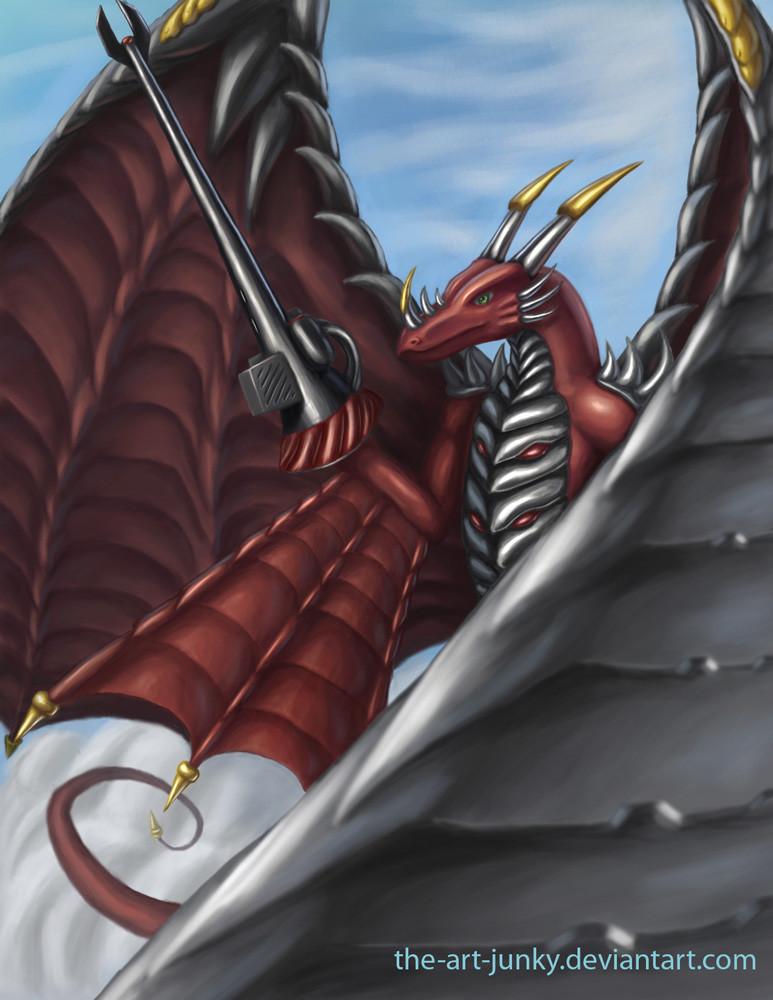
Published: 2010-02-25 08:43:50 +0000 UTC; Views: 6254; Favourites: 157; Downloads: 204
Redirect to original
Description
This is Examon(エグザモン) from digimon. the prefix exa stands for 10^18 or 1,000,000,000,000,000,000(byte) monster...Global monthly internet traffic is estimated to be 21 exabytes!
My hard drive's memory is only about 160*10^9 bytes or 160,000,000,000 bytes. Its old, but I'm able boot off it in under 20 seconds(unlike my raid array which is much slower for some reason).
Related content


Comments: 50


me:I never realised how big Examon-sama was
blackwargreymon:again with the sama thing?
👍: 0 ⏩: 0

Examon, the Emperor of Dragons, is my favorite digimon. I love it so much. And you did an amazing job wit him too! I love! I love a lot!
👍: 0 ⏩: 0


This is really nice. I like the way you color him. Although I think his weapon should be bigger.
👍: 0 ⏩: 1

Then it would go out of the picture or force the canvas to be larger. IMHO doing either one of those would make it look worse than it does now.
👍: 0 ⏩: 1
Hmmm... You have a point. But for accuracy sake, I suggest some parts of the weapon go out of the picture or use a different pose.
👍: 0 ⏩: 1
No thanks. ")
👍: 0 ⏩: 1

👍: 0 ⏩: 0


 (Smile) - :)")

thanks.
I just went beyond awesomeness.
I did not realize this was possible
 - :o")
👍: 0 ⏩: 1

Is that armour on his chest?
👍: 0 ⏩: 1
Looks good. Is that particular armour official or is it artistic licenscing?
👍: 0 ⏩: 1
Thank you. ^^
A bit of both I suppose. Looking at official art it is hard to tell how everything should look. Specifically I'm not sure about the transition to the neck with the armor. However, the red things are in the official design. There are changes made to a few of the horns, the lance gun, the shape of several armor plates, the wings, and the tip of the snout. To me most of these seem to be rather minor design changes, and it is true enough to the overall official design.
👍: 0 ⏩: 1
Were those shoulder guards always there? Either way it looks like it must've taken weeks to do.
There's more than one official Examon picture actually, not sure if you've seen it or not. It's a much more close up and frontal view.
👍: 0 ⏩: 1
Yep they were. You can see them here [link] . There was also another picture that showed them better, but now that one is not on google any more  - :(")
👍: 0 ⏩: 1
Well, it still turned out awesomely. I think I have the picture that you said you couldn't find though.
👍: 0 ⏩: 0

Very nice job. I've never seen a picture of Examon this close up or of this quality.
👍: 0 ⏩: 1
Yep. Examon also needs some love. XD
Actually, you just mentioned the main reasons for my drawing of this character.
👍: 0 ⏩: 1


Glad that you enjoyed it. @<|:-D
👍: 0 ⏩: 0

Thank you. I wanted to be sure that at least the important parts where drawn accurately.
👍: 0 ⏩: 1
where??? what a n00b
*were
👍: 0 ⏩: 0

wow very nice! It looks so shiny and clean. And I'm totally digging the perspective
👍: 0 ⏩: 1
Thank you.
When will you know if you got that job?
👍: 0 ⏩: 1
I got it!  - :D")
👍: 0 ⏩: 1
Actually I was still in the dark about it. Anyways awesome, I'm glad that you got it!
👍: 0 ⏩: 0

I have to agree: the metal really looks well done- but the shoulders looks somehow a little bit weird (especially the right one)
Maybe you can blur the wing towards us a little bit? I think this would give it a little bit more depth.
Otherwise it really looks nice
👍: 0 ⏩: 1
agreed. Made some minor, likely not very noticeable changes. None the less it now seems more natural to the eye now, Or possibly I've just looked at too long by now.
👍: 0 ⏩: 1
It looks better now- I like how the tail fade a little bit with the background
👍: 0 ⏩: 1

This is really good. I love the metal shading on the wings and chest.
👍: 0 ⏩: 1
Thank you. I've realized I need to work on more dynamic poses. I'll probably be trying that next.
👍: 0 ⏩: 0