HOME | DD
 TheABones — home on the range
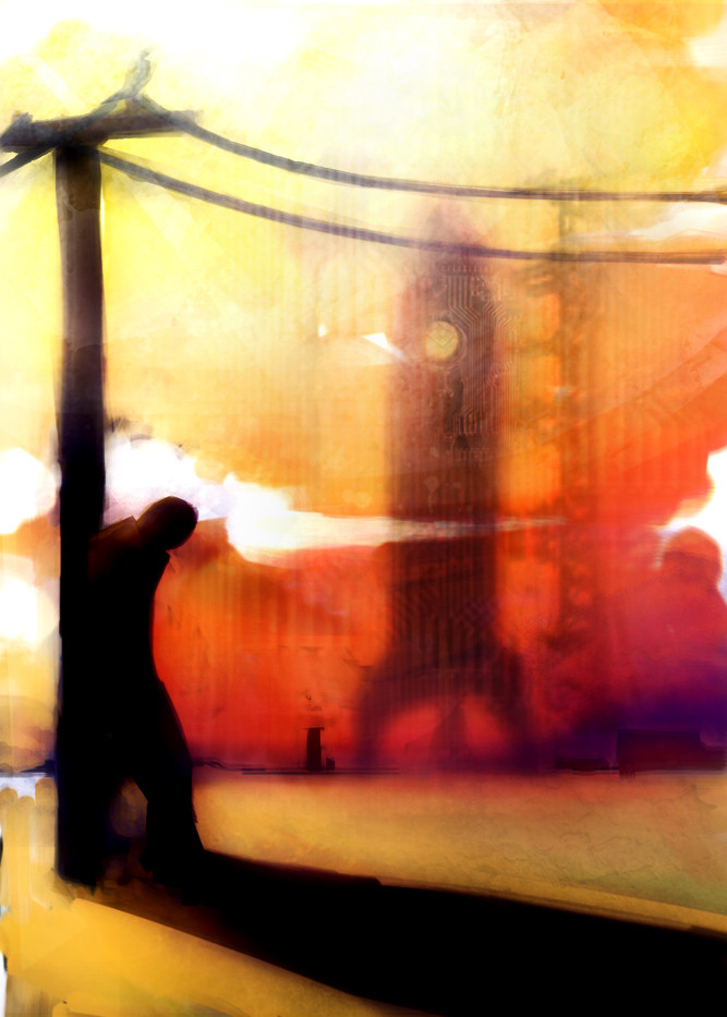
Published: 2005-06-30 22:08:42 +0000 UTC; Views: 1380; Favourites: 33; Downloads: 114
Redirect to original
Description
got fired today so i had some time to finish this. painter 9 and photoshopRelated content


Comments: 67

feel free but you have to put my name on there somewhere or give me credit or something. and also send me a check for a million dollars. please.
👍: 0 ⏩: 1


I think the subtle layering and the luminoscity of the colors here are really working for you. They should be little kid happy, but instead they just look toxic.
👍: 0 ⏩: 1
perfect! i wanted that kind of hazy-chemical sky you get around like nuclear power plants, and launch pads. glad you like it!
👍: 0 ⏩: 0

the shillouette could be more refined, but the compositions too good not to pass up!
👍: 0 ⏩: 1
yeah, you're probably right about the figure. i was hoping to keep the focus on that rocket ship in the background, but perhaps a little more definition would have helped. thank you, though! always apriciate a little critique
👍: 0 ⏩: 0

 (Smile)")
ha! well i never get tired of hearing it. thanks very much for the implied compliment
👍: 0 ⏩: 1

great work on the textures, kinda reminds me of *ghrendal 's work
👍: 0 ⏩: 1
ha! well i'm not sure if i want to take that as compliment, as i love his work, or as a warning. i don't want to be a second rate ghrendal
👍: 0 ⏩: 1
It's probably mostly a compliment with undertones of, "keep your own style"
👍: 0 ⏩: 0

I definitely like the purple you added in.
Adds a nice look to the piece. And kind of shows better that it's in the background.

👍: 0 ⏩: 1

wow! i love the bright orange-red. looks like the colors of a sunset, but i am guessing that is what you were going for. meh...
👍: 0 ⏩: 1
indeed it was what i was going for, but i still apriciate the comment. thank you.
👍: 0 ⏩: 0
You're just too cool for work.
On the other hand, great piece. I like the color use.
👍: 0 ⏩: 1
thanks very much. i'm still trying to decide if i want to update the piece with some slightly different colors...
👍: 0 ⏩: 1
Well, I think it looks fine as it is, though I wouldn't at all be opposed to that idea. What colors do you have in mind?
👍: 0 ⏩: 1
little more purple and some more texture in the rocket
👍: 0 ⏩: 1
Funny, I was thinking purple.
Good idea. See how it looks.
👍: 0 ⏩: 0


Nice peice of artwork, yet again, man. ")
👍: 0 ⏩: 1
thanks. if nothing else i'm glad i could get an irritating song in everyone's head
👍: 0 ⏩: 0

oh no, bad thing happened on you.
But this is beautiful.
I can draw better when bad thing happen on me, though I should not say that.
👍: 0 ⏩: 1
no, i definately know what you mean. sometimes my best stuff comes out when things are looking kind of down. this isn't such a great tragedy though. anyway, hopefully i can at least get some solid drawings out of it.
👍: 0 ⏩: 0

I'd suggest a bit more green than the creeping bits near the bottom, but then it might start to look a bit too much like your last one. Rocketships now? You seem to be drawing on 50s scifi for alot of your inspiration. And there's absolutely NOTHING wrong with that.
👍: 0 ⏩: 1
yeah, f the green. i think i'm going to edit the image soon with more purple and less green. tell me what you think
👍: 0 ⏩: 0

")

👍: 0 ⏩: 0


you should consider making a print available for this.... personally i like it very much
👍: 0 ⏩: 1
geez, thanks again. i'm not sure about a print account. i've heard horror stories about people's prints being bought and then sold elsewhere for far more...and perhaps more realisticaly i assumed no one was interested. maybe i'll ask around and see how much an account is and if people would actually be interested in paying for my shit...
i'll definately look into this. thanks again, man
👍: 0 ⏩: 1
no need for print account... you just gotta be a subscriber (of course you get only 10% instead of 50% when you have a print account)...
as for what you say about things being sold elsewhere, i don't know... i want to believe it's not true
👍: 0 ⏩: 1
well either way i have to pay money so it's kind of a risk. maybe i'll try itout for a month or something...
👍: 0 ⏩: 1
yeah, okay
p.s.: subscription for a month it's about $3-4 if i remember well....they're not too much
👍: 0 ⏩: 0

Very outstanding. Two simple words: YOU RULE.
I especially like the background, and the figure, and...wel, hell, I just like the whole thing! Instantaneous Favourite!
👍: 0 ⏩: 1
ha! thank you very much. i've still got kind of mixed feelings about it. i'm definately glad you like it though
👍: 0 ⏩: 0

more purple would look cool!, where did you USED to work.
👍: 0 ⏩: 1
wayne art supply. super-crappy local art store. never go there, anyone. i'm gonna throw the purple one up in my scraps if you're interested. allong with the original painting for this puppy
👍: 0 ⏩: 0

FUCK THAT ART STORE, FUCK THAT OLD MAN, AND FUCK WORK. we have more important tasks, like eating fondue and watching spongebob.
you could try the purple, but i wouldn't have added the green in there. this one looks more fruit-rollupy than the giant lady one.
👍: 0 ⏩: 1
word. do me a favor and check out the other version in my scraps. see if that tickles you better. and yeah, down with work, up with cartoons and chocolate fountains!!!!
👍: 0 ⏩: 0

your stuff is getting more and more beautiful every time you make something new - or at least i think so, i could be wrong, But it is my thought...
and hopefully (if you feel this way about it) the person who fired you was hit on the head by a really heavy ...thing
👍: 0 ⏩: 1
aww, thanks a lot. i think i've turned a corner recently. i'm glad you apriciate the change!
👍: 0 ⏩: 0
thanks very much! whatsay you to a more purple color scheme?
👍: 0 ⏩: 1

.you're very welcome!...hmm...purple...well i think it could also pretty nice...but it'd be definitely a change of mood...this orangy-scheme has this kind of apocalypse feel to it...the purple one'd probably be more like a darkish, nightish mood...or so.......bah...i'm babbling... ^___^
👍: 0 ⏩: 1
no no, you might be right....mmmm decisions. maybe i'll put it in scraps and see what people think.
👍: 0 ⏩: 1
| Next =>