HOME | DD
 theANiMOL — Element of Fire SCRAP 2
Published: 2006-01-26 04:44:03 +0000 UTC; Views: 31; Favourites: 0; Downloads: 5
Redirect to original
Description
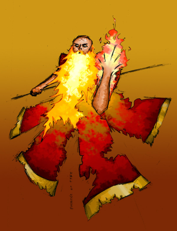
Ok Cory, I made some changes to it.I think it looks MUCH better, but you be the judge of that
")
-First off, the beard. I changed the outline to a soft light to give the outline a sort of red tint with SOME hints of black. I think it looks pretty good that way.
-I made the lighting on the clothes more apparent of the light source.
-I changed the back arm a bit, mostly in lighting and adding a "thumb" (look I know it's really bad but I don't have a scanner and I'm pretty satisfied with it anyway.)
-I made the symbol on his head less bold/black, and made it brown/scalding so that it looks like it was branded into his head kinda.
-Added flames to his hand, obviously. This was before your suggestions of separating it. I already knew that the flames would conflict, so I decided earlier to make the flames on the hand a different color. I think the end result turned out fine.
-I made his face a bit darker.
Ok now questions about finishing the piece up:
-THE STAFF! What do I do with the staff? I was thinking of making it into a flaming fork, or just have it really dark and black scribble and have like the red smoke/glow that we talked about in class.
-Background. Is the gradient really lame? If yea, then what do I change it to? I think it looks okay, I just have to change the rest of my other element drawings. Also, you think I should paint my own background? Make it all sketchy and flamy? But then I kinda wanted the background to kinda contrast the messiness of the flame dude.
-Anything else really.
Good job on the last critique, it was greatly appreciated.
Related content


Comments: 1

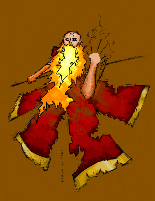
yes chris. 100% improvment. im very glad/pleased/honored that u used the crit.
the beard with the line improvements is awsome. this is great, the only thing is that when it connects with his face than it amost looks like its a separate thingie.(sorry bad description) maybe just touch it up a bit with moer black around the head where it connects.
the lighting on the clothes is much better. i cannot compare it to the old one and dont know how much u changed it, but it looks better.
the back hand. great. the thumb is better, but eh..as u know. the improvemnts on the arm are nice, although i dont dig how its so damn dark and you can tell that there are 2 differnt lines. the lines of the beard and the arm dont really conflict anymore which is nice and improves it. just notice that the whole back hand is darker (cuz of the thumb and additional lines etc) just keep that in mind when evening out ure composition...or something.
the shadow fixes are great, only little...little thing is that near his joint it becomes darker, but should still be lighter from the fire.
i really wasnt big on the symbol and knowing what to do with it, but its an improvemnt from b4: it looks good. it isnt uber strong and jumps out, yet it is apperant that it is there and i dont think people will have to search for it much. gj.
hand...nice. i love what u did with the color change, and it isnt to random and fits pretty well. i think you should have put a black line dividing the fires and used a colored line (kinda mixed w/b+w -like the beard lines) on the outside that isnt touching the beard.
the blur effect you did between the skin and fire is discusting. i think you should start the transistion lower.
also you should use more white and colors inbetween red/yellow/white on the arm. can you see how his beard is bright and his hand is just ...eh.
w/e u do make sure u change the blur and have the flame start lower (possibly grow from the side flames)
another thing on the front hand is the fingers. hella lame and people can see that the fingers were half hearted -even though u put fire there. the middle finger is zomfg way too long. !!! notice how it is 2x the ring and almost 3x the pinky finger. please exagerate to a limit. look at ure hand.
and changing the colors of these lines would also be nice, something like what u did with the iner lines of the beard.
the face is 100% better. it now matches and i have no complaints.
NO on doin ure own BG, remember that we are all gunna fit these characters together. alone the gradient looks good. and i like it.
....you could clean the pic extra lines and dots up though...damn.
the staff...i say no to the fork...that just seems lame. i think you should still do somehting like a flaming staff, using stuff like [link] draw ure own or make ure own in PS. fire is random and does things like this. i was probably gunna do something like this on my sun guy...but im not gunna. glow ftw. lol
on what it should be i say some sort of new staff. you will deffinitly need to widen the image. AND please do not do somethng that looks like some fukin WoW or Magic staff, they may be cool, or "the" real staffs, but make ure own. being inspired by something only goes so far before it becomes fanart or a biteoff.
and great job. it was a great improvement. again thanx for takin my shit to mind.
late -SNAKE
👍: 0 ⏩: 0