HOME | DD
 theblueblue — Hinata Bust Color
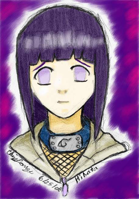
Published: 2008-06-27 04:00:56 +0000 UTC; Views: 822; Favourites: 15; Downloads: 5
Redirect to original
Description
I hadn't done any color pieces in a while, but I liked how my Hinata Bust came out so I wanted to do something a little bit more with it (and I wanted to add more to what I made the people at my Hinata Fanclub had to add to their thing) This took me about an additional half an hour to color. It is three layers, one that is the pencil rendering, one that is the "background" and one that is the colors and darkened lines since it was a semi-transparent layer.This was yet another experiment, but rather than experimenting with cell shading I was experimenting with the acrylic paintbrush from Corel Painter Essentials 3. Anyway, if you didn't like the original bust, you should like this one because it's color, and that always catches attention. Just talk to the people who I was talking today about how color attracts more attention than black and white does (you can consider that this is an experiment to see which one gets more attention.
I did an alternative version where I started to bring the background to the edge of the line, but it didn't have the same charm as the aura around the line art. If you really want to see it, beg me to post it, and I might just post it up here or do something else so that both of them can be visible.
I don't own Hinata, Naruto, or Naruto Shippuden.
Related content


Comments: 12


Yeah, Hinata is what it's all about.
👍: 0 ⏩: 0

Really like this overall, but the shading differences between the face and neck/chest are a bit too harsh.
👍: 0 ⏩: 1
They probably are a bit too harsh. It was me trying to do shading with the coloring without while still keeping the pencil shading in there, which probably would have the effect of doubling every contrast I did. I was also struggling in figuring out how her neck should be shaded, considering that parts of her bangs come down to her shoulders or whatever. I probably should have lightened it up a bit, maybe I'll go back and fix that or something, I don't know.
👍: 0 ⏩: 0

nicely done, and i see what you meant before about cg pieces getting more views than line art XD
i guess ppl like colors XD
👍: 0 ⏩: 1
On here, it could be something as simple as colors being easier to see when they are super small and in thumbnail format, so I don't rage as much, but really, my pencil renderings should still attract attention because they aren't line arts which often turn into big white blobs. The experiment seems to have worked though.
👍: 0 ⏩: 0

")
Thank you. I'm glad that you liked it.
👍: 0 ⏩: 1

Thank you very much.
👍: 0 ⏩: 1