HOME | DD
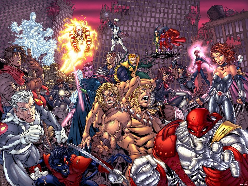
 TheBob74 — M. Brooks' AOA color contest
Published: 2006-05-10 19:48:33 +0000 UTC; Views: 13490; Favourites: 238; Downloads: 3084
Redirect to original
Description
A pic drawn by one of my absolute favorite artists here on DA- The one and only Mark Brooks.To me, his style is a hybrid between Joe Mad! and the legendary Arthur Adams (two big reasons why I am a full-fledged comic book geek!)
The thing that also makes this pic outstanding is the fact that it's from Age of Apocalypse. So it's all the original X-Men with a different twist. If you've never read the storyline, I highly recommend it!
Anywho, this is my entry for Mark's color contest. If you really like it, be sure to vote for it when Mark posts the voting poll in his journal!
pencils - Mark Brooks
colors by me, Bob Pedroza!
(Big ups to Andy Elder for providing the flats/ color separations! thanks a bunch!!)
Thanks for lookin!
Disclaimer- The artwork and above characters are copyright Marvel Comics and Mark Brooks and may not be reproduced without the written consent of the artist and Marvel comics. All artwork and characters within are included for the purpose of scholarly review.
Related content


Comments: 105

 (Smile)")


Wow, too bad I'm so late seeing this. I know the contest is over already but I personally think yours is the best out of the entries I saw 

👍: 0 ⏩: 1

Thanks! I sincerely appreciate it! (as well as to the others who've said the same)
But really, I think the better reward was getting my name associated with some of Mark Brook's work, and the numerous people watching me that I've gained since then- winning was definitely not priority for me- unless the prize is $$$...
👍: 0 ⏩: 1


MY GOD THIS IS BEATUIFULLY COLORED. Such depth. Such detailed attetion to shadow!
👍: 0 ⏩: 0

Way cool, you're really great at colouring
And AOA is awesome, read it and made a few linearts for my gallery
👍: 0 ⏩: 1
dear welcome, should you ever feel like colouring one of my sketches feel free to do so
")
👍: 0 ⏩: 0

thats is amazing colouring.. i think u should have won that contest.. i like the effect on torch
👍: 0 ⏩: 1


your welcome ")
soo much detail its sooo beautiful 

👍: 0 ⏩: 1
Thanks, but just to clarify... I didn't draw this, I just did the colors. Mark Brooks is the penciller
👍: 0 ⏩: 1
oh ,still great job on coloring it 

👍: 0 ⏩: 0

congrats!!!
👍: 0 ⏩: 1
you are welcome 
👍: 0 ⏩: 0

Yo bob you at an excellent level. I haven't seen you work for a while now, but for what I see, you been practising all this time!! (Wink)")
👍: 0 ⏩: 0


Jus had to drop a comment to a fellow entry. I reckon you did an outstanding job on this piece and even though our entries are essentially running against each other, I still wanna give you props
👍: 0 ⏩: 1
Thanks I appreciate the comments! and the vote!
Your entry is outstanding as well, the FX you have are wicked - the glow around Magneto and Rogue was brilliant! It makes me wish I thought of it! lol
👍: 0 ⏩: 0

sweeeet! I love the lighting you have done on this...the paint seems to have a nice gradient to it too, is that just a large flat coloured brush in PS?
👍: 0 ⏩: 1
No, actually I use the cut and grad method (using the lasso tool and the airbrush)
Thanks for the kind words!
👍: 0 ⏩: 1
sorry for being inquisitive but does that mean you select every single piece of every character? that must take ages!?
👍: 0 ⏩: 1
No problem!
Yep, that's what it means - I guess it would be just like any other style, the more you do it, the more proficient you get.
👍: 0 ⏩: 0

*Why CutieQ added this to her favorites:
Out of all the entires for the contest this was my absolute fav. Mostly because of the way you colored Shadowcat, Wolverine, Rouge, and Gambit. I had to make sure that my favorite characters where done right and you hit the nail on the head. Also I like the colors you choose for the background.
👍: 0 ⏩: 1

I loved the inks for this piece. Your coloring has just made it all the more wonderful. Great job, hon.
👍: 0 ⏩: 1


i'll vote for you...really good work.... like your style....
(take a look to the n°9's booby drake... that's the only thing i can see better than your)
👍: 0 ⏩: 1


I appreciate the vote! Thank you!
👍: 0 ⏩: 0

I think you have very nice contrast effects (light to dark) but would have liked to see a more spectacular BG
nice job but honesty forces me to say that you wont get my vote
greets Soulrailer
👍: 0 ⏩: 1

I thought you did a real good job coloring this one but the one thing that would have made it a definate vote for you would have been the background. I like the colors you chose but it has no texture to it and makes it look flat compared to the rest of the piece. Just a hint of cloud layers and not just horizontal lines would make it a really great piece. Good luck to you.
👍: 0 ⏩: 1
Thanks for the helpful critique!
I appreciate it!
👍: 0 ⏩: 0

good luck in the comp,your one of the top 3 contenders
👍: 0 ⏩: 1
Thanks!
I'm hoping I win, but I wouldn't be surprised if I don't, there is some incredible talent on display in the contest!
👍: 0 ⏩: 0

I voted for this one! Best use of highlights.
👍: 0 ⏩: 1
| Next =>