HOME | DD
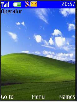
 thecat2000 — BlissXP
Published: 2002-01-30 23:52:16 +0000 UTC; Views: 2832; Favourites: 2; Downloads: 1328
Redirect to original
Description
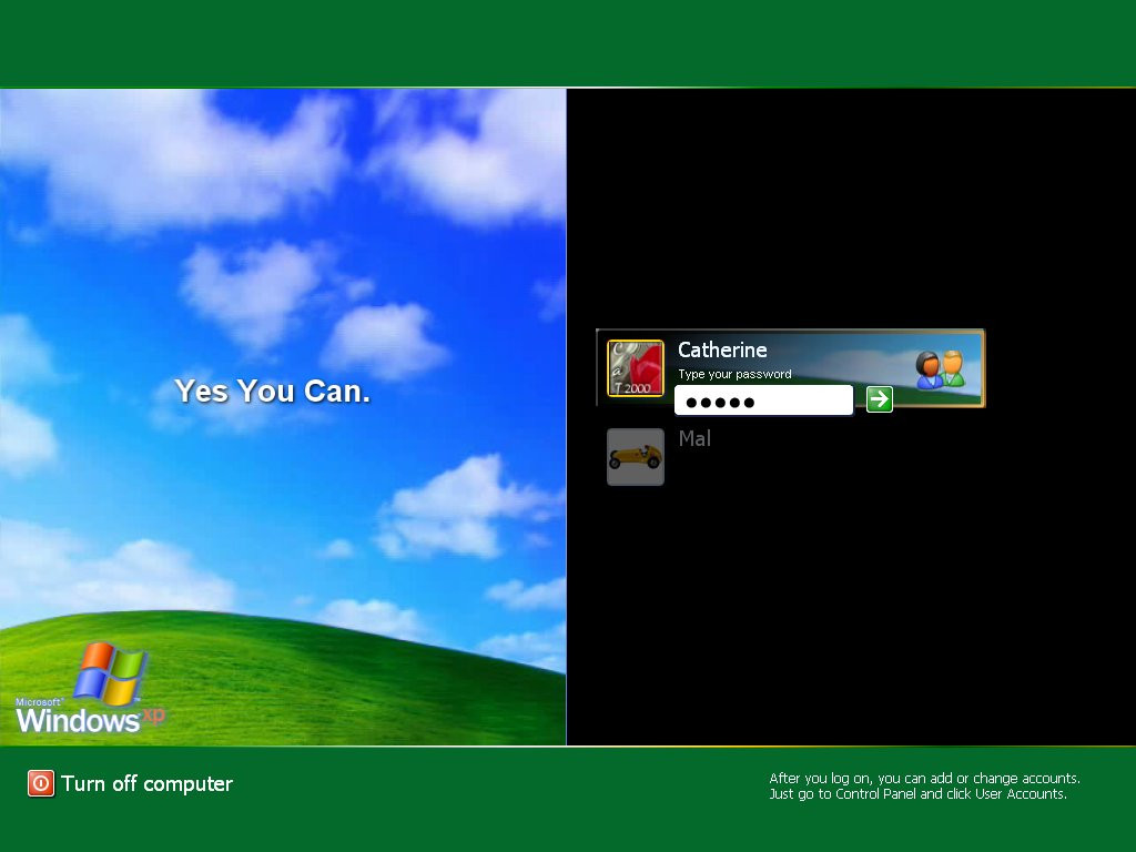
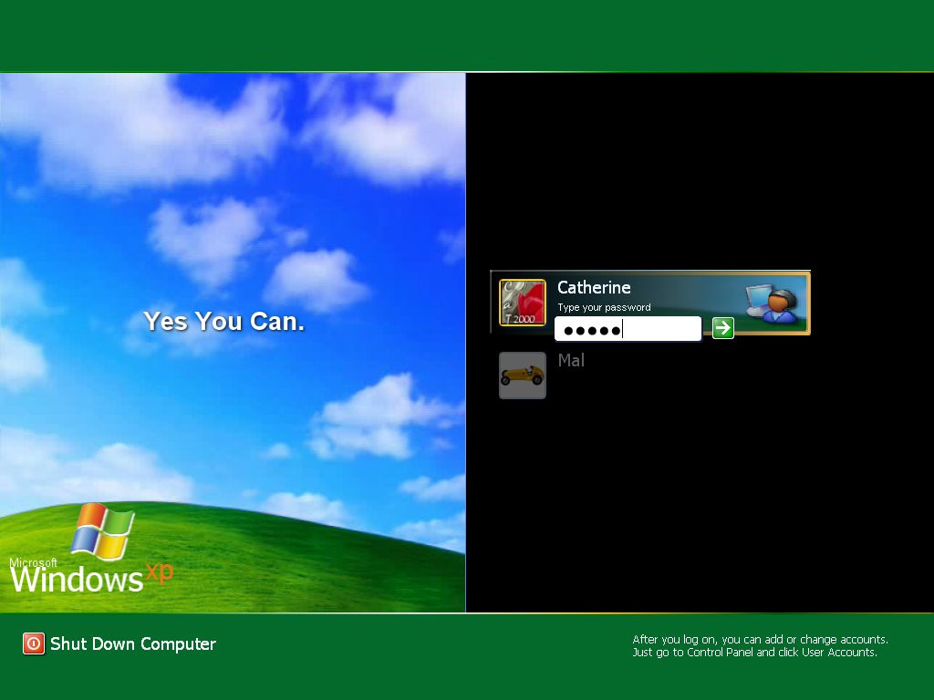
Converted to logonui.exe for Logon Loader users.*Bugs Fixed* Theme should work with out errors now
*Account Logon Graphic Changed with new one* This removes the stretched graphic problem.
Related content


Comments: 7

Very nice, but id prefer a blue to a green. Never the less ill give it a go
👍: 0 ⏩: 0

Just fixed the error's mentioned. But anyone wanting this theme could hold off another night while I update the AccountLogon Picture and remove the stretched graphics.. Hopefully that one will then be the final version of this theme
👍: 0 ⏩: 0

Oops. I just saw that, and I'll fix it This one I DO know how to fix
I'll post the fix later
👍: 0 ⏩: 0

I'm going to be extremely critical, but that's only because this one (and your other one) are the best logon screens that I've seen so far. Creative (well, great use of what was already there), and well put together. But I'm picky and won't change my screen unless it's error free. Here's some constructive criticism.
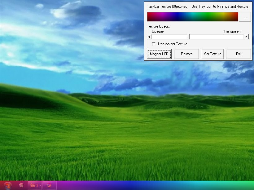
I like the one that's not "original". I like the black, it's sexy. But like your other logon, when you put your mouse to the left, it turnes green, which just looks nasty on that black. You did manage to get rid of the block when you log off, but when it says saving settings, it halfway goes over the green. Not too sure what you can do with that, though. Maybe change the string to say "Saving Settings" as opposed to "Saving your Settings..." (if you can). And I agree with oddfox, the icon looks stretched. You should make it look like the one in your blue one. Also, when you logon for the first time, it says welcome, but that clashes with the "Yes you can." right next to it. My advice is to just get rid of that "welcome". It wouldn't be missed.
Overall, a great submission, but I'm a perfectionist, and I'm sure there's guys out there that would love this logon if it were void of the small technical errors it has. It's great in the style department. (what happened to the old voting anyway?)
~Simplex
👍: 0 ⏩: 0

Awesome except the user icon doesn't look very nice being stretched like that (The button next to the text-line/arrow-button). Good job, again, thecat2000
-----------------------
Karma Police
arrest this man,
he talks in maths,
he buzzes like a fridge,
hes like a detuned radio.
👍: 0 ⏩: 0