HOME | DD
 theCHAMBA — In front of the Gate
Published: 2008-03-20 10:31:42 +0000 UTC; Views: 28101; Favourites: 901; Downloads: 0
Redirect to original
Description
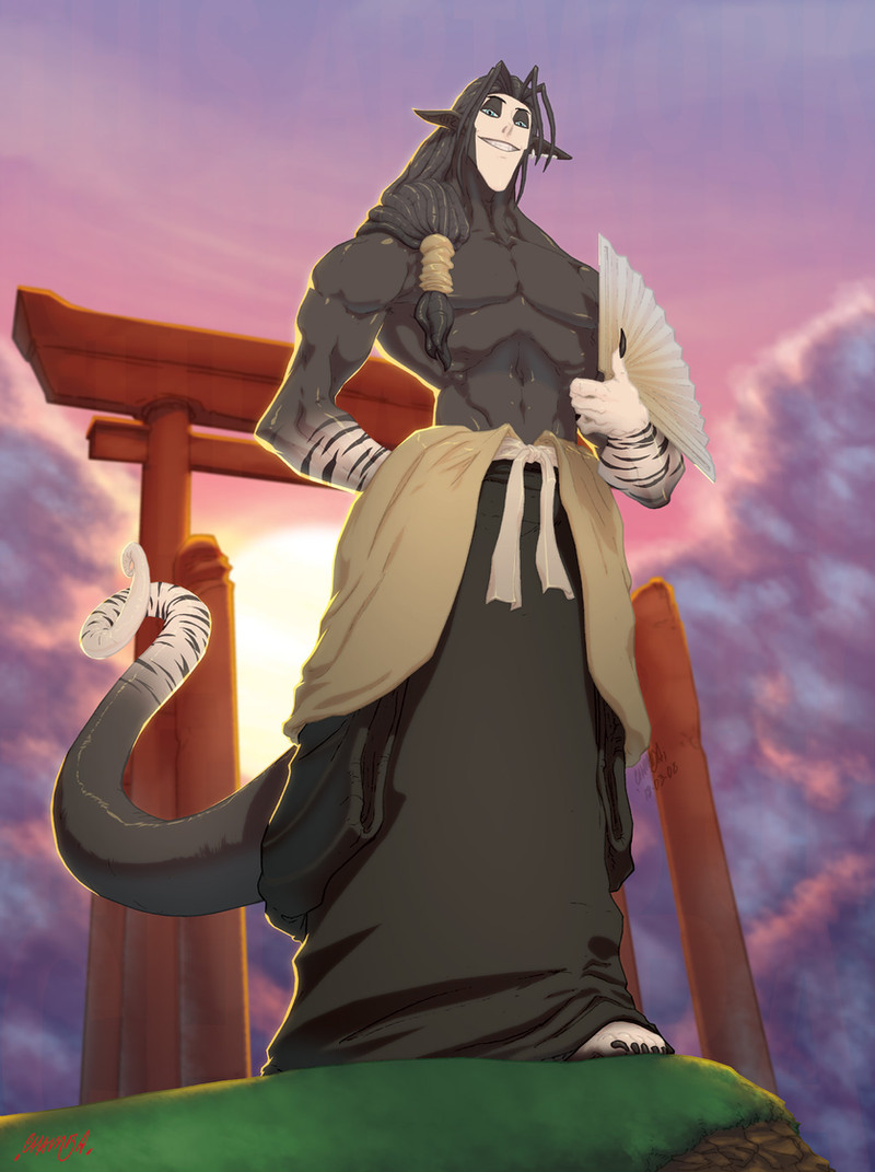
Full-Colour commission for of her character Abyssi, standing in front of a Tori Gate.I enjoyed colouring this piece up, the backgrounds in particular.
-tools-
4h.HBpencil/A4PrinterPaper > Photoshop7/OpticalMouse
Related content


Comments: 128

qooooooooooooooooooooooooooooooooooooooooooooooooooooq
best best pictutre ever wow ...:fav+:
👍: 0 ⏩: 0


awesome pose and colors...and the face is ipercool!
you rock,guy!

👍: 0 ⏩: 0

All your drawings have this crazy sense of space, a good 3- dimensionality.
👍: 0 ⏩: 0


tanx! i was wondering if it were real clouds being made to look like painted clouds. looking closely, can see the brushstrokes now.
👍: 0 ⏩: 0


 (Smile)")

The colouring is excellent, but the character...what the hell is he?
👍: 0 ⏩: 0


your coloring is superb. the sun glowing off of his back/sides is a nice touch and the background overall is very beautiful. very nice perspective as well.
👍: 0 ⏩: 0

That coloring is epic man. The subtle change in color on the tail and in the body, and especially the slight specularity and highlight you gave his torso, just great work man. You're something to aspire too, buddy.
👍: 0 ⏩: 0


Interesting character, I love how you coloured him
👍: 0 ⏩: 0

Very creative character,
i can already see the character coming out of this picture.♥
👍: 0 ⏩: 0


Great job on this commish, your take on the character is stunning... and inspired me to go off and sketch which then delayed my comment here.
👍: 0 ⏩: 0

likea lot his face and his smile. and I like how you've colored it. you're coloring with mouse, right? its amazing dude.
I have not so many time, so I'll comment this here. I like a lot your idea of drawing tones of characters from animated movies like disney's or Miyazaki's. I loved every single drawing, and I think its so imprtant that someone like you have done this, becouse, I dont know if this is your idea, but anime movies need more advertisments becouse 2D is dying... and all we need the essence of 2D movies. Have you seen Nocturna? its a Spanish movie. The history its not so good, but the backgrounds and the animation is great. Sure you could work in some anime movie. Your speed is your best weapon, I guess.
Well, you must be bored reading this, sure there's nothing that someone haven't told you, so I should say Bie, keep drawing so good, and keep submiting tones of drawings everyday.
👍: 0 ⏩: 1

Nocturna has been something that I've been wanting to get a hold of for the past year and a bit.
But unfortunately It seems to be incredibly hard to get my hands on.
👍: 0 ⏩: 1
I guess I could do something... but mine is in spanish and sutre you wont be able to understand... but look here, you just have to download Pando, it is a program like bittorrent, and click this [link] ...Maybe you have to get a registration in the page.
good luck
👍: 0 ⏩: 1
cheers for the link.
I think i'll most likely just wait for it to be released on DVD.
👍: 0 ⏩: 1
yeah, sure is the best you can do. well, nice to talk with you!
👍: 0 ⏩: 1

u make other people's characters look really great
👍: 0 ⏩: 0

Wow! He's so cool lookin. ")
👍: 0 ⏩: 0


omg!!! that is freaking sweet i like that alot!
👍: 0 ⏩: 0


That's a really interesting character design...the things that some folks come up with. ")
The lighting thing someone else mentioned... it wouldn't have even been an issue to me if I hadn't read that comment, but now that I did, I can't help thinking he was right. It's funny how things can go totally beneath your notice until someone else brings it up, and then it's all you can think about...
But it doesn't take anything away from the quality of this piece, which is extremely high.
👍: 0 ⏩: 1
Oh no it's true what the comment said.
but would this piece look any better if it did follow how actual lighting works?
I doubt it.
👍: 0 ⏩: 1
I don't know...I think if the front of the character were a tad darker--not totally in silhouette, but just a shade or two shadowed, it might look even better than it does. It would make for sharper contrast.
I think it was Da Vinci that said art is never finished, only abandoned... there's always more you could do.
But there's no reason to push it any further, either, as it definitely gets the job done as is.
👍: 0 ⏩: 2

I'm an artist myself and I'm completely happy with it... If it were something that I felt detracted from the picture then it might be worth changing. It's a valid crit in that it makes sense. Aesthetically I think it works pretty well as is.
👍: 0 ⏩: 1
But then it would lose more of the focus off the character.
Indeed, the IS more i can do. With practically any piece.
But this is what I and both the client was satisfied with.
It got the job (literally) done.
👍: 0 ⏩: 0

You are done good work...i like luster effect in this pic
👍: 0 ⏩: 0


Its a good picture. However, your shading is illogical. With such a hard light behind him he would be silhouetted and none of his features would be highlighted as they are in this picture. Great work, just something to keep in mind.
👍: 0 ⏩: 1
something to keep in mind
Stylistic versus realism, This piece isn't realistic. Sure possibly to an extent it may be, but as an Image, I'd much prefer to choose a stylistic choice.
👍: 0 ⏩: 1


Reminds me of a draenai.
~Brilliant work, the lighting on his trace are a bit over-pixelated, but otherwise admirable.
👍: 0 ⏩: 0

Very impressive. 
👍: 0 ⏩: 0


He's a shadow-beast!
👍: 0 ⏩: 1
| Next =>