HOME | DD
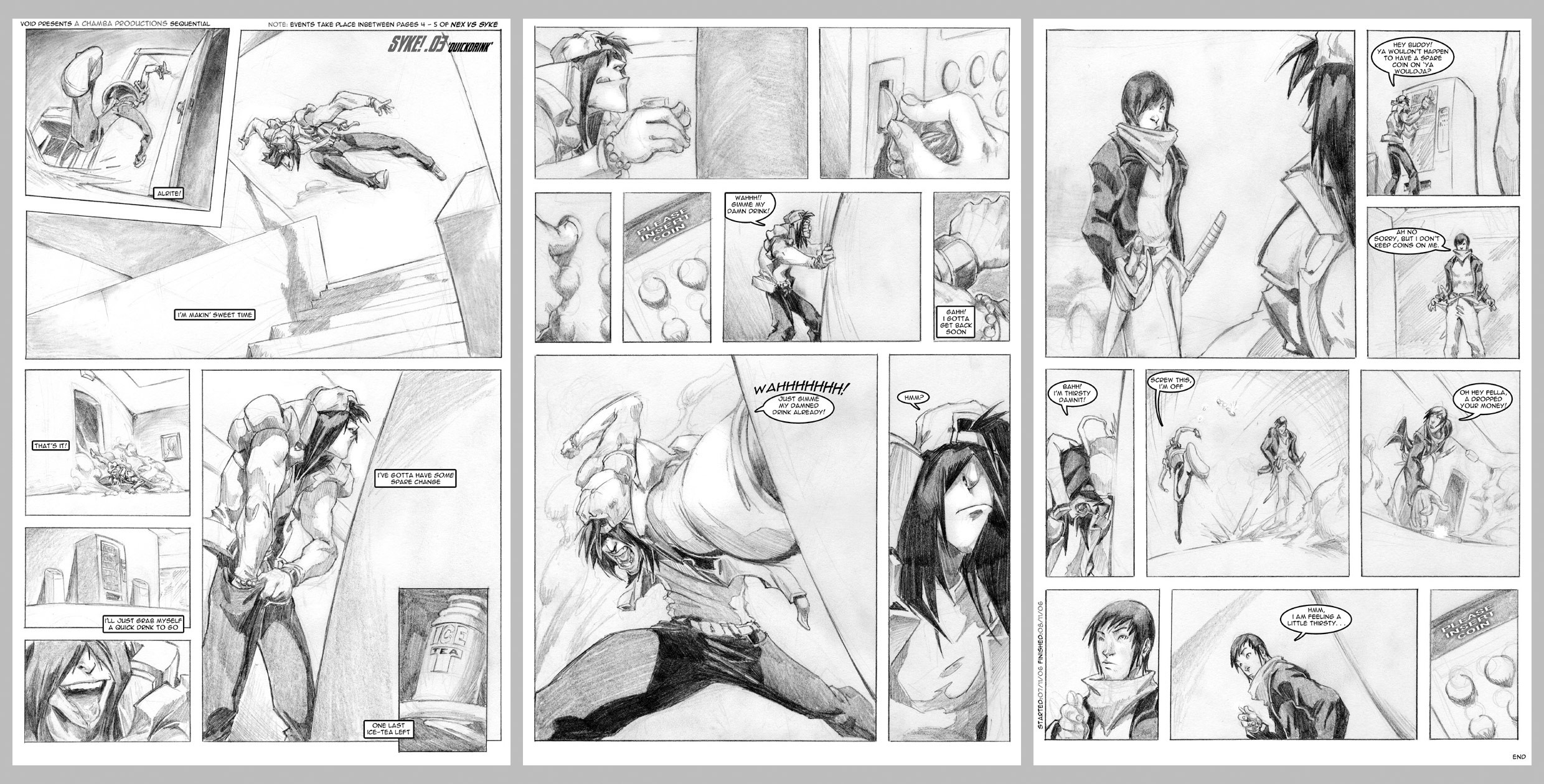
 theCHAMBA — SYKE in 'Quickdrink' p.1-3
Published: 2006-11-16 05:57:53 +0000 UTC; Views: 11911; Favourites: 143; Downloads: 0
Redirect to original
Description
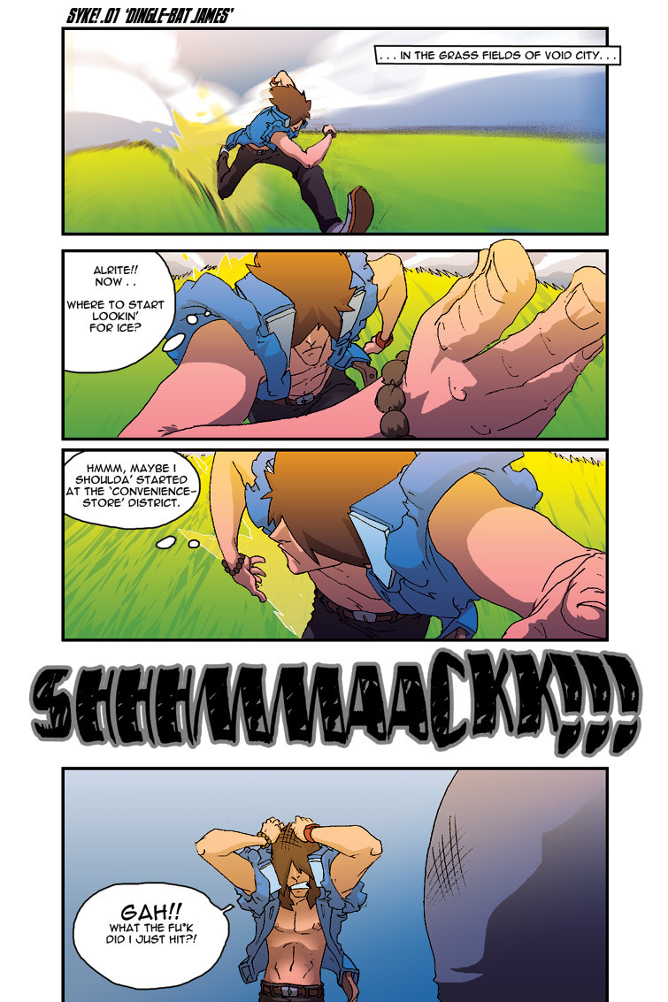
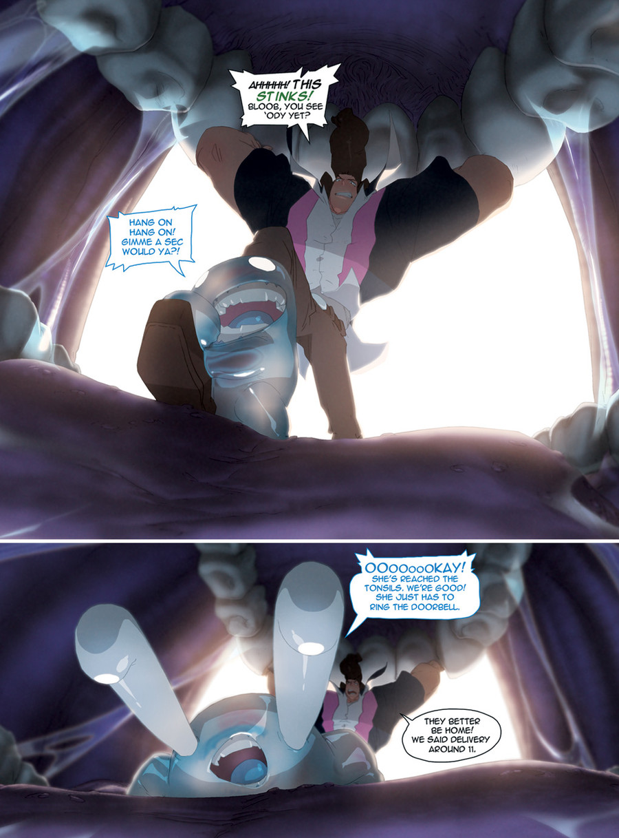
ANNNND here's the 3 pages of Syke's 3rd battle on Void, this time against 's character 9daysso yeh, i had finished off the battle w/ Del's character Nex, and so all i had left to do was this battle. Luckily it was only a 3 page minimum, which i actually plan on stickin' to now a days.
Luckily also, during our 'battle time of 4 weeks' i had writted both the Nex battle and this 9 battle as one whole 8 page battle.
The events of these pages actually happen between pages 4 and 5 of the Nex battle, upon his return from his delivery.
Having a few hours to work on these, i decided to try out something a little different from my usual full-colour work and actually go all traditional w/ the exception of texts/word bubbles..
to my delight, i was quite pleased w/ the final outcome.
-tools-
4h.HBpencil/PrinterPaper > Photoshop7/OpticalMouse[text]
Related content


Comments: 114

I meant with your usual cell chades. It looks great like this.

👍: 0 ⏩: 0


i ... got it !
you had perspective classes with escher !!!!
that must be the only explanation
👍: 0 ⏩: 1
oh .. and just for record .. if (and i probably will) someday i make a fanart of this syke guy .. it is because of this deviation
👍: 0 ⏩: 0

well done, good use of perspective (the back of my head still has a knot in it from slammin me around from corner to corner of the room) really helps along the drama...it's serious. people can freakin DIE from thirst.
👍: 0 ⏩: 0


I really like the sense of depth lent by the shadows. Looks pretty sweet!!
👍: 0 ⏩: 0

Oh my god I love your characters. You don't show much of their lives...but even if its simple the audience can already get the character's general personality. That takes some skill for a comic only three pages long. I envy you...and I like the story ideas. this kind of reminds me of a old school video game...the character desgins remind me of a street fighting game I used to play....and usually these character designs don't work at all..but you make it work. You make this style your own and I love it. I also like the way they talk since their grammar isn't propper....but it just makes the comic even more realistic.
Is this a simple strip comic or does it go in sequence? I saw the only one about the pizza delivery....and I thought that was all of this character...but seeing that you are drawing more than one...I thought I would ask.
👍: 0 ⏩: 1

this particular strip [as noted in the artist statement] happens inbetween the 4th and last pages of the coloured strip titled 2 minutes
so in that sense, this is all one page adventure.. to be exact
👍: 0 ⏩: 1
Oh okay...must have missed that. Thanks!
👍: 0 ⏩: 0


solid pacing.
i think page 3 suffers mostly from slight boredom to the eye due to lack of size balance in panel/figure.
For example, one of the main boo boos in sequential paneling is making too many figures in the panels ( as well as the panels themselves) the same size...that is unless you're doing a "same shot sequence," a technique similar to cartooning strips and animation storyboarding.
varying the size of your panels create balance and interest. but also note that thinking about whats happening in the panels and whats of importance dictate whats important to the viewer's eye. right now, it seems like page 3 just has different actions happening but they all have the same size relevance. considering how dynamic you are in your pin-ups, you could have taken advantage of a lot of opportunities to make page 3 better in pacing.
Also, that huge panel at the top left of your page is relevant, but not nearly as important in content that it has in it to dominate all others.
the mix between light shadow and heavy blacks in panel 3, page 3create shape tangents that confuse the eye..
i can tell these are rushed since its for void, along with your heavy output with other stuff.
but yo, if you're serious about sequentials, stop looking at comics to learn. the best way is study film. also, listen to this man : Will Eisner.
he's the best to ever have done it and has an amazing book that will change the way you thnk comics are done! its called: Comics and Sequential Art. any pro in the game will agree its the best book on the terminologies, why you do what you and and understanding the science behind why you makie the ecisions you make. its amazing. highly reccomend it (Smile)")
look forward to more sequentials from you
LeS-
👍: 0 ⏩: 1
yeh, i totally get whatchu'r saying mate,
page 3 was a *so-so* one on my end, i didn't really kno which panels i should pay more focus towards, sumfin i'm still learning as i go along.
studying film instead of comics, yep.. i totally understand ya there.
i will definately look out for that book.
Thanks for the recommendations mate.
'preciate it
👍: 0 ⏩: 0


ihave never faved so much stuff from one artist so fast 

👍: 0 ⏩: 0

Wow. Not only does the artwork kick ass, but the story itself is funny! XD
👍: 0 ⏩: 0

That pose in the second-to-last panel on the second page is sick...it makes me think of Terry Bogard in Fatal Fury for some reason. As always, amazing work.
👍: 0 ⏩: 0

Dude Syke kicks major ass!!!!!!!!!! I would love to have him as a monthly comic!
👍: 0 ⏩: 0

the shading looks really nice, your stylistic elegence is ever present^^
Skye's appears to be a very energetic individual XD (i read the other two battles^^ good job on 'em)
niceness over all^^
👍: 0 ⏩: 0

Hey, i saw this on void! This was so awsome, your style really kicks ass. Must watch and fav!
👍: 0 ⏩: 0


Yes.. Vending machines are the bane of my existance...
👍: 0 ⏩: 0

I actually think your pencil shading look cooler than your fully colored pieces.
I can't really explain why, it's like your pencil rendering has some kinda flare that makes it more attractive to look at the polychromatic colorings. but then maybe I'm just biased in favour of monochrome expressions.
Anyway, I wanna compliment you on how neatly clean you keep those shadings and outlines. Faved.
👍: 0 ⏩: 1
hahah
yeh sometimes so pencil renders can look more attractive to me than that of fully coloured.
i kinda jst wanted to show that i aint reallya one trick pony that replies on his colours
👍: 0 ⏩: 0


Bravo!! Great story, Jeff! My film language teacher would be quite proud of this story, it's simple with a good conflict and a nice resolution (at least for this part since I know you probably have more coming
Welp, keep it up and can't wait to see more Syke!
👍: 0 ⏩: 1
i actually didn't wanna do a fully clean pencilled look.
something raw w/ expression was my goal and i think i achieved something more than i expected.
👍: 0 ⏩: 1
Ah, I see. A more organic look than usual. Well, anything I think you attempt looks incredible. Especially when it involves Syke. (Wink)")
👍: 0 ⏩: 0

yeah I'm a syke fan now. I just read 3 of these things. they rock! the stories really catch the readers.
👍: 0 ⏩: 1
it's good to kno that they do
👍: 0 ⏩: 0

The shading is great, and over all it looks really good.
👍: 0 ⏩: 1

on the fourth from the last frame it looks like he says "a dropped your money" is that what you intended it to be? because i dont quite understand what he is saying... other than that it is awesome, i really like the expression of the characters as well as the movements they show
👍: 0 ⏩: 1
ya it became 'a drop' instead of 'ya'
👍: 0 ⏩: 1
sweet, now i understand... again great movement... i said it once and so has everybody else, i dont really need to say how good it is again
👍: 0 ⏩: 0


I like how this happens in between the "2 Minutes" battle. That's a cool concept. I also really like the 7th panel on page two. It's just an awesome perspective. Oh and the traditional style you used on this one was a pretty cool change. Awesome job overall, man.
👍: 0 ⏩: 1
i like that panel too
and the raw style is very fun to draw in
👍: 0 ⏩: 1
Awesome. I wouldn't mind seeing more of your work in that style.
👍: 0 ⏩: 0

thats pretty cool dude.
That character looks like so much fun to draw ^^
👍: 0 ⏩: 1


heh...i really love the narrative and the storytellin, so dynamic
👍: 0 ⏩: 1

| Next =>