HOME | DD
 TheDragonofDoom — Quetzalcoatalus Northropi Restored

#paleoart #prehistoric #pterosauria #pterosaurs #quetzalcoatlus #reptile #study #pterodactyloidea #azhdarchidae #quetzalcoatalusnorthropi
Published: 2016-07-05 19:55:59 +0000 UTC; Views: 8718; Favourites: 343; Downloads: 0
Redirect to original
Description
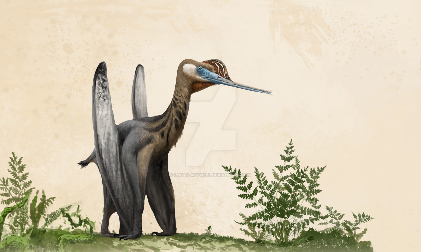
Here's my finished quetzalcoatalus northropi! I went with a more colorful palette because I noticed a lot of artist illustrate quetzalcoatalus northropi with very mute greys and browns. Which there's nothing wrong with that, I just don't see any evidence suggesting they wouldn't be colorful. So I was greatly inspired by the cassowary and multiple toucan species (I know they have no relation to quetzalcoatalus northropi). Enjoy!MY PATREON! patreon.com/RushelleKucala
My site: rushelle.com/
Contact me at: rushelle@sbcglobal.net
Related content


Comments: 14

👍: 0 ⏩: 0


Originality
Impact
I decided to critique this artwork for a few reasons, the main being that from my first impressions of this piece, I had a very clear idea of what the artist was going for, and I really appreciated the subtle beauty of the color and the technique. Looking further into it, then, I found a few stand-out areas that were amazing, and I had a few critiques as well, which is ultimately why I decided to critique rather than comment.
So let's start with the good. Specifically, let's talk about color. What I really appreciate is the use of vibrant colors that don't overwhelm the viewer. Let's look at the wing first: going from left to right we go from a muted black/grey/brown to a soft, cool white to then a simple sky blue and then finally a deep, rich ultramarine-esque blue. Going back to what I said before about not being overwhelmed by the vibrancy, the artist uses these richer colors in specific areas that then enhance the lighter colors and make them pop in a nice way. The beak has this too, where there are many bright colors that then are muted with shadows and brightened with highlights to make the main color that much more dynamic. The other "good" I want to talk about is the overall technique in the making of the fur/father look. Texture is extremely important in pushing a subject into that last bit of realism, and there are many areas here in which I think the artist succeeded with that. Specifically the neck/ torso region that is covered in some sort of fur or feathers. That area is absolutely fascinating to look at because of the technique behind that fur texture. What's incredible to me, then, is that not only was it established in a realistic manner with light, dark, and contrast areas but also that there is significant implication of the fur having direction. Around the eye especially the way that it "grows" makes complete sense; it then flows around naturally, back into the rest of the body like fur should. And that's what I love about this.
But like all art, there is always something that you can critique in order to make what comes next that much greater. So now let's talk about the "bad." And I put bad in quotes because its not really bad, its more nit-picky than anything, but these are some things that detract from the overall experience. First and foremost I want to mention the background. Now, the background itself is great - there aren't too many points of brightness, but that's to be expected in a landscape that is the background rather than the subject. What I don't like about it, though, is that it looks like a backdrop sitting behind the subject. Now, I don't know if it's supposed to be a backdrop or not, and this figure is posed in front of it (ala taxidermy), but if it isn't, there isn't a sense of depth between the mountain closest to the creature and the creature itself. There is depth from that point back, but the lack of anything in this space gives it a sense of distance. And what further makes me think this is the space directly to the right of the wing. There is a shadow-y area that goes from the right side of the wing and over just a bit that looks like it could be the second wing from the back. And looking at the related images in this piece's description makes me think that it is the second wing. However, this piece makes me doubt that, and instead, I see a shadow of the creature's wing hitting the background/backdrop. Now, I only say this because it has no detail itself, and instead darkens the mountain and sky behind it, like a shadow hitting a picture. And lastly, my final critique has to do with a really small part of this drawing: the eye. I just don't think it is prominent enough, and should have maybe a greater highlight or a brighter color to help it pop out. I'm not saying it should be bigger necessarily, but just less hidden.
Overall, I really enjoyed this piece (otherwise I wouldn't have critiqued it), and I totally like the dedication to anatomy and the use of vibrant colors rather than dull, muted ones. It's a great piece!
👍: 0 ⏩: 1

Thank you for the excellent feedback and critique!
")
👍: 0 ⏩: 1
Of course! I genuinely like your piece!
👍: 0 ⏩: 0


I personally feel that bright colors would'nt work on a creature like Quetzocoatlus. Quetzocoatlus had a similar niche to a Secretary bird. I would say bright colors would work on something like Tupandactylus.
👍: 0 ⏩: 0

 (Smile)")

I wanted to write a critique for you, but found that it was too beautiful to do so.
👍: 0 ⏩: 1
Thank you! I'm always open for critiques though!
👍: 0 ⏩: 1
Maybe make the wings a bit longer, or the body lighter-looking.
Sorta gives off the look of a murre right now, or maybe I'm just tired.
👍: 0 ⏩: 1
I can see why the wings may look like they need to be longer, but that's just how quetzalcoatalus northropi looks like. They freaky looking animals: MASSIVE skull, long neck, tiny body and wings. However, I agree with the the color, could be lighter. Thank you!
Wing example:
www.google.com/url?sa=i&rct=j&…
👍: 0 ⏩: 0


Oooh! Wow, this is beautiful! I love the colors that you chose, especially the contrast of blue and orange.
👍: 0 ⏩: 0