HOME | DD
 TheElsian — INCONSTANT COLORING PROCESS 2
Published: 2009-03-14 06:30:47 +0000 UTC; Views: 11558; Favourites: 256; Downloads: 175
Redirect to original
Description
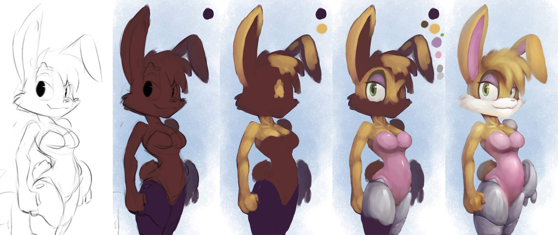
lots of folks have been asking how I've been coloring stuff lately, so I figured since I had a bunch of backups of the last one I'd use that as a poor example.WHAT I USED: Corel Painter
WHAT BRUSHES I USED: Smeary Wet Sponge [Sponges], Basic Round [Tinting], Scatter Brush [Custom Brush based on Basic Round], Digital Airbrush [Airbrushes]
THE LOWDOWN
1. First things first, I need a sketch to work with. So I borrowed a lil sketch Winstar did to work with. Once I got it I enlarged it to a hueg size to make it easier to work with (for me anyway).
2. Now that the sketch is enlarged I lift it from the canvas layer by selecting everything, cutting it, and pasting it to a new layer. Next you'll want to set the layer type to either Multiply or Gel, whatever works for you and keep the sketch layer above everything else you do from this point.
3. With the sketch lifted I took the Smeary Wet Sponge and painted a bullshit blue backgrond on the Canvas layer. I chose blue simply because Bunnie is sorta orange I guess. Next I make a new layer above the Canvas layer called Color, which is where I do every bit of the coloring of the drawing. Make sure in Painter you tick "Pick Up Underlying Color", that way when you paint on a new layer it picks up the colors from the lower layer. It's like painting on the same layer except not.
")
4. With your newly created Color layer, bring out your Basic Round tool and get ready to block in the entire sketch with a dark color. Typically I use red since it kinda blends a bit better, but I also used purple just for her metal bits. I tend to start off with the furthest area first, using light pressure on the tablet to make the Basic Round blend it in with the background layer a bit. It's a cheap way to add depth to your subject. Afterwards just block in the rest of the sketch with your color. Don't worry too much about the edges not perfectly lining up since you'll prolly do that during the touch up phase. I've left the lineart visible to show you my results, but I'll keep it off afterwards. Keep in mind that the color that you choose to block in will effect the rest of the colors you add.
Oh and by the way, use large brushes whenever possible. This makes it so you don't draw too many un-needed strokes and eventually muting the painting.
5. Ok the 3rd image isn't a good example of this step, but what I do next is block in the brightest areas. In the third image you can see a few parts where I have a little bit of color scribbled in, but the rest is blank. These will be the brightest part of that specific area. I typically set my brush to 30%-40% opacity for this phase. After I do that it's time to mold in the rest of the area. This time I typically set my opacity to around 15%-25% since its a bit easier to have the Basic Round blend when you paint. When you want to add a new part of the subject over something (say like her eyes), take the color you used to block in and paint in the shape. Remember there's no harm in going back to the lineart layer for ref.
One thing I can't stress enough at this part is to paint around the forms. In other words you need to paint this like if it was a 3D object of sorts, not a flat 2D image (even tho it sorta is lawl). Make your strokes go around the form, doing little curves and shit, and this can greatly help achieve that 3D kind of look.
6. Not everything is made of the same material, so you'll want to keep that in mind when painting other parts of your character. In this case you'll notice Bunnie's skin/fur/whatever has no kind of specular highlights, but her suit does. When it comes to metal I try to push more highlights and less midtones, although I did a very poor job of it here. With her eyes, I make the brightest part of the iris opposite to where the light source is (if light is coming from the left, the brightest part of the iris will be on the right) since irises concave I guess??? Her hair is actually just a custom brush I made up since I refuse to draw individual strands but the Variable Flat in the Oils catagory can produce a similar effect.
7. After I finish all of the main stuff I focus on some extra lighting effects and stuff such as bounced light, hard shadows, etc. I make a new layer (still with Pickup Underlying Color checked) for all of this. For the backlight, I pick up the color I used for the background layer and paint it opposite to the light source, using the Basic Round at around 5% opacity. For hard shadows, I use a higher opacity and I use the same color I used to block in. Never use black for shadows. It's ugly as shit. Similarly, don't use pure white for highlights unless its a specular. For bounced light coming off of something like say her shirt thingy or metal, I use the Digital Airbrush at the low low opacity of 2% and pick up a nearby color to where the light would bounce on and slowly apply it to whatever area needs it. For example I'd take some of the pink from her shirt, saturate it a bit, and apply it towards some of her left arm.
8. After all of that non-sense I bring up a new layer I like to dub the "Focal Overlay" using the Overlay layer type. I use this layer to highlight and darken specific areas of the drawing, while simultaneously effecting the color temperature. Using the Digital Airbrush at 2% opacity I lightly go over the area of focus with a white-ish color until whenever. Similarly I use a black-ish color to darken areas not of interest. On some occasions I make a "companion" layer called Bloom Overlay which has the same idea, but focuses on specific areas to add some cheap bloom effect like every next-gen game does these days.
tl;dr paint with light and volume until something cool happens
p.s. If you use Photoshop you can substitute the Basic Round with the standard brush at 100% Hardness, and the Eyedropper. I prefer the Basic Round as it blends while you paint at lower pressure.
UPDATED:Fuxed the final image and made few revisions.
Related content


Comments: 13

👍: 0 ⏩: 0


absolutely love your shading style. Wish I'd had something similar back in the day!
👍: 0 ⏩: 0


I have a question. Why do you work on one color at a time? ")
👍: 0 ⏩: 1

There's likely at least a 10:1 ratio of photoshop tutorials versus Corel - in fact, most Corel techniques I've seen are derived from reverse engineering Adobe tutorials to fit Corel.
If this artist is using Corel Painter, he may not even own Adobe Photoshop... just a thought.  (Wink)")
👍: 0 ⏩: 0

OOH MY GOS
i was thinking I was alone to colo like this, I'M so happy you found it too! *A* <3 Thisn is really great, love the colors use <3<3
👍: 0 ⏩: 0


Layers...
I'd love Painter (more than i already do) if it didn't fuck up the edges on transparent layers. Keeps me coloring only on the canvas so i don't end up with jaggy white shit edges...
Nice WT.
👍: 0 ⏩: 1

yea i hate that damn glitch, and they still haven't fixed it in Painter 11. The only real solution is to use "Pick Up Underlying Color", but sometimes we don't want the color to blend with the layer below it. :V
👍: 0 ⏩: 1
yeah, specially when doing grisaille; if i fuck up,i can't retouch it without getting a weird glow on the outside :U
👍: 0 ⏩: 0

Cool walkthru, even though Painter's tools give me chronic trouble however I set them, lol!
Glad to know I'm not totally stupid for always going the 'start with dark and add along' route. It would be hard to unlearn such a thing now I think hahah. Anyway good stuff, I'm sure this will help some people.

👍: 0 ⏩: 0