HOME | DD
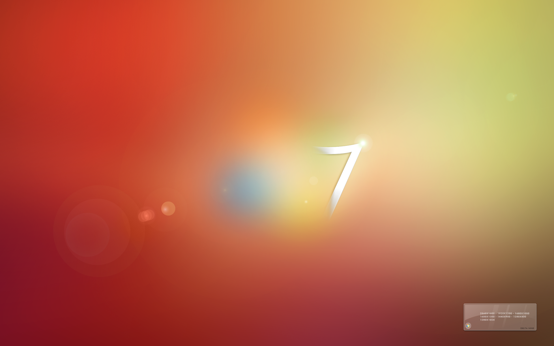
 theeverydayghost — Minimal iOS 7 Wallpaper

Published: 2013-08-15 07:15:55 +0000 UTC; Views: 7128; Favourites: 17; Downloads: 424
Redirect to original
Description
I know I'm a little late on the iOS 7 customization bandwagon, but I wanted to have a go at a new visual style and thought this would be a nice way to try it out.Also, that gradient was a pain in the ass to replicate, just saying
")
Made in Photoshop CS6, took about half an hour.
Related content


Comments: 18


I mean the top line in 7, should also produce a shadow. A more clear example is my avatar: fav.me/d6cwfwf
👍: 0 ⏩: 1

Oh I see what you mean, apologies for being rude
I tried it like that at first but I preferred just a single shadow.
👍: 0 ⏩: 0
the shadow must be inside the seven, great wall anyway
👍: 0 ⏩: 1
Why *must* it be inside the seven? I was copying a popular style which is done this EXACT way. Please don't tell me that my work is wrong.
👍: 0 ⏩: 0

Nice wallpaper man! I think the shadow is a little too long. That's all other than that this is a nice deviation (:
👍: 0 ⏩: 1
The shadow is meant to be long  (Wink)")
👍: 0 ⏩: 1
Oops sorry it looks good anyways
 (Smile)")
👍: 0 ⏩: 0

I bet it could be more minimal without this shadow, but it looks great anyway
")
👍: 0 ⏩: 1
That's the new style I was going for, I've seen a trend of long shadow minimalism so I figured I'd give it a shot. Without it, it's just the iOS 7 logo with a crappy drop shadow
👍: 0 ⏩: 1
Hehe. And what about bluring it more and mixing with background? I mean to make it more transparent or somethin'.
👍: 0 ⏩: 1
Nope, this is the style I was going for and I'm happy with it.
👍: 0 ⏩: 1