HOME | DD
 thehoverworm — +Reach+
Published: 2009-07-28 13:33:31 +0000 UTC; Views: 376; Favourites: 3; Downloads: 13
Redirect to original
Description
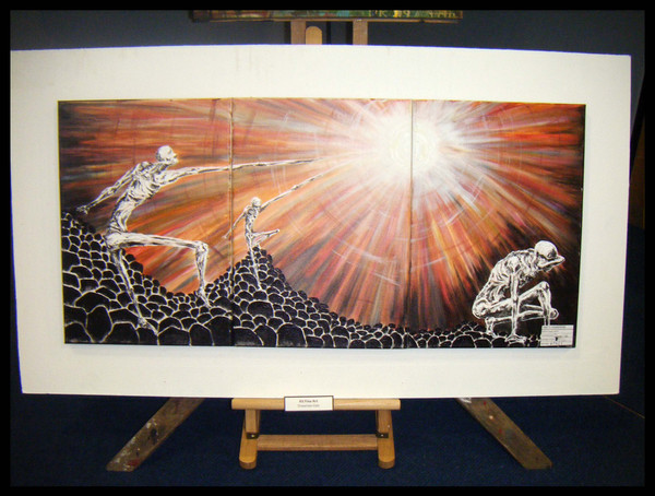
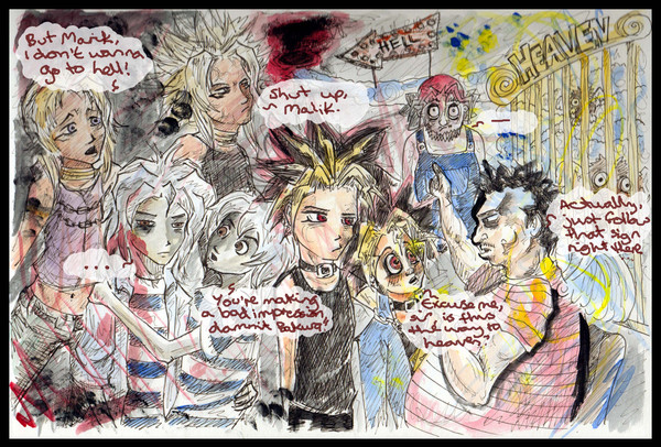
Final piece from my Unit 1 AS course. Crappy photo, cause I couldn't find a better one, and crappily rotated for your viewing pleasure.BUT DON'T WORRY, IT HAS A BLACK BORDER-FRAME.
<3
EDIT: Uploaded a different pic I found of it, once my art teacher decided to mount it and put it in an exhibition without telling me. OH, THOSE ART TEACHERS. Anyway, I think this one's a bit clearer. Your thoughts?
Related content


Comments: 16

Am loving the black boredered frame.
GAH I love the shiny light. How did you do that? I can stare at it for ages. Every time I'm in your house I stare at it. >.>
👍: 0 ⏩: 0

Shawnetta you be a right genius and no mistake, simply amazing <3
👍: 0 ⏩: 1

(another late reply haha)
Thank you, m'dahhhling. <3
👍: 0 ⏩: 0

I love this, Shawnee. It looks like its own world and the colours of the sky are amazing.
I can't quite remember the last one but in that one I liked how it was in 3 parts and it made it look more 3D and like a story
")
👍: 0 ⏩: 1
Thank you! I really hope the examiners think the same.
&& I really can't decide which photo's better... This one is obvs more professional and mounted and stuff, but the other one was a bit tilted like a storybook. HMM. D:
(Also, that mounting was non-consensual! Aww, but they do care. OR are just wankers.)
👍: 0 ⏩: 0

I like the colours and the skelleton figures. nice details
👍: 0 ⏩: 1
Thank you very much! <3
👍: 0 ⏩: 1
")


I love this, all the colours used in the lit up sky (really looks like light as well, like when you see all the colours coming from the glare from a lamp or something!) and the contrast between them and the monotone figures in the foreground.  (Smile)")
Either way, very awesome piece.
👍: 0 ⏩: 1
The triptych thing was mostly because Dean was all "GET CANVAS" and I had no idea what I was going to do, so I got a few so I could leave one out if I chose, but SSSSHH, people don't need to know that. =3
And thank you very, very much for the nice words! It's amazing how long the sky took in comparison with the figures, just cause of all the bloody colour layers. I wish the texture had shown up more though - I spent ages adding more layered paint on each of the rocks and figures to make it look purdyer. >_<
Thanks again! <3
👍: 0 ⏩: 1
Haaha, good one. ;]
=[ Well photos are always deceiving, I'm sure it's way more textural IRL. Even so it looks great here!
👍: 0 ⏩: 0
")

👍: 0 ⏩: 0