HOME | DD
 thejagman22 — Pencil and Notebook Design
Published: 2009-03-06 20:13:40 +0000 UTC; Views: 3069; Favourites: 24; Downloads: 325
Redirect to original
Description
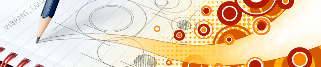
A recent banner design for a website that's not quite online just yet. The notebook and pencil are from photos(although they are separate entities - shadowing added manually), the text and notebook illustrations were achieved using Adobe Illustrator and customised brushes, and the circle design to the right was made in Photoshop which was also used to compile all the elements.Related content


Comments: 12

Great way of combining traditional and digital feel as one; I love the transition
 - :D")
👍: 0 ⏩: 1


This is a great design! I Really like the transition on the paper. It feels like a short commercial taken in one shot.
👍: 0 ⏩: 1

Thanks a lot- it's far and away everyone's favourite in my gallery.
I can't really understand it as there's loads of others that I myself prefer.
Maybe it's more accessible or something- ie. not just appealing to specific tastes?
Anyhoo..
 - :p")
👍: 0 ⏩: 1
you know why...cause the art you created goes from (imaginary) into (real life) and every artist can relate cause our brains are half in reality and half imagination. (LOL)
Bravo! Well Done!
👍: 0 ⏩: 0

Nice work. Maybe you should make some of the circle designs blend from pencil to digits like your swoosh? That might help make it look more integrated rather than two designs put together
Nice job on the illustrator designs, do the brushes you used already look like pencil markings or did you do that?
I can definitely see this as a web banner.
👍: 0 ⏩: 1
Thanks for the comments. Interesting you should mention the transition between the pencil cicles and the colours. I did try a couple of things, none that I was all that happy with, so I just sort of attempted to use the pencil stroke to unite the 2 parts. Maybe, I didn't really pull it off.
The site's actually up now [link] .
The pencil brush I sampled myself from an actual pencil line. I've done a similar thing here but with a pen:
:thumb129441518:
👍: 0 ⏩: 2
You know, seeing it on the site really makes a difference, it just fits. Especially with the way the two sections of text are split just under the two sections of the art. The gradient from pencil to ink on the swoosh just ties it together.
I think if I had been making this, I probably would have encountered the same thing, though: wanting to try to make more transitions between the circles but not liking the result. It works the way it is now, and upon 'further review'  (Wink)")
That's a pretty snazzy website by the way. Congrats on getting your art on there. Do you work for them or was it commission?
👍: 0 ⏩: 1
Thanks a lot for all your comments. They're really valuable.
I do indeed work for that company and I actually designed the overall look and feel of the website, as well as the various graphical elements, so glad you like. It was put together by an associate of mine as my HTML skills are pretty woeful.
Thanks again.
👍: 0 ⏩: 0
Damn - I was referring to this.
[link]
👍: 0 ⏩: 0