HOME | DD
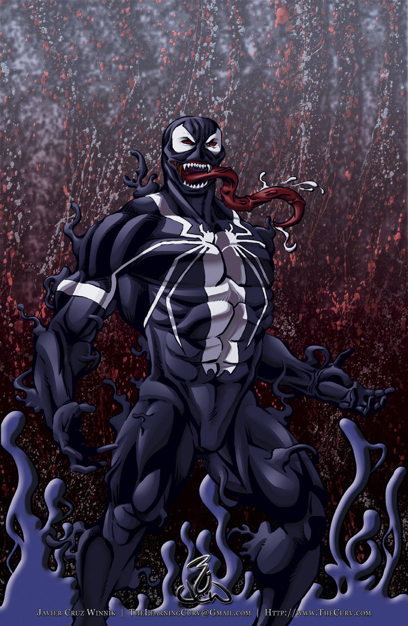
 thelearningcurv — Commander Tutorial.....

Published: 2009-05-01 03:59:21 +0000 UTC; Views: 4012; Favourites: 49; Downloads: 89
Redirect to original
Description
I felt that because I've learned so much from being here and watching so much great art in the last two years, i'd share my experiences with you guys.1. the pencils
2. the inks (this layer is at the top set in Multiply)
3. I added a layer of green under the inks, started erasing where I felt the most light would hit Cobra Commander (CC) and slid the opacity to 65% and used a Multiply setting
4. I then put a layer above it and laid out the flats at 100 % opacity and actually had a screen capture from the cartoon on adultswim.com and used the eye drop tool to get the specific colors I wanted.
5. I added highlights on a layer above the flats set to Lighten @ 100%. it seemed to still let the original colors shine through while making the colors on that layer a bit vibrant (I may be wrong but thats what I think it did)
6. Here is another layer above the highlights and everything else that I added some red tones that I felt would be present in the lighting I'd later show
7. New layer, set to multiply @ 100% where I selected the snake emblem, used some brushes to add some textures and then once I was satisfied with that, I darkened the background with some red tones. No need to lower the opacity here, the Multiply helps to make sure what's underneath is seen.....
8. Here on a new layer I selected the Commander and actually set the later to Multiply but at 40%. With the Snake, it is suppose to be like a stature of some sort, so the textures coming through hard is good for that weighty feel. On the Commanders clothes and mask, hard textures would take away from it's softness in the cloth and would take away from the Masks nature metalic sheen, so I left the opacity low.
9. New layer, multiply @ 25%. If you look all the way at the bottom, I show how i fill an area or the whole piece and then take away, or erase, what i feel isn't necessary. So here I filled the piece with black, lower the opacity so I could see the work I've done, and started erasing. I made sure the areas that would get the least light had the darker tone in it and then played with the opacity til I felt comfortable with the results.
9. Same thing here as #9, but I did this with brushes instead of a fill. Once I felt that the brushes left the right mark, I decided i was basically done... but i needed one more thing and that was....
10. Background layer. This layer is behind everything so that it doesn't interfere with anything and helps establish the type of environment the commander may be in .....
I wish I had time to break the image down even more like I did in the bottom area of this tutorial, but hopefully this helps those of you who it can help.
For those of you who find anything here that I could do differently or more efficiently, I would love to hear it=] it can only make me better=] thanks guys=]
Related content


Comments: 34

 (Smile)")

Great breakdown of the process, & great drawing of one of my favorite characters of all time. Props!
👍: 0 ⏩: 1

thank you my fine feathered friend=]
👍: 0 ⏩: 0

thank you and nooooooooooo problem=]
👍: 0 ⏩: 0


this is truly an amazing tutorial and it's spoon fed really lol
great job
much love and respect
👍: 0 ⏩: 1
There are times I've had a hard time understanding the tutorials I've read and seen so i tried the best I could to do a good one.... had I actually done this with the intent on making it a real tutorial, i would have done it a bit more comprehensive, but I am glad it helps=]
👍: 0 ⏩: 1
well you can go into more details in some areas but it's quite understandable as is, again great one and a real tutorial
much love
👍: 0 ⏩: 0

heheh good stuff=] hope it helps ya out=]
👍: 0 ⏩: 0

Watching the progression of a drawing, especially this good, is great.
Thanks for sharing!
👍: 0 ⏩: 2
glad I could oblige =]
👍: 0 ⏩: 0
Btw, I think the BG is a little too dark.
👍: 0 ⏩: 0


Thank you very much! This has been very enlightening.
👍: 0 ⏩: 1
wow, that works, thats what I'm hear for=]
👍: 0 ⏩: 0
")
a few hours, maybe 5 or 6 at most after inks.....probably 10 to 12 totally.....
👍: 0 ⏩: 1

Wow that's a lot of time, but it was worth it I say!!!!!

👍: 0 ⏩: 0


Thanks man, this is actually helping (some). I just can't seem to get the whole nice grey scale bit : (. Never cannn.
Great work though and lovely pic, especially when the movie is round the corner!
👍: 0 ⏩: 1
what I use to di was try to apply a light black/gray tone to the areas I thought needed shadow, btu I felt that the overall image is strengthened by adding the tone you want as the shadow, and erasing away the areas you think the light will be hitting. It's like drawing a dark shape and erasing where the highlights will be to help form the shape..... play with the brushes too during that stage, it'll help develop the look you want.
👍: 0 ⏩: 0

lol thatworks.... let me know if it helps=]
👍: 0 ⏩: 0
I just added some text that may make you change your mind
👍: 0 ⏩: 1

Indeed. Much better. If I were you, I'd put the text into the image file though. As this is, it's not really a save-able tutorial.
I like your penmanship, btw.
👍: 0 ⏩: 1
I think that may be a good idea....
I may do it tomorrow, i am really tired right now....
👍: 0 ⏩: 0

no problem, hope it helps some=]
👍: 0 ⏩: 0