HOME | DD
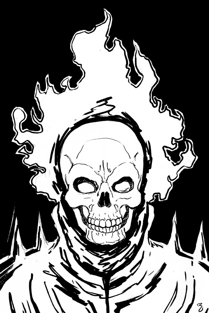
 thelearningcurv — Con practice - Ghost Rider
Published: 2009-02-06 04:11:30 +0000 UTC; Views: 2190; Favourites: 29; Downloads: 30
Redirect to original
Description
I set up a journal to help me practice and get in the zone for NYCC and this is the eighth character suggested byI haven't drawn Ghost Rider since I was a kid, it was nice drawing him again. He's one of those characters though that is very simple but very intricate at the same time with the leather outfit and the bike, so I choose a simple SIMPLE way of presenting him so I can get it done quick and nice. Since it was SO simple, I thought I needed to at least ink it=] Had fun=]
Related content


Comments: 26

Ghost Rider really looks bad-ass! I like it!
")
👍: 0 ⏩: 1

good stuff=] I think I need to do some more of these....
👍: 0 ⏩: 0
Foot up a dogs ass, Bang Bang bang! heh (name that movie) Glad you dig it man=]
👍: 0 ⏩: 1

I am lost to that one.
👍: 0 ⏩: 1

I'll be there all weekend, in podcast alley at Da Fixer's Hideout's booth=]
👍: 0 ⏩: 0

 (Smile)")
heh that works=]
👍: 0 ⏩: 0


glad you like it man=]
👍: 0 ⏩: 0

thanks a lot=] what do you like about it?
👍: 0 ⏩: 1

Well, I've always liked the high contrast black and white look, and your gallery has a lot of that, but this one in particular I really like, because it looks more stylized, rather than the cleaner super hero pics. Makes it look appropriately darker.
👍: 0 ⏩: 1
interesting way of explaining that, thanks for that=] I will be taking that into account=]
👍: 0 ⏩: 0

I really love the loose lines you used for this one. Great job!
👍: 0 ⏩: 1
cool, I was a lil worried about it but it seems it's something people are digging, so I can dig that=]
👍: 0 ⏩: 0

I think it's the 9th actually. All that's left is 9 a NY Jedi it seems.
👍: 0 ⏩: 1
it's the 10th cause I skipped 9 to do a quicker drawing.....
👍: 0 ⏩: 0

Very nice. Really like this, the inking really helps the piece have that darkness that the character should represent.
Just have to say, that chin looks very Skrullish... I wonder...
👍: 0 ⏩: 1
lol maaaaaaaybe lol glad you like it bro=]
👍: 0 ⏩: 0
