HOME | DD

ThemeFinland — Risk and reward by-nc-sa

Published: 2013-05-20 09:10:37 +0000 UTC; Views: 2166; Favourites: 51; Downloads: 26
Redirect to original
Description 
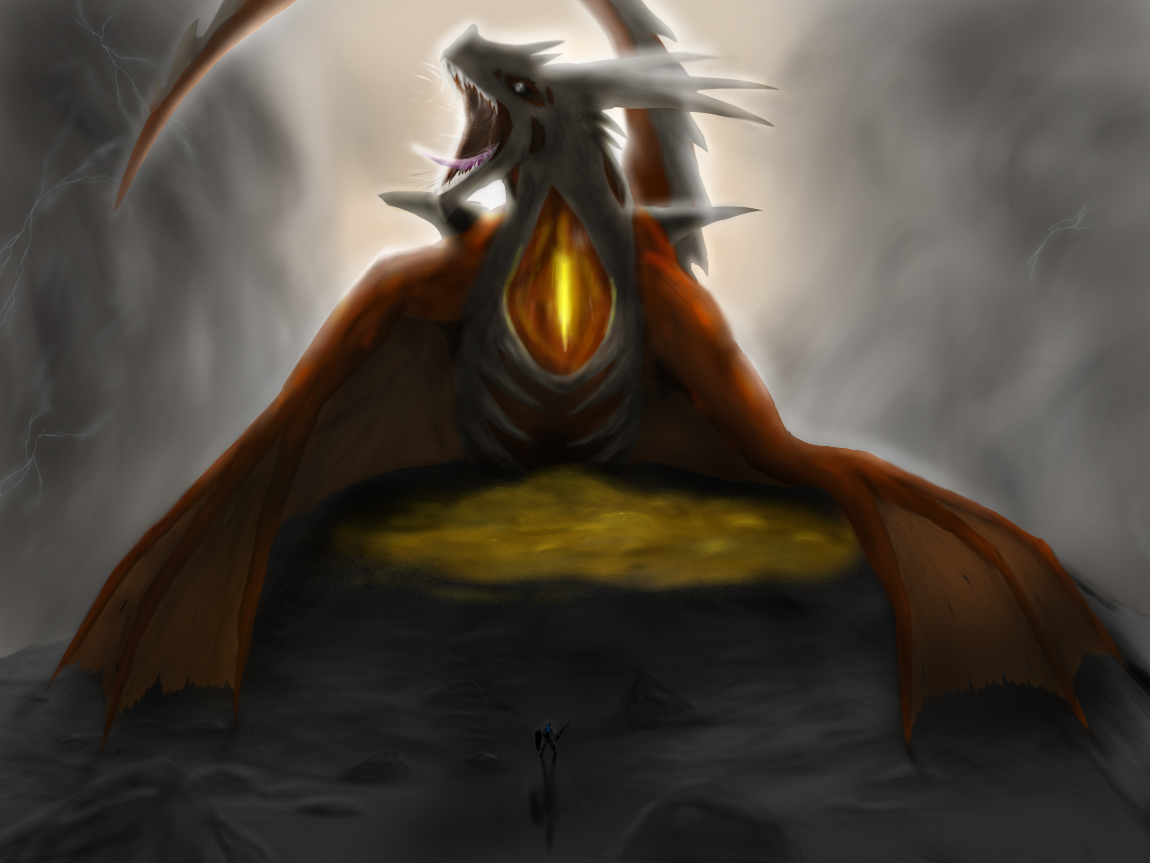
Looks like this knight misjudged his dragon slaying abilities.
Edit: Added a bunch of little shading details and improved the look of the gold pile
Related content
Comments: 15

Jdrawer01 [2017-05-06 18:41:40 +0000 UTC]

What's that thing on its neck?

👍: 0 ⏩: 0

kaburninator [2013-05-30 15:51:15 +0000 UTC]

whats that on the neck?

👍: 0 ⏩: 0

10animallover10 [2013-05-30 14:35:49 +0000 UTC]

O.O that dragon is huge O.O

👍: 0 ⏩: 0

Dragoness17 [2013-05-23 10:34:27 +0000 UTC]

Oh dear. That dragons only needs to flop forward and the knight is history xD

👍: 0 ⏩: 1

ThemeFinland In reply to Dragoness17 [2013-05-23 20:12:25 +0000 UTC]

haha, yeah that knight sure should have stayed in bed this day

👍: 0 ⏩: 0

RedWingsDragon [2013-05-23 07:08:00 +0000 UTC]

Awesome work here

👍: 0 ⏩: 1

ThemeFinland In reply to RedWingsDragon [2013-05-23 20:12:34 +0000 UTC]

thank you

👍: 0 ⏩: 0

VoidOfValor [2013-05-22 05:28:52 +0000 UTC]

That knight has seen better days Awesome work! I especially love the dragon's design

👍: 0 ⏩: 1

ThemeFinland In reply to VoidOfValor [2013-05-22 08:24:15 +0000 UTC]

Haha, for sure Thank you, I think it's one of the best looking dragons I've done so far

👍: 0 ⏩: 1

VoidOfValor In reply to ThemeFinland [2013-05-23 05:34:14 +0000 UTC]

You're welcome The bone "armor" definitely was a cool addition

👍: 0 ⏩: 0

Virensere [2013-05-21 19:32:13 +0000 UTC]

Woah, looks really nice!
Your style is really interesting, and i mean that in a good way!

👍: 0 ⏩: 1

ThemeFinland In reply to Virensere [2013-05-22 08:21:25 +0000 UTC]

Thanks My style probably is just due to the fact that I tend not to look up any tutorials/references for anything so I usually develop my own ways of drawing different things

👍: 0 ⏩: 0

gabrielIgnitus [2013-05-20 21:25:09 +0000 UTC]

maybe some more detail on the golden thing between the dragon and knight would give this something more than the aspect of yellow lava.

👍: 0 ⏩: 1

ThemeFinland In reply to gabrielIgnitus [2013-05-21 06:31:44 +0000 UTC]

Good point, I've never even tried to try to draw a pile of gold or anything similar, so I definitely need some practice on that. Maybe it would look better with a bit more shading.

👍: 0 ⏩: 1

gabrielIgnitus In reply to ThemeFinland [2013-05-21 20:06:24 +0000 UTC]

I would draw more lines and not leave that "gold" floating like particles in the air...

👍: 0 ⏩: 0