HOME | DD
 TheRavensBastard39 — Aesli Garravant
#aesli_garravant #anthrofox #anthrofurry #anthrogirl #digitalart #fantasy #fantasycharacter #foxgirl #magicalgirl #femaleoc #fox_girl #anthrocharacter #furry_oc #female_oc #anthro_female #anthro_furry #anthro_fantasy #anthro_girls #anthrofemaleoc #anthrooccharacter #theravensbastard39
Published: 2017-09-16 01:04:51 +0000 UTC; Views: 1321; Favourites: 50; Downloads: 7
Redirect to original
Description
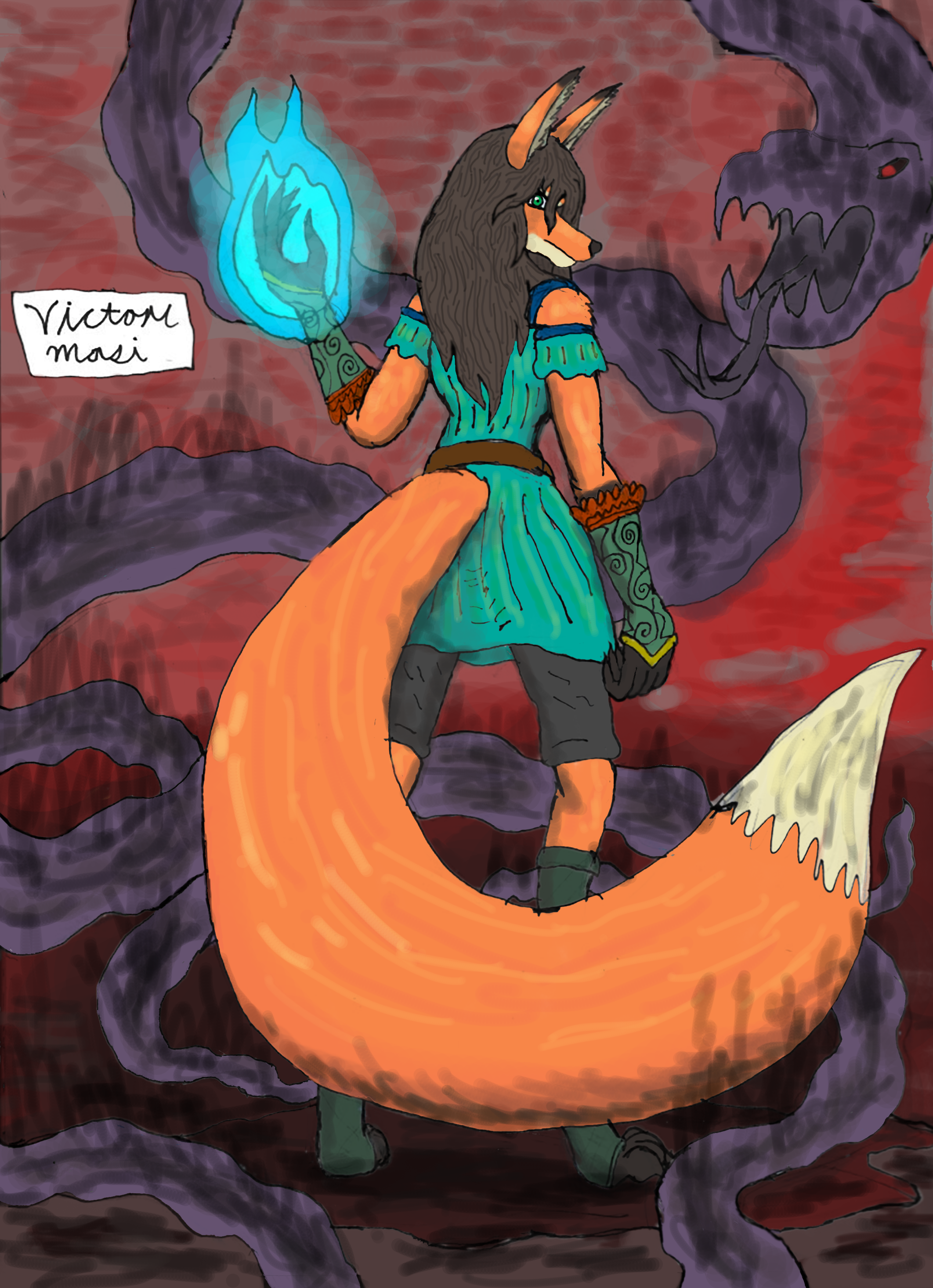
Looks badass, no?The Fox sorceress in training is my OC Aesli Garravant
Link to page 1 of her comics debut:
theravensbastard39.deviantart.…
Related content


Comments: 18


The Artist's style does recall Japanese anime without the overly exaggerated features and free of the often grossly sexualized design that often spoil otherwise fine artworks.
The style of this piece is very free and allusive,The pose of the main character is striking and unusual ,The better to show off the magnificent brush.The concept of mystical sorceress in the form of a fox recalls the Japanese fox deity Nine tails,The character's head however resembles that of the Egyptian God Anubis.
I am unfamiliar with the character unfortunately but I find the image as a piece of art fascinating and compelling.
👍: 0 ⏩: 0


The character and setting within this piece look very much alive and vibrant. The personality of the character and her story shine through merely by her expression and pose. The design is original and the technique is smooth, awe-inspiring and unique. The colors used to reflect the situation are on point and eye-catching. Once again the smallest details are not overlooked and there can be much to learn from the character or to guess at merely by, looking at the portrait that reflects her nature and the nature of the environment around her. A truly biographical piece of unique art.
👍: 0 ⏩: 0

This picture does have the feel of epicness. The character design is really nice and the details all a nice touch.
Though I have to say the line art is a bit wobbly and messy in some places, I suggest seeing if your art program has a "stabilizer" and try to finish each line with one stroke.
The coloring is pretty solid so I don't have many complaints there but there are some white edges and some problems mostly caused by the line art.
The shading looks a bit lazily done. It's looks like it's been sketched in with a black color, sometimes it goes through the line or doesn't even touch the line. It's also hard to tell the light source, I say the fire in her hand would have been a good light source and the lighting could have been a interesting color which is blue, though yellow is not a bad lighting choice.
I can't really tell what the background is suppose to be maybe because it's also very messy and doesn't really have any discernible details. But if it was a more simple background then it would work if a bit messy.
Now onto anatomy. I'll say most of it is pretty good and pleasant to look at, the ones that stand out though is the left arm. It's awkwardly angled and the proportions don't seem right. The hands seem a bit big but I don't know if that's a stylistic choice or not. I feel like if there was more visible fur that sticks out of the body it'll seem more like it's covered in fur then a plastic or skin body, that problem really does show in the tail the most cause foxes tails are usually very fluffy. The texture on the hair makes it look more like wood then it does hair, I think doing long individual strands that connect to the outer part would be better then lots of individual short lines that don't really connect to anything.
But once again I think this is a pretty solid peice, it did not hurt my eyes, and it was pretty pleasant to look at. I hope I didn't come off as rude in this. I hope to see you improve and you do seem like a very promising artist!
👍: 0 ⏩: 0

Hello I am here from
First of all, as a whole, I like the colors. The bright orange paired with a tealish color really draw your eyes to the main focus of the piece; the fox.
For the lines (like the lineart before it was colored) look a little shaky and are broken in some spots, but that could have been intentional. If not, try using fast quick strokes, as going slow leaves time for more mess up in the lineart.
Her hands look a little large compared to the rest of her body, but hey, no one is good at drawing hands. Just keep practicing at them.
The snake is a wonderful addition to the back round. It makes it so there's not just a boring plain color on the back, which in turn makes the fox herself pop out even more. So super loving the snake
The positioning of the fox is really nice. It gives it more of a mysterious quality, which is what I think you were trying to go for. If so, it was noticed!
Finally, the brushwork. It's good in some spots, but for the most part there are circles and random lines in each color stroke. It really looks like random scribbles, but it can be fixed, depending on the art program you use. I recommend Paint Tool Sai and if you do use that, then a way to fix the blotchy strokes is by using a small canvas/brush size, or mess around with the details of the air brush. I personally like it to be set at density 100, the smoothest quality, 52 edge hardness, and max dens prs at 100%.
All in all, I really like this piece! (Especially the fox's outfit lordy I love that.) Keep up the good work!
👍: 0 ⏩: 0

Hello, I saw this cool painting on ProjectComment !
First off, the character looks very interesting! The clothing is well detailed, and the posing gives her a fair bit of personality. The concept itself is also intriguing and well presented.
I think however the brush work is the weaker part of the piece. If your computer can handle it, I’d recommend lowering the Spacing attribute in your brush settings, to avoid visible “circles” in your shading. You could also try playing around with the Opacity and Flow settings, since it looks like right now there isn’t a lot of opacity variation, which makes the shading kind of harsh-looking.
The shading could also use more direction. Picking a clear light source is good practice to give a scene its mood and depth, so for example you could decide your main light source comes from the top left, so each element would have shadows towards the bottom-right. The blue ball of light would also create highlights on anything close to it, mainly the arm and hair.
Lastly, the lineart could also be a little cleaner. Nothing wrong with giving it a rough look, but it would have to be consistently rough, whereas right now areas here and there have lines intersect or suddenly get thicker or thinner. Making clean lineart is tough, but it can really be worthwhile to take the time to go over it and make it more consistent. It seems it was inked on paper, so you could potentially just clean up digitally wherever needed.
Still though, you’ve drawn a very interesting scene showcasing a cool-looking character with pretty good anatomy, nice clothing design and an intriguing creepy snake monster, too! You can really tell there’s a story behind this, which makes it even better.
👍: 0 ⏩: 0


I wish good fortune onto you in all your endeavors
👍: 0 ⏩: 1
Welcome I wish I had the talent to draw my OC's
👍: 0 ⏩: 1
It's all in the practice my friend. You get netter the more you do it.
👍: 0 ⏩: 1