HOME | DD
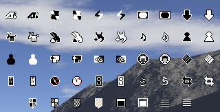
 theRealPadster — RetroPixel v0.74
Published: 2010-08-20 00:20:10 +0000 UTC; Views: 9701; Favourites: 26; Downloads: 1306
Redirect to original
Description
A retro theme made to go with my Digital pack ([link] )________________
Icons from:
[link]
[link]
[link]
and me, of course.
_______________
Many icons were modified by me in some way.
____________________________
Made to go with my Digital theme pack.
On OpenDesktop.org:
Metacity/Gtk2: [link]
RetroPixel icon theme: [link]
Digital Cursor: [link]
Digital Gtk: [link]
On deviantArt:
RetroPixel icon theme: [link]
Digital cursor: [link]
Digital Gtk: [link]
______________________________________________
Changelog:
v0.74 - January 2, 2011 - More icons (gnome-sound-properties, gnome-display-properties, ubuntu-tweak, gnome-system-monitor, world of goo, changed terminal icon)
v0.73 - November 28, 2010 - More icons (OpenOffice.Org suite, miro, wormux, openarena, mame, gparted, tag-editor)
v0.72 - September 23, 2010 - More icons, removed lots of unneeded files
v0.70 - September 6, 2010 - More icons, bug fixes
v0.68 - August 31, 2010 - Still adding more icons
v0.67 - August 23, 2010 - More icons, bug fixes
v0.65 - August 18, 2010 - More icons, bug fixes
v0.6 - August 17, 2010 - More icons...again
v0.55 - August 11, 2010 - Added tons more icons, fixed a few bugs
v0.5 - August 10, 2010 - Added tons more icons, fixed a few bugs
v0.4 - August 9, 2010 - initial release
Related content


Comments: 10

Good idea, but i'd suggest looking at some pixeling tutorials before attempting to draw yourself.
👍: 0 ⏩: 1

Thanks. I know, I probably shouldn't do the scaling and outlines seen in some of them, but it didn't seem like enough pixels to capture the icon without it :/
👍: 0 ⏩: 1
Indeed if you search for good pixel art tutorials they explain how to cleanly represent some shapes depending on the perspective. Your arrows and circles need work, for example. And there's improper scaling in quite a lot of icons (one side thicker than the other and so on). I'd suggest using integer scaling and keeping the square ratio, at the very least.
👍: 0 ⏩: 1
I see. This project is dead, though, I'm just going to leave it as it is. Thanks, though
 (Smile)")
👍: 0 ⏩: 0

")

thanks! pixels are nice, no?
^^
______
yay for duplicate comments!
👍: 0 ⏩: 1
tho the first one was for my new cursor...
👍: 0 ⏩: 0