HOME | DD
 thescotters — snatch poster B.
Published: 2005-12-05 23:51:41 +0000 UTC; Views: 13266; Favourites: 59; Downloads: 711
Redirect to original
Description
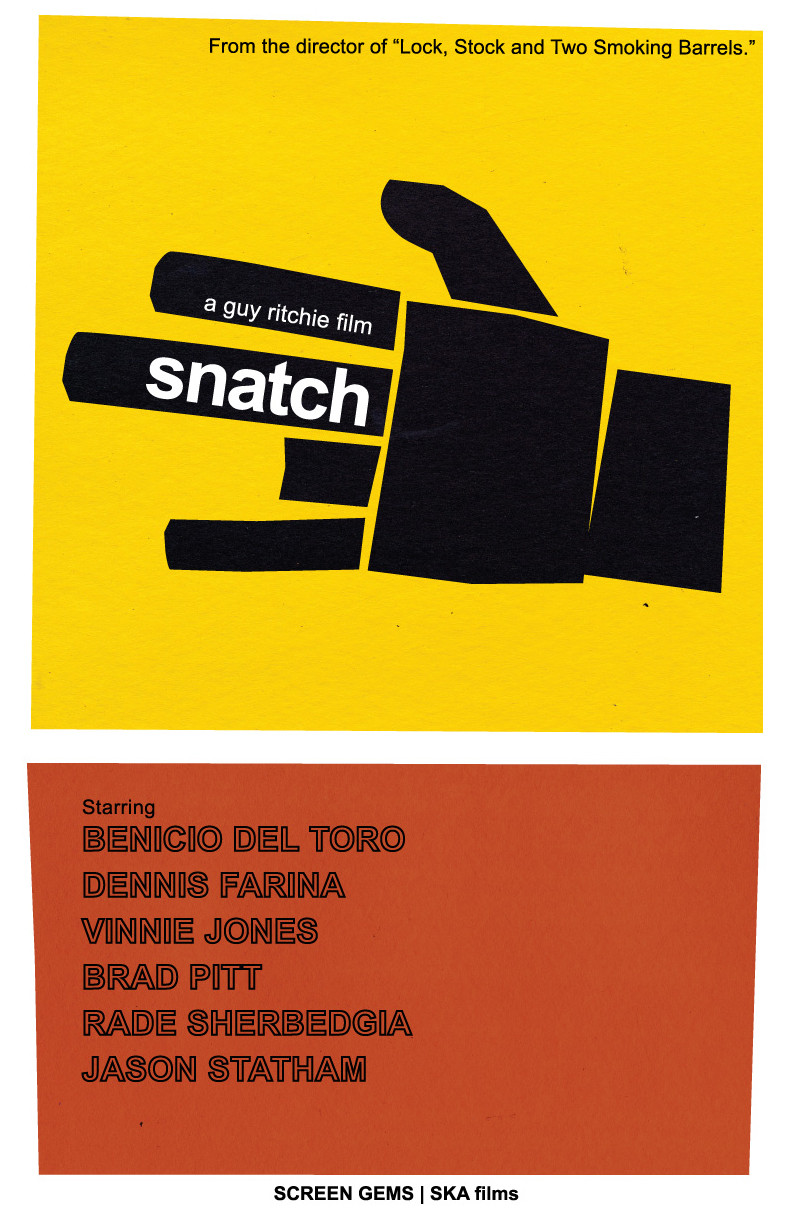
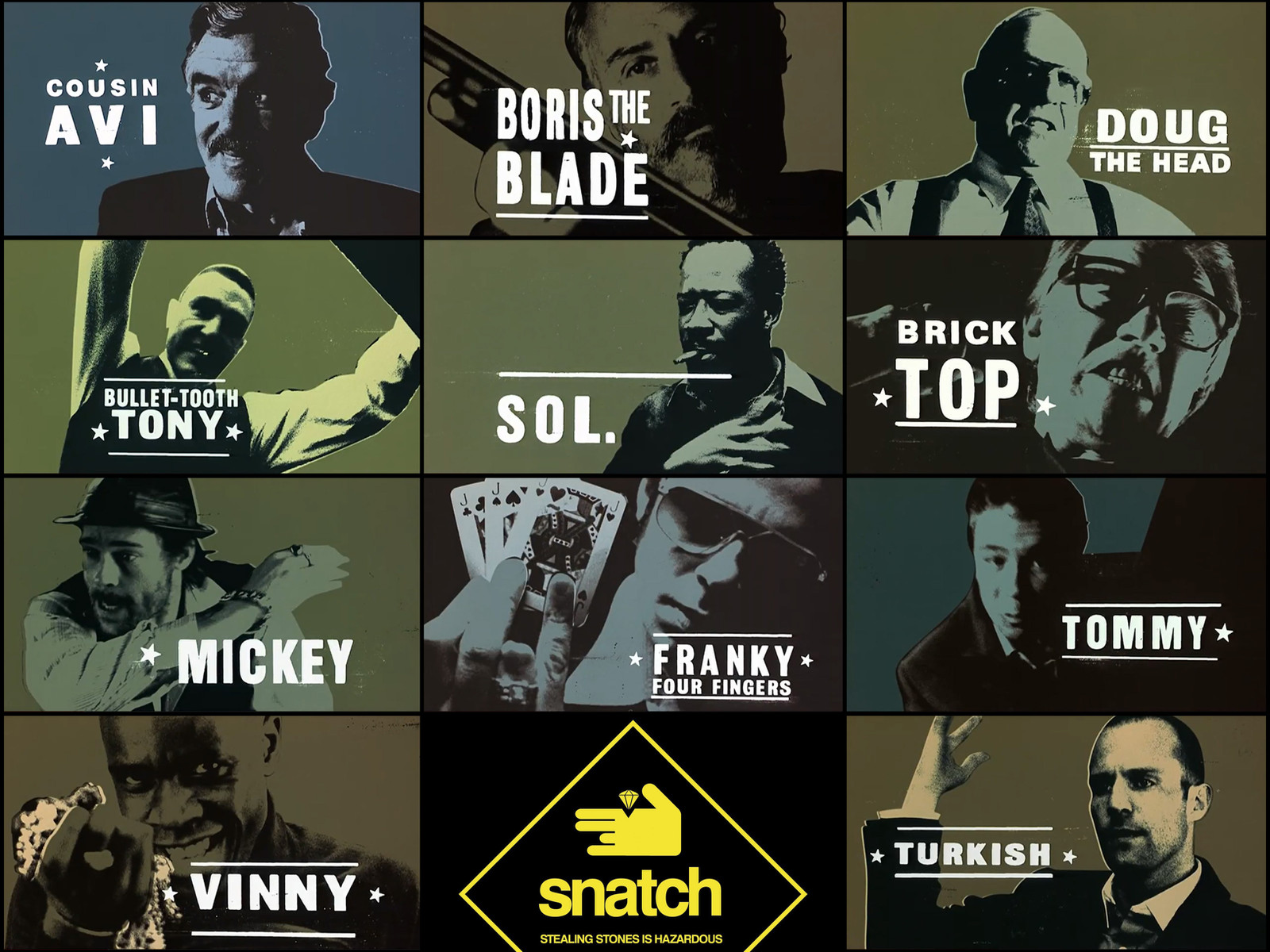
done for my history of graphic design class, this was done with the methodology and style of famous designer saul bass in mind. he was known for using cut paper, simple, robust shapes and illustrative typography, as well breaking design down to a single, simple image.i designed promotional posters for guy ritchie's films "snatch" and "lock, stock and two smoking barrels" [two posters per movie]. for each i scanned in cut paper, manipulated some of the coloration in photoshop and did all the laying out, putting together, and messing with shape and size in adobe illustrator. type was done in that program as well.
of all four posters, this is the only one that directly mirrors one of bass' own pieces, a poster for otto preminger's "the anatomy of murder."
here's to you, saul. and guy ritchie, geniuses that you both are:
snatch poster A: [link]
snatch poster B: you're lookin' at it
lock stock poster A: [link]
lock stock poster B: [link]
Related content


Comments: 9


that would be the perfect book cover for me, in my humble opinion. like this alot!
👍: 0 ⏩: 0


 (Smile)")

DUdE I LOVE IT!
Anyway you could make it super huge? I want a Snatch Poster, but they all suck...
👍: 0 ⏩: 0


Nice! Sweet colors and composition. The only thing that bothers me is the top text "From the ..". Maybe its the font :/ Besides that, it is awesome
👍: 0 ⏩: 0

that is a classy take on the saul bass style. and it really gives a simple image that is still important to the story.
👍: 0 ⏩: 1

thanks much .. glad to hear i did mr. bass right.
👍: 0 ⏩: 0