HOME | DD
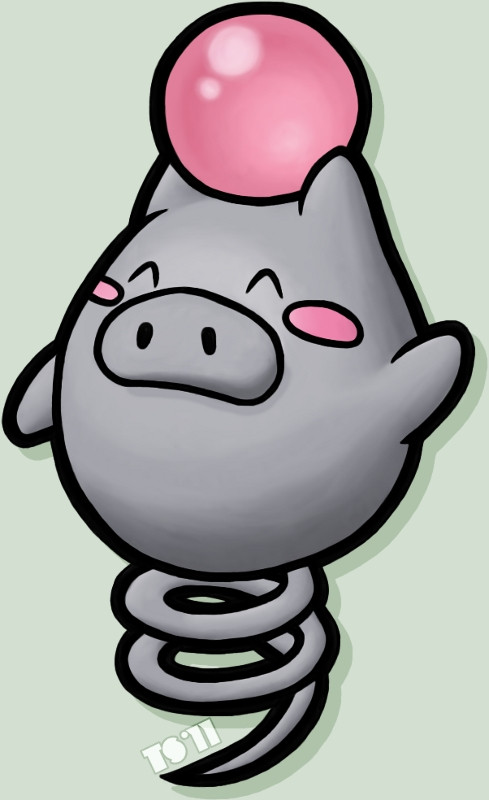
 TheSerotonin — Bouncing Psychic Pig
Published: 2011-05-05 23:21:16 +0000 UTC; Views: 2325; Favourites: 47; Downloads: 13
Redirect to original
Description
Part of the mini-series I've got going on, it's everyone'sfavourite pig with a bouncy tail that holds a Clampearl's pearl!
And no, I can't be bothered drawing Grumpig yet, that'll come
sometime later.
Anyways, I took the liberty of experimenting a bit with this,
specifically the shading. I tried blending it differently, so the
result looks a bit more paint-y (I'm bad at describing things).
What do you think, better? Worse? Indifferent?
Pokémon © Nintendo
Other parts to the mini-series:
Related content


Comments: 3

It almost looks like it could be in a real game with its smooth shading. The thick outline mostly gives it away though. I still like it despite that.
👍: 0 ⏩: 0

Better. This shading makes the picture look less flat, but... I don't know. It's like you missed a layer of gray between the lightest and darkest tones, or the darkest part is too uniform. Still, it's absolutely beautiful.
👍: 0 ⏩: 1

You've got a good eye, I did miss a layer of shading, only because experimentation of the blending was my primary goal here. Although I suppose if I really wanted to see what it looks like, I should have done the shading like I normally would instead of skipping some of it. I just figured that since it's such a simple design, I didn't need to bother trying too hard. That, and I did some of it late one night when I wasn't really in the mood to, haha.
👍: 0 ⏩: 0