HOME | DD
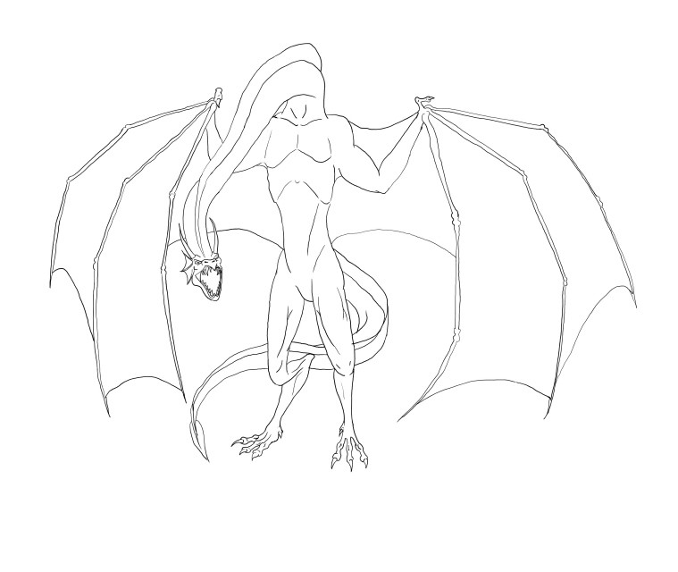
 thespaceinvader — Wyvern clean lines - WIP
Published: 2005-10-20 15:20:48 +0000 UTC; Views: 84; Favourites: 1; Downloads: 10
Redirect to original
Description
WIP shot of my latest. Needs colour, obviously... I hope to get a more American/Marvel comics look... I need to research digital inking techniques to get the shading right...And i know that the neck is a little long, but looking back it'll be difficult to fix...
I am particularly pleased with how the head came out. looks a lot better than most of my attempts at dragon heads from the front...
Related content


Comments: 15

The design is nice, but you coud improve the composition... why don't you try doing the neck with a smoother curve? You could curve the spine, while you are at it, it would make him look more graceful and dynamic
👍: 0 ⏩: 1

Bring the shoulders down so the neck is pointing forward not down? I think it is something to bear in mind for next time... Changing it that much is a somewhat daunting proposition at this stage.
I'm definitely going to do something about the head, though.
Thanks.
👍: 0 ⏩: 0

oh one other thing, there's a dutorial about how to do chothing, like draping stuff that might help w/ the shading difficulties. i know not really the same thing, but the principles are the same. i think it's in my fav file.
 (Wink)")
👍: 0 ⏩: 1
I might have gotten to it...
I have a couple of clothing tuts around.
👍: 0 ⏩: 0
heyo it looks good.
and since you've had loads of comments about the neck length i won't go there, but the way the neck attaches to the body is a little off. Sorta looks like u were drawing a man with wings and then uot a dragon neck on him. Might be the adams apple lines (ditching those might help and wouldn't be over hard to try and decide if that works).
As well, and i'm not super sure if GIMP will do this, the head although fabulous in it's style and detail seems a bit small. I know u can highlight specific things in Photoshop and enlarge them within a picture, so you could prolly do the same in gimp. Either way, b/c the head is essentially in front of the body due to the neck and stuff, it should be a bit bigger just due to perspective
not that i'm that great with perspective, but i think if the head was bigger it'd bring the neck length in a bit without u actually having to shorten it. And it would add dept to the picture.
Anyways, on a whole it's really good.

👍: 0 ⏩: 1
I did think about making the head bigger, to be honest, and moving it up the neck a little. I'd have to redo the inking if it enlarged it too much, but that's easy enough. I think you're right... I'll give it a shot.
And WRT the neck/shoulder anatomy, i think you might be right there too. I did try for some batlike anatomy, but i didn't bother with reference... I'll look something up and see how the shoulders work...
👍: 0 ⏩: 0

It's not bad ")
I could probably fill you in on some digital inking techniques if you want, though my stuff tends not to look like marvel stuff once it's inked, (I wish!) that's more of a traditional deal. What program are you using to ink? Photoshop? If it's photoshop, and you don't have a tablet, there's still some fun stuff you can do if you learn to use the pen tool well. If it Isn't photoshop, well then Idunno. haha. A basic rule of thumb when inking is that you want lots of line variation. Usually around the outside of the character, the outline is much larger than the inside. (say the difference between 5 and 3 pixels) but that's usually depending on the style as well as the context of the image. Your best bet is to look at some of your favorite marvel images, find the inker that did them and study his work, being that most inkers work differently. But yeah, if you want some inking tips for photoshop i wouldn't mind giving you some.

👍: 0 ⏩: 1
I use GIMP. I think it is more learning where to shade than learning how, though... It is probably just practice that i need...
Thanks for the tips, hough, i'll bear them in mind.
You might be right about the head, too. It would be kind of an awkward angle to have you neck at...
👍: 0 ⏩: 1
Ahh, the good old GIMP. Can't say I've ever used it to be honest. 
👍: 0 ⏩: 1
GIMP has quite a learning curve, and a very awkward interface, bhut other than that it's good. i was thinking of trying out inkscape for vector inking as well, see what it's like...
I should probably try some on-paper inking too, in my spare time...
Thanks. i will, of course ^_^
👍: 0 ⏩: 0

whoah, wicked. It's a little disorienting with his neck extending his head that far down, but really, it's an awesome pic.
👍: 0 ⏩: 1
Thankies. I might do something about the neck in the end. If i extended it up it would be almost as high again as the main body... But her, it's a wyvern who needs realism. I like it...
The crest might also be contributing to the wierd look...
👍: 0 ⏩: 1
I like it to really though! I didn't mean to say that I didn't
👍: 0 ⏩: 2
*is utterly confused*
alright, back to basics, I love it really! I have very little idea of what I'm talking about, so pay me little heed!
👍: 0 ⏩: 0
Thanks. I didn't think you did say that though...
👍: 0 ⏩: 0