HOME | DD
 thetopcrusader — The Simple Things
Published: 2006-07-04 18:28:55 +0000 UTC; Views: 39190; Favourites: 1812; Downloads: 1890
Redirect to original
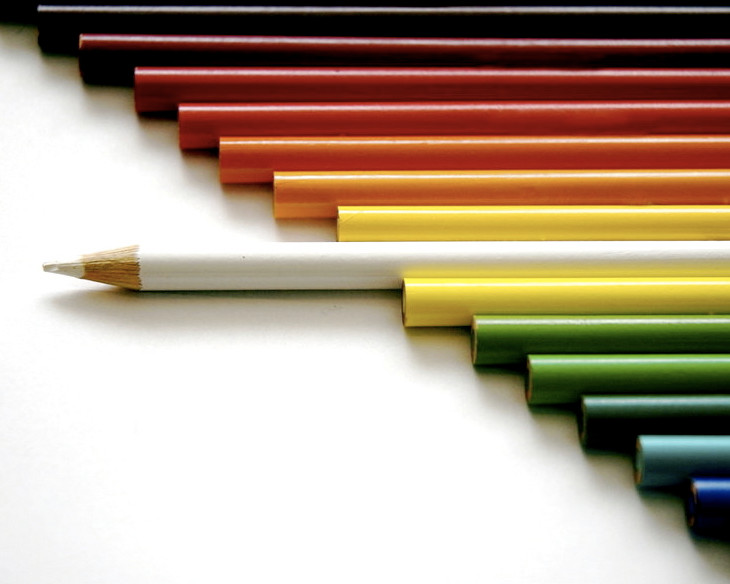
Description
This is something I've been wanting to do for a while, and it took about 40 shots to get it right. I was using Crayola pencils, which bore the golden logo that kept shining on other pencils. In this picture, you can faintly see this in a couple of pencils towards the top - I attempted to edit it out in Photoshop, but couldn't get rid of it completely. But since this was the best of the bunch, I thought I'd share it with y'all...hope you enjoy it (Smile)")
NOTE: This photo is NOT promoting racism. Please stop with the racism comments.
Related content


Comments: 1339


Wow that is a great shot. It's so appealing due to all the different colors, and the way the white colored pencil is sticking out ... truely fabulous!
👍: 0 ⏩: 0

It's so simple, yet awesome,
I like the title. and how the colors are blendy.
👍: 0 ⏩: 1

beautiful composition and concept

👍: 0 ⏩: 1

it's simple but awesome! I like the message of originality and anti-conformism it conveys!
viva la revolution!

👍: 0 ⏩: 1


wow!!! Thats what i call creative photography!!!
👍: 0 ⏩: 1

This picture is awesome. It sort of applies a message of nonconformity, first how the pencil is plain white within an array of rainbow colors, and secondly how it sticks out and is turned so that the viewer sees the point, instead of the end. My only critique is that towards the top, like you said, you can kind of tell where the crayola marks were, but that's nothing major and doesn't detract from the picture at all. Beautiful shot!
👍: 0 ⏩: 1

This is just fantastic, perfect alignment, lovely focus and GREAT colours ")
👍: 0 ⏩: 0


i've never seen anything quite like this.
the idea turned out very well.
i love it.
def. a fave [:
👍: 0 ⏩: 1

Thanks a bunch!!
👍: 0 ⏩: 0

Nice shot, it was very clever to have the white one standing out from the rest, good concept.
👍: 0 ⏩: 1

Awesome dude!
👍: 0 ⏩: 1

I like the idea of the long rows of color, well done
👍: 0 ⏩: 1

Really cool work
I like those rainbow colors
really amazing
👍: 0 ⏩: 1


wow. great composition. nice stuff, cool idea.
👍: 0 ⏩: 1

I agree with :Little-Loopy-Laura: Good stuff
👍: 0 ⏩: 1

really neat concept...this is an awesome shot!
👍: 0 ⏩: 1
Thank you very much!
👍: 0 ⏩: 0

yeha this is pretty similar, but i feel like you put more thought into this then the other girl. good concept.
👍: 0 ⏩: 1

here is the link of the photo I'm talking about..
[link]
👍: 0 ⏩: 0
have you seen crayons by :Silme-Amelie: because this picture is very similar to that one!

👍: 0 ⏩: 1
Yes I have - actually, that's what inspired this one!
👍: 0 ⏩: 0

i really like this photo. Nice step line. Infact the rainbow pattern effect is cool too. Pity you couldnt just turn the logo to face down and backwards out of your photo - would have saved all the editing hours. Nice use of one pencil different just off center too (cos allthough 7 pencils top and bottom also some empty space bottom) i like this!
👍: 0 ⏩: 1
Actually, I did do that, but somehow there was one or two wayward pencils that rolled (or maybe I wasn't just looking carefully enough  (Wink)")
👍: 0 ⏩: 1
ah - as you place one another always moves just to be awkward!!!! Pleasure
👍: 0 ⏩: 0

wonderful idea! love the composition and lighting. great job!

👍: 0 ⏩: 1

<= Prev | | Next =>