HOME | DD
 thetwiggman — ShellShock

Published: 2005-02-02 17:34:08 +0000 UTC; Views: 1176; Favourites: 30; Downloads: 231
Redirect to original
Description
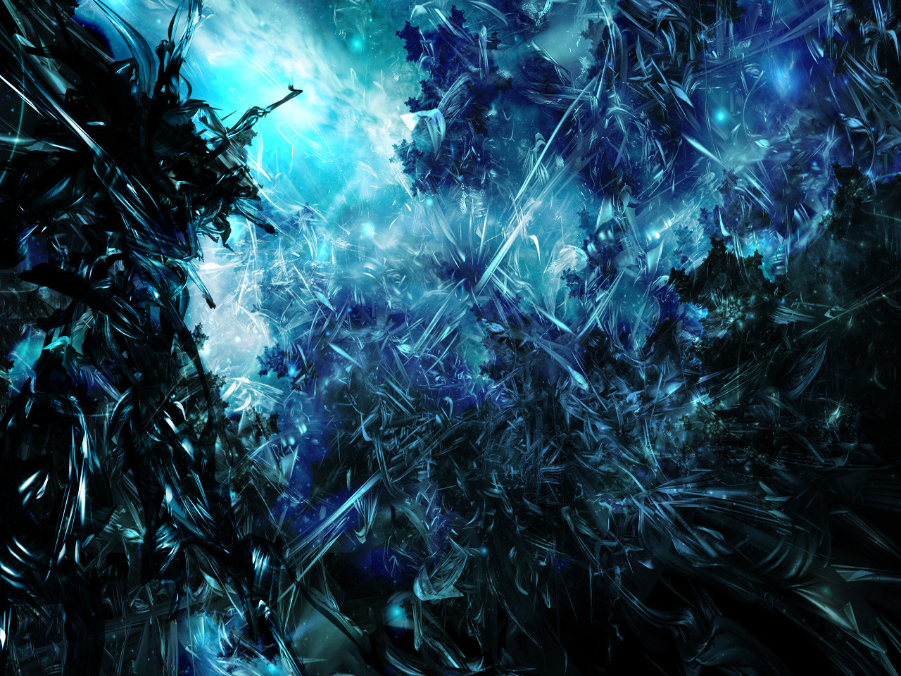
ShellShock - 2005This piece was inspired by the great * sec , took me about 4 days of rendering and brushing and getting everything to look and have a good feel to it. Hope you guys like this one.
Comments and favs are always welcome and appreciated, enjoy this and have a great day!
")
Related content


Comments: 20

Im lucky you really toke These 4 days for design this.
a wonderful Dimension in my eyes, i really like it, gj mate
👍: 0 ⏩: 0

oh man, the render, the brushing, the color, real cool. dont like the 2d tho... oh well +fav
👍: 0 ⏩: 0


gollat. the fucking ownz!9excuse my langauge..but hell..that rocks man.
👍: 0 ⏩: 0

liek a firey inferno. lovely color usage and effects...
👍: 0 ⏩: 1

Thanks, I love its vibrancy
👍: 0 ⏩: 0

of course man thats why I faved em, lol
👍: 0 ⏩: 0


i see a crystal to liquid meta going on... i like the center and the shades of orangish red that dominate the piece. on a second inspection, i notice that the electricity is layered up and i also see more detail to the brush work. i think the only thing about this i don't like is the red 2d. why? i have no clue... lol.
👍: 0 ⏩: 0

holy shit..one of your best. could use more depth. but its awesome!

👍: 0 ⏩: 0


I don't know - it seems a little flat compared to some of your other stuff. I like it though, but not as much as others.
👍: 0 ⏩: 0

I really dont like this piece, same old, not my thing, sorry.
👍: 0 ⏩: 0

Incredibly vibrant colors, and the 2D is nice. I just don't think it has enough depth to it. It looks flat. Good effort though
👍: 0 ⏩: 0

this is pretty good, love the color and brushing is sweet
👍: 0 ⏩: 0


wow.... thats awsome andrew this is ur best work to date!
👍: 0 ⏩: 0
