HOME | DD
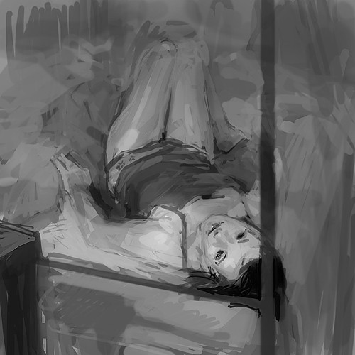
 Thomas-Wakely — Female Study

Published: 2012-05-09 04:51:04 +0000 UTC; Views: 1739; Favourites: 33; Downloads: 24
Redirect to original
Description
No color this time.Was going to work color in, but decided not to.
Left it a bit messy, i enjoy the broken up look of the visible strokes.
Don't know if its really that appealing.
Related content


Comments: 7


from my memory of the reference, you've made her thigh/ass and lower leg too large. but it could be closer than i think. seems you couldve pushed the contrast harder as well. overall nice, maybe work on softening some strokes
👍: 0 ⏩: 1

I didn't even catch that, but yeah, i pushed the bottom of her legs out too far. Thanks for pointing it out.
👍: 0 ⏩: 1

the bigger dynamic strokes helps illustrate and guide a viewer's eye with the fundamental buildup of the piece, it helps me see how you did it in other words
👍: 0 ⏩: 0

The messier look gives me the impression that you spent time getting the major shades in the right places rather than purely in finishing. I think excessive finishing is when you have too much time in a pose and you lose focus on your goal. Looks really great!
👍: 0 ⏩: 0

Beginner here, but I know I and a few people I know like seeing the messier strokes in pieces so it's visually appealing to at least a few of us.
Neat study btw!
👍: 0 ⏩: 0