HOME | DD
 thundercake — Younger vs. Older Features
Published: 2009-06-25 08:26:14 +0000 UTC; Views: 42402; Favourites: 1599; Downloads: 769
Redirect to original
Description
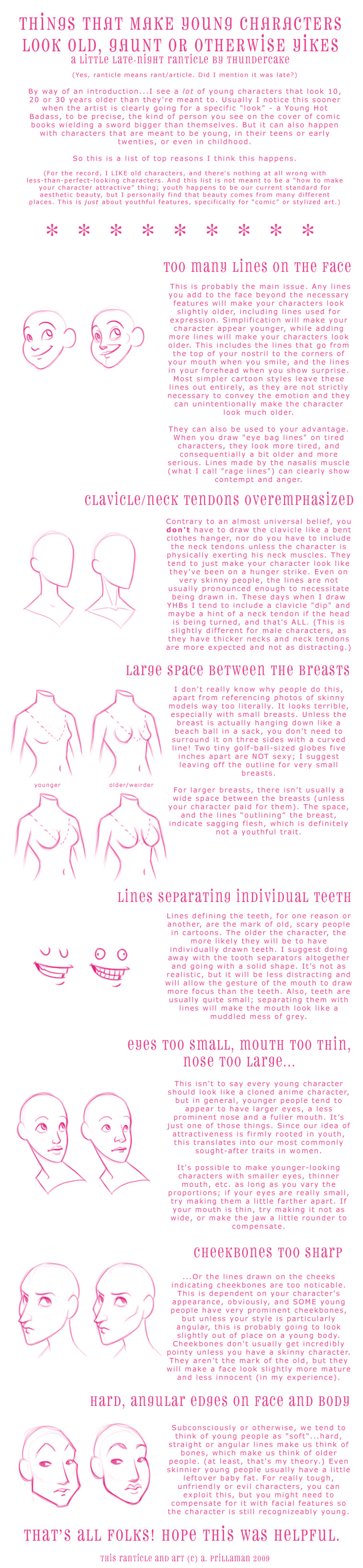
disclaimer-ish...I like writing down things I have sorta "figured out" over the years, and some people seem to find it helpful, but this isn't the word of god and I'm sure a lot of much smarter people have given better over the years, so please understand that this is just my personal experience/opinion speaking and nothing else.second disclaimer: as I said in the tutorial, this is aimed at strictly cartoony styles, NOT REALISM. I realize there is sometimes a boob-space in real life. My argument is that a cartoony style with lines requires some realism sacrifices in order to draw your attention to more important things, like gesture and shape.
Also I drew the examples in like 10 seconds so.. sorry, they're not the best, haha. PIIIINK
anyway, these are all things I would have liked to know about 5 years ago, so that's why I wrote this. (I'm looking through my old art. YEEP! it's scarier than that ghost I saw the other day.)
Related content


Comments: 141


Your genius surprises me still <3 Very inspirational ranticle.
👍: 0 ⏩: 0

My problem has always been the fact that I make too many lines in the drawing. No wonder all my humans look so old even if they're meant to be 15 or younger.
Great tutorial!
👍: 0 ⏩: 0

You had a good tutorial, have you any advice on height? It's so hard to find decent references if a person wants to draw characters that don't necessarily fit the normal heroine, hero, villain stereotypes. For example, a short main character female paired with a tall but proportioned male. or a taller than average female etc. It's hard to decide what height is too short and too tall without reference for male and female. Anyhow, if you've any insight into that I'd love to hear it!
👍: 0 ⏩: 1

I use the "head" system, set up a general height for a people (six heads = normal height for example), then change the character's height based on how many heads tall they are. old people tend to be shorter, in my experience.
👍: 0 ⏩: 1

I actually think some of those "uglier" features look better in the comparison. XD
But that's just me.
👍: 0 ⏩: 1
so do I, this wasn't about attractiveness
👍: 0 ⏩: 1
ah true. But all of them look nice~ c:
👍: 0 ⏩: 0

this was INSANELY helpful since i couldnt seem to figure out how to distinguish my adult characters from my teenage characters, and THANK YOU SO MUCH for this
👍: 0 ⏩: 0

Haha, I am totally guilty of the clavicle/neck tendons thing. Its probably because, while I'm only 20, my clavicle/neck tendons are somewhat prominate and so I include them a lot. I should probably back off of that a bit XD
👍: 0 ⏩: 0


Great tutorial- thanks so much! I'm in the planning stages of writing a comic, and I've had some trouble with defining my characters' ages while designing them. This was really a great help. ^__^
👍: 0 ⏩: 0

Oh gosh, "there isn't usually a wide space between the breasts (unless your character has paid for them)"
That made me giggle! Wonderful pointers there hun :3
👍: 0 ⏩: 0

this is really helpful for aspiring cartoonists 
")

👍: 0 ⏩: 0

LOL after this, I've re-confirmed my love for old people XDDD I just love wrinkles, pointiness and tendons way too much x) I tend to make my young doodles older than they are

👍: 0 ⏩: 0

Well, thanks for this. It's rather tough to draw older looking people for me, and this is a great place to start.
👍: 0 ⏩: 0

Thanks for sharing!  (Smile)")
Also, there is a compromise with teeth - I rarely outline ALL teeth but I usually outline some (like a couple of lines). Maybe because flashing white stripe of teeth looks too much like a dental ad to me. ")
👍: 0 ⏩: 0

For drawing cartoons, this is exactly what I needed. Thank you! The tips are really helfpul
👍: 0 ⏩: 0

I never really noticed the teeth thing, but it's true. It really is kinda creepy. I'll have to remember that for a creepy character.
👍: 0 ⏩: 0

This is great!
👍: 0 ⏩: 0

This was both very entertaining and very helpful.
👍: 0 ⏩: 0


Thanks for making this! I'll put this to good use.
👍: 0 ⏩: 0

this is a nice observation of what people tend to do with young/old characters. helps me a lot with the do's and don'ts... i have so much trouble with age(and gender...
i'll definitely use this as reference when working on my characters. some of them desperately need to be redone anyway, so at least i know the reason WHY they do.
awesome pinkness!

👍: 0 ⏩: 0


Thank you for putting this up. Now all we artists have to do is work on coming up with different face types. But yeah, getting a character to look like their age is hard to do when you have the young adult (late teens to mid-20s, in my idea) and the teen. Of course, I'm all for a wide spectrum of age groups, kids to seniors in my stories, if I can.
👍: 0 ⏩: 0

altough this pink is wetting my eyes, thank you for the tips!
👍: 0 ⏩: 0

You're very observant. Or maybe you're not, and I'm just completely oblivious. But either way, this was helpful. Thanks a bunch.
👍: 0 ⏩: 0

I think that the part about putting in less lines may upset people who love detail
This is really good though- I had never really thought of things like this. Generally, when I'm doing very young children, younger than six, about, I just tend to make them chubbier. And shorter.
👍: 0 ⏩: 0

"For larger breasts, there isn't usually a wide space between the breasts (unless your character paid for them)."
I have my doubts about this. Natural breasts are NOT together as you show in your example. They have a natural fall, that separates them. Even if they are large, with more reason, because they are heavy and the gravity does something, you know? The outline should be at the sides and in the inferior part of the breasts. At least that's how I've seen in real life.
Round, perky, together and rally up, happens to look more like "artificial" breasts.
👍: 0 ⏩: 1
This isn't about realism, it's about cartoons and what conveys an idea best working with lineart. outlining the breast and placing them really far apart might be closer to their actual position in real life, but in a cartoon it only makes the character look saggy.
👍: 0 ⏩: 0

Very, very helpful. I didn't realize the effects of some of these things~
👍: 0 ⏩: 0


Hey, thanks for posting! I think this'll help a lot of people, including me.
👍: 0 ⏩: 0

Someone should tell the boobs one to that RPG ad that they keep showing on LJ. Theres a three-lane highway of space between this young girl's boobs, it really bothers me T__T Not that I should be looking but you know.
👍: 0 ⏩: 1
I see it everywhere.. especially 3D models, where, you know, it's very easy to screw up that particular area, but honestly it's like they've never seen a boob before or something.
👍: 0 ⏩: 1
Well thats a distinct possibility

👍: 0 ⏩: 0

I like this, but the pink kinda makes it hard to see, could you change the colour for me? So that it's easier to read?
👍: 0 ⏩: 1

Couldn't you just pop it into an image prog and adjust it yourself? That'd be faster.
👍: 0 ⏩: 1
My photoshop is dying, but I'll try.
👍: 0 ⏩: 0

hey this is really great!!!! XD
Thanks, goddess of thunder!!!!
YEAH
👍: 0 ⏩: 0

Nice one! Can't say I've noticed the older/younger character trend, though!
👍: 0 ⏩: 0

Oooh, thanks for this, while I don't really think I have a huge problem doing this (although I really like drawing the clavicle...that will never stop, haha). It is definitely something to keep in mind, especially when you start over-rendering a face or something with all those lines and such (like I just did on this drawing I'm doing right now >.> (Wink)")
👍: 0 ⏩: 0
| Next =>