HOME | DD
 tiefgrau — Days Go By
Published: 2004-08-19 19:20:32 +0000 UTC; Views: 1026; Favourites: 8; Downloads: 91
Redirect to original
Description
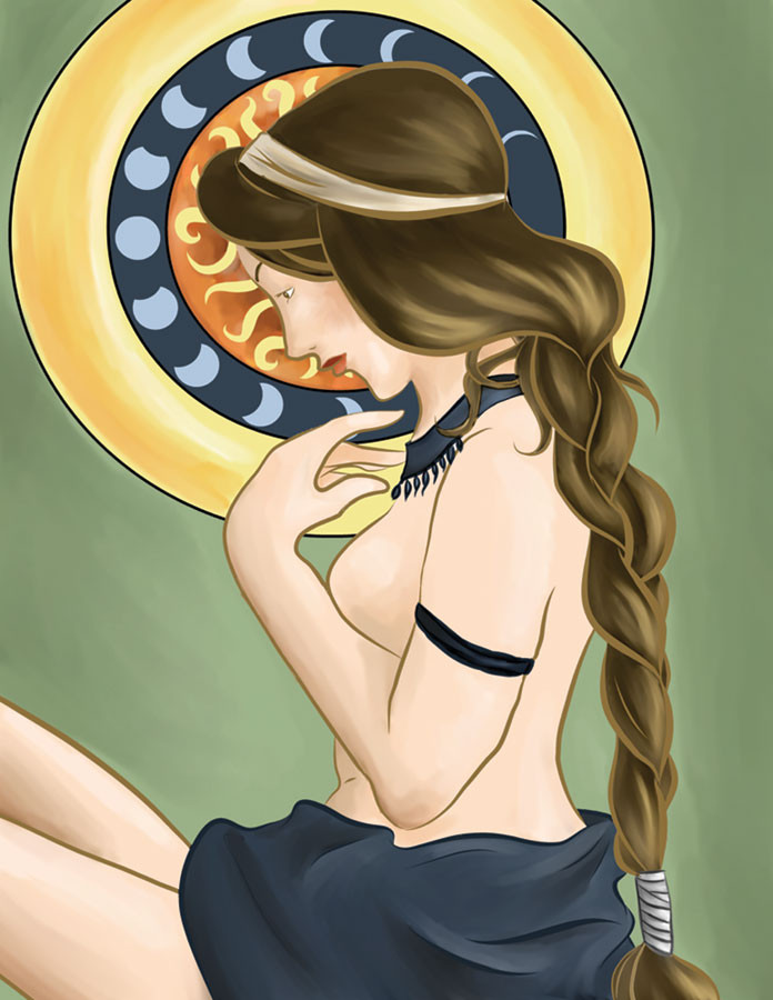
This was one of those things where it started off really awesome, but the more I worked on it, the more I was convinced it was awful and not worth my time. But I finished it this afternoon and printed it out on my superemely awesome printer and it just looked so beautiful in real life I love it again.It still took way too much time to finish for how simple it is. I inked it in about ten minutes, but it took me hours to color it. Not just because I was working 8.5 x 11 at 600ppi, but also because I am stupid and it took me forever to figure out how do to some things I ended up not doing.
Used Painter 8, Photoshop 7, and Expression 3. Sketch here , Inks here , and Colored Inks here
Character is Parsley from an upcoming comic and she's mine, mine, mine. I don't give anyone any permission to use images ofher for anything.
Related content


Comments: 8

")

Amazingly cool. Very classic style, but I love the textures. It would make an excellent print.
")
👍: 0 ⏩: 0
Amazingly cool. Very classic style, but I love the textures. It would make an excellent print.
👍: 0 ⏩: 0

I adore the softness and simplicity of it. It's on my favourites.
👍: 0 ⏩: 1

lovely work, i think it's very art noveau and classy. i love the dark bold colors, too. i'm sure it looks beautiful in real life! it's what i tell myself about my art, too, hah hah. good job, keep it up!
👍: 0 ⏩: 1

Hey! I should send you a print! I've got your school address around here somewhere, if it still works.
The art noveau style is harder to pull off than it looks. More detail than I'm used to drawing, lazy me.
👍: 0 ⏩: 0

The part my eye keeps getting drawn to is the braid. I love the colors and the interlocking curves there.
The disc is interesting, because it keeps changing for me. Overall, the disc seems to have an Eastern design quality. The individual graphics, particularly what looks to be the phases of the moon, reminds me more of Native American art. Then I look at it as part of the overall piece, and it suggests the halos often used in Italian Renaissance art. (By the way, my art history is extremely rusty. This it really just what it evokes for me.)
👍: 0 ⏩: 0