HOME | DD
 TigRaidoXXX — Gilbert and the Hunter

#dark #gilbert #despair #gamefanart #hunter #liners #sadness #traditionalart #bloodborne #bloodbornefanart
Published: 2017-10-29 13:49:08 +0000 UTC; Views: 1137; Favourites: 53; Downloads: 2
Redirect to original
Description
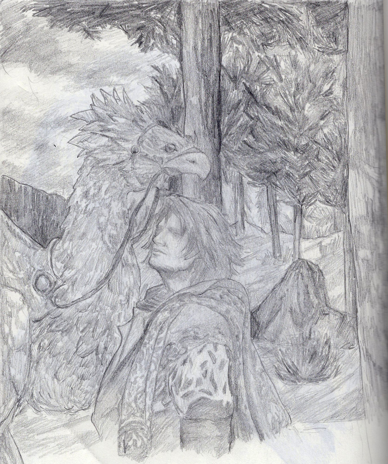
Because I love Bloodborne and Gilbert (damn, why does everyone have to die in this game?)Done with liners, original size is A5.
Related content


Comments: 23

👍: 1 ⏩: 1

👍: 1 ⏩: 1
👍: 1 ⏩: 1
👍: 1 ⏩: 1
👍: 1 ⏩: 1
👍: 0 ⏩: 0

Hello there
I saw your artwork at the gallery of :devprojectcomment:
First of all I would like to take my hat off to the time you most likely spent to draw this piece. A complex traditional piece like this is usually a real bunch of work.
I also like the style you chose. That you tried to do everything with one pen, from outlines to shading, found my greatest approval.
The way you made the shading shows me, that you are very skilled in this area. You used a lot of different techniques like dots, lines or cross hatches. Furthermore is every shade placed perfectly. As example you could take the folds in his white-shirt. Nevertheless, however flawless your shading is, when you look just at the details, you made some slight mistakes in the "shading master plan".
If one looks at your piece from a farer point of view, his face and the blanket that covers his shoulders are far darker than the rest of the piece. In general it is not a problem, if some parts are darker than others due to the incidence of light, but in the case of this picture the darker places seem to be chosen randomly. If you made his head and the blanket darker because of missing light you should have made the lower part of the picture (from his knees downwards) darker as well. But if you made this part darker because the blanket and his hair are supposed to be black, you should have made it a little bit lighter to blend in the optical illusion of a black and white drawing.
Now, secondly, I have to admire your hand-drawing-skills. Drawing realistic hands is my personal nemesis and therefore I'm amazed by anyone who can do it easily without thinking about it. I especially like his right hand, the proportions and the shading are really nice and I love that you added e finger nail! The left hand is drawn just as skilled as the right though it seems to be too small. Comparing the length of the fingers they seem to be just half the size of the fingers of the right hand.
This slightly too small left hand brings me to my final compliment but also to my final critique.
This piece is drawn beautifully with an extraordinary love for details; the pistol with the bullets, the pills on the window sill, the wheelchair, the hunter standing outside. But there are some dissonances. I chose two examples to explain my feeling, the left hand and the too dark face in the first passage. There are some more like the handkerchief, which quite doesn't follow gravity or his extremely long right lower arm, but they are uninteresting because all the mistakes you made have the same origin.
I am totally sure, that you wouldn't have made any of these mistakes I found, if you had looked once or twice at your piece from afar.
You are a very skilled artist, who posses the potential and the nerves to become one of the greatest. My only advise for you would be to be careful to not loose yourself in the details but keep a close look at the overall image. That doesn't of course mean you should draw less details (they are amazing!), just draw them at the very end.
👍: 0 ⏩: 1
Hi, thank you for sharing your thoughts!
I can see what you mean about having no main shading that shows the objects' shape, not the details. I did try to make their colors differ (like, dark hair, grey/brown blanket, white shirt) but I guess that messed up the comparison between dark tone on light objects and highlighted areas on dark ones... And only main tones remained in the end, without proper shades/highlights. I'll try to do a better job next time - I'm not an experienced traditionalist actually, but I want to try doing this stuff again.
Happy to hear that you like the hatching - I experimented with it, trying to remember what I know of hatching and what other artists do, seems to have turned out well  (Smile)")
You mentioned extremely long lower arm - you mean I've missed some body proportions? That's sad, have to look better next time... right, I probably should check the image from afar more. It's not that obvious with traditional art.
Anyway thanks for the critique and for giving a fresh look to my picture, because it's hard to keep everything in mind on your own. I will try to avoid these mistakes next time! And thank you for complimenting my style!
👍: 0 ⏩: 0

Your style is very...well amazing dear! It's very detailed. It's lovely.
👍: 0 ⏩: 1
Wow, thank you! Happy to hear that you like it
👍: 0 ⏩: 1
I'm glad to have found you! I like your style, >3> Kepp up the greatness~
👍: 0 ⏩: 0

Thanks, happy to hear that
👍: 0 ⏩: 0


Not everyone! Some will just go completely crazy.
👍: 0 ⏩: 1
Yeah, that's SO much better than dying ")
👍: 0 ⏩: 0
Really?
👍: 0 ⏩: 1

Really really! It's awesome.
👍: 0 ⏩: 1
Cool! So spending time on hatching did pay off
And leaving the tint was my friend's advice, first I wanted to turn it into full grayscale.
👍: 0 ⏩: 1
It sure did. I'd love to see more in the same style.
👍: 0 ⏩: 1
Well, I hope I'll take a few more shots with the liners...
Oh, and you could probably check out this one too: The art of necromancy It's an old one, done by black pen and a whole lot simpler than this one, but still.
👍: 0 ⏩: 0