HOME | DD
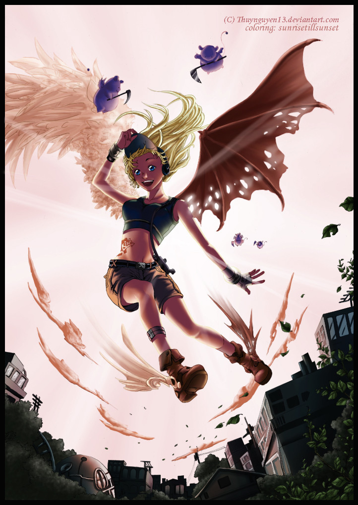
 TimareeZadel — Flight of the Mailman
Published: 2010-08-12 16:28:26 +0000 UTC; Views: 2185; Favourites: 77; Downloads: 0
Redirect to original
Description
Lines:: [link] byFrom the line art artist comment:: "She was the mailman, between two world: heaven and hell, you can give her an angle, would be a sub-demons, would be a man, let your imagination be Altitude.
Let's go surfing with her, the wind, clouds, and the primary devil cute, gentle angels"
- - -
EDIT:: Thanks everyone who has fave'd or commented thus far. It really is good to know that I'm getting better and faster.
 I was really aiming to create a mod/atmosphere and it feels like I achieved my goal. So, again thanks everyone for the feedback.
- - -
I haven't entered a CMC contest in a while, but I had the time for a change and the lineart was too cute to resist
So, yeah, this is an entry for the August coloring contest.
Related content


Comments: 28


Wow! Probably one of the more impressive pieces I've seen on deviantart. Right away I have to say that the use of perspective really gives me a sense of direction. I have a feeling of where everything is like she whizzing by over my head. Beyond that your technique is obviously great. Use of color, shading, lighting are all great. One thing I noticed though that could make or break a work of art depending on who your talking to. I find myself immediately drawn to her face. I'm not sure if you did that on purpose but the contrast of her blonde hair and blue eyes kind of stick out. I can't really say if that is a good or bad thing but some people would say that the contrast could take away from the rest of the image. Story always adds to any work of art and your description only served to make the impact of your work more powerful. I really love your work and you can only get better from here. I'll be "watching" for more.
👍: 0 ⏩: 0


Thanks. I can only really take credit for the coloring on this image, but I appreciate the positive feedback on the image as a whole
👍: 0 ⏩: 0

Really really like your colour scheme here, the backlight from the sky makes this a really unique entry!
👍: 0 ⏩: 1
Thanks so much! I appreciate that you took time to consider the positives of my entry
👍: 0 ⏩: 1
I couldn't not, it really stood out to me
 (Smile)")
👍: 0 ⏩: 0

Oh, I like your idea of color, it is impressive 

👍: 0 ⏩: 1
Thanks
👍: 0 ⏩: 2

What the artist is trying to tell you here is, the problem with the clouds is from using an inappropriate technique to color them. With the coloring style you used on this, you would get a better result by ignoring the line art, and then using your cloud brush with just white, so that the cluds blend in to the background rather than stand out from it. The way you tried to color realistic clud surfaces into his cartoon style lineart makes them look almost like items in the foreground with the character swirling around her feet. Aside from that, no offense meant to the artist who dre wthe lineart, but your colors on this piece far exceed the composition of the original lineart. good work.
👍: 0 ⏩: 1
First off, thanks for taking the time to read the comments in context with the image. It's really helpful to get information from multiple sources. (Especially if I can't understand one 
👍: 0 ⏩: 1
No problem. It's the shape and the saturation I think. For this piece a soft hint of white with very little definition probably would have been more suitable.
👍: 0 ⏩: 1
Thanks again. I'll keep that in mind in future works for sure.
👍: 0 ⏩: 0

Great colours on this, especially love how you did the lines (or lack thereof) on the skin.
👍: 0 ⏩: 1
Thanks ")
")
👍: 0 ⏩: 1
Yeah, that was a very good call, really accents the highlights : )
👍: 0 ⏩: 0

Great choice lighting this piece, and the shading amplifies the whole tone, everything is absolutely accomplished! You definitely have and edge winning the contest here!
👍: 0 ⏩: 1
Thanks so much for your feedback
thanks again for your comments
👍: 0 ⏩: 1
No prob! If there aren't any AMAZING last minute subs, you got my vote!
👍: 0 ⏩: 1
haha, well thanks very much
👍: 0 ⏩: 0


Hi sweetheart! Omfg, okay, so I came across this picture and fell head over heads. Lol, anyway I did a little thinking and was wondering if you’d be interested in joining: [link]
We’re a new club for people willing to submit Angle, Demon or Human OC’s and share them with the community. The group is structured around a fantasy world where we encourage people to submit group themed art; whether it’s literature, visual art or anything else you can produce! The format it’s in also leave room open from RPG’s to take place further down the track for people that wish to participate. I’d love for you to join and am looking forward to hearing from you soon. We really would be honored to have you!!!
xx Mistress Gaia xx
👍: 0 ⏩: 1
Thanks for the nice comment
👍: 0 ⏩: 1
Thats alright sweetheart <3 good lukc with your art anyways, and if you ever change your midn, feel free to send me a join request xx
👍: 0 ⏩: 0

Very cute with wonderul details. Your color work is superb!
👍: 0 ⏩: 1
Awe, thanks so much! It was definitely fun to work on this piece. The line artist gave me a lot to work with
👍: 0 ⏩: 0