HOME | DD
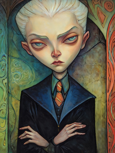
 TimBeard — The Innsmouth Look

Published: 2005-12-31 08:30:21 +0000 UTC; Views: 1020; Favourites: 23; Downloads: 129
Redirect to original
Description
Pen and ink on paper6.5" x 8.5"
Related content


Comments: 10


It wasn't really the intention. But I guess he does kinda look Italian.
👍: 0 ⏩: 0

I like this, especially the white highlights and his adam's apple/neck tumor.
 (Smile)")
👍: 0 ⏩: 0

You've really captured the Innsmouth look here... normal looking at first, but there's just something *off* about him...and then you see the developing gills
Amazing linework, very well controlled indeed. I like the touches of white, too. Did you add the orange/yellow in digitally, or do a wash? And if it was a wash, what did you use to get it so consistent?
")
👍: 0 ⏩: 1
The golden color is actually the color of the paper. The white highlights were painted on. Glad you like it.
👍: 0 ⏩: 0

love the colour you used for this one and the linework and the texture.... Super!!
👍: 0 ⏩: 0


sweet hatching...had a real vintage feel to it (i know, an overstatement of the obvious..still) you know your way around a pen
👍: 0 ⏩: 1
Well, thank you very much for thinking so.
👍: 0 ⏩: 0

Nice character design. I really like the expression of the face. Fine style and texture.
👍: 0 ⏩: 0